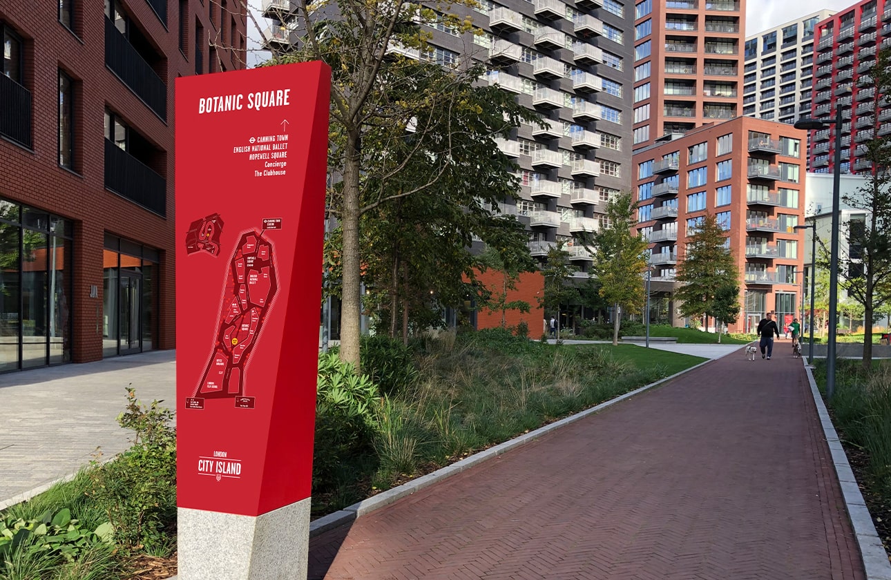
As construction work enters the final stages on the Island, installation for the new wayfinding scheme for the public realm has started to roll out.
Based on the vision for a simple, strong and architecturally distinctive design, the wayfinding scheme reflects the unique character and identity of the Island through expression of form, colour and graphic language.
Slices of red permeate through all aspects of the built environment from architecture to landscape and now to signage.
The colours of the Island’s identity are not just eye-catching, but link specifically to the local area, replicating pigments used throughout Leamouth’s history of artisan and maritime production.