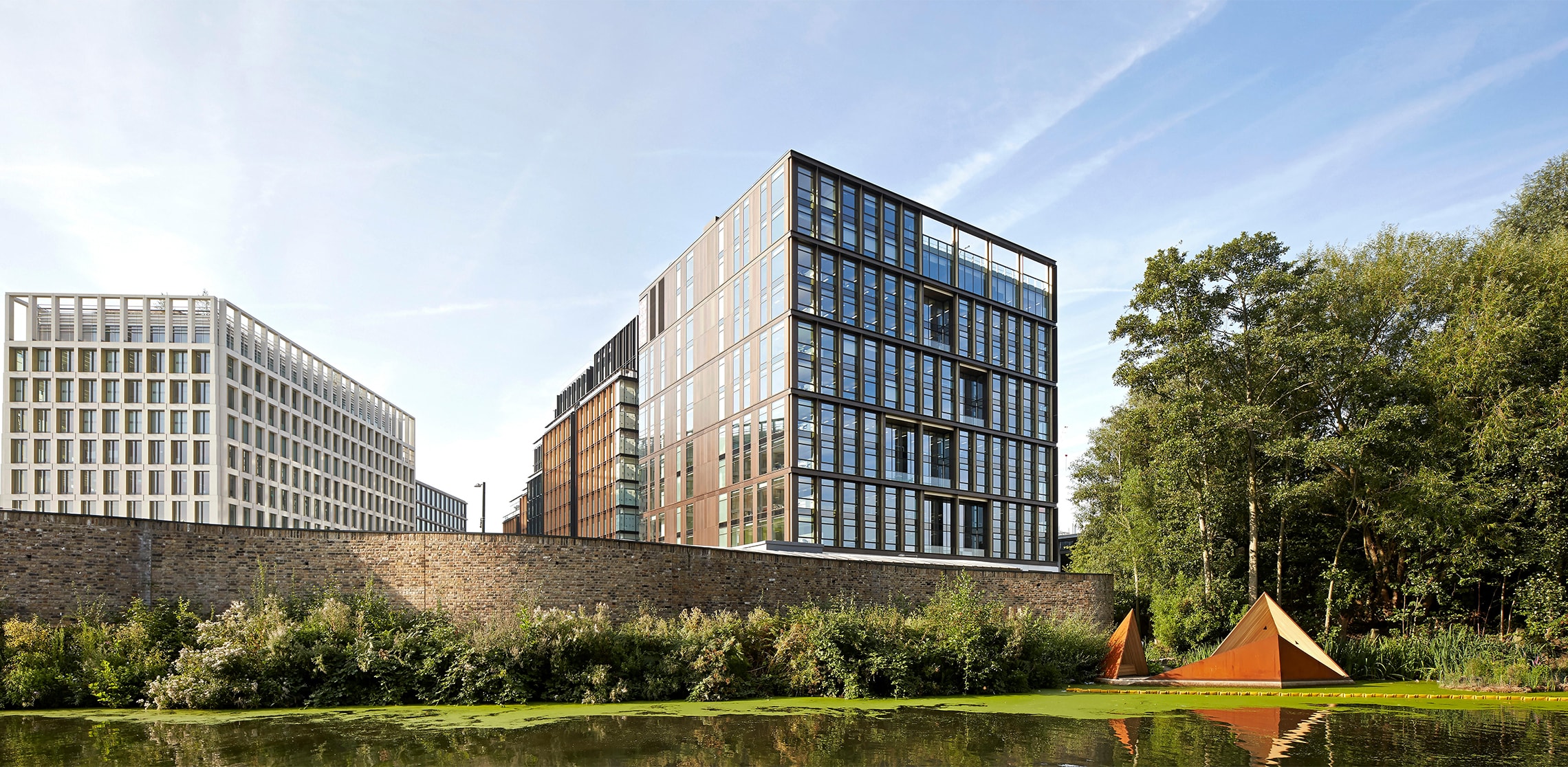
From Camden Lock, you can follow the Regent’s Canal towpath all the way to King’s Cross and, in less than half an hour, move between two entirely different expressions of London. Camden Town still carries its smaller grain – cobbles underfoot, market stalls, the familiar persistence of punk – while King’s Cross opens out into something broader and more composed. As Edwin Heathcote put it, it’s “the perfect mix of grittiness and shininess,” holding together the city’s industrial past and its creative present.
That contrast isn’t incidental; it’s characteristic of Camden as a borough and, more widely, of inner London itself. Layers of history and use sit tightly alongside one another. There are 36 Conservation Areas, more than 5,600 listed buildings, and at the same time an economy that ranks among the largest in the UK. It is a place where difference is not smoothed out, but lived with, and navigated daily.
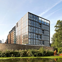
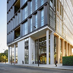
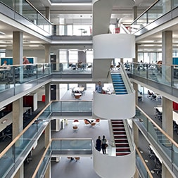
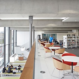
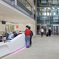
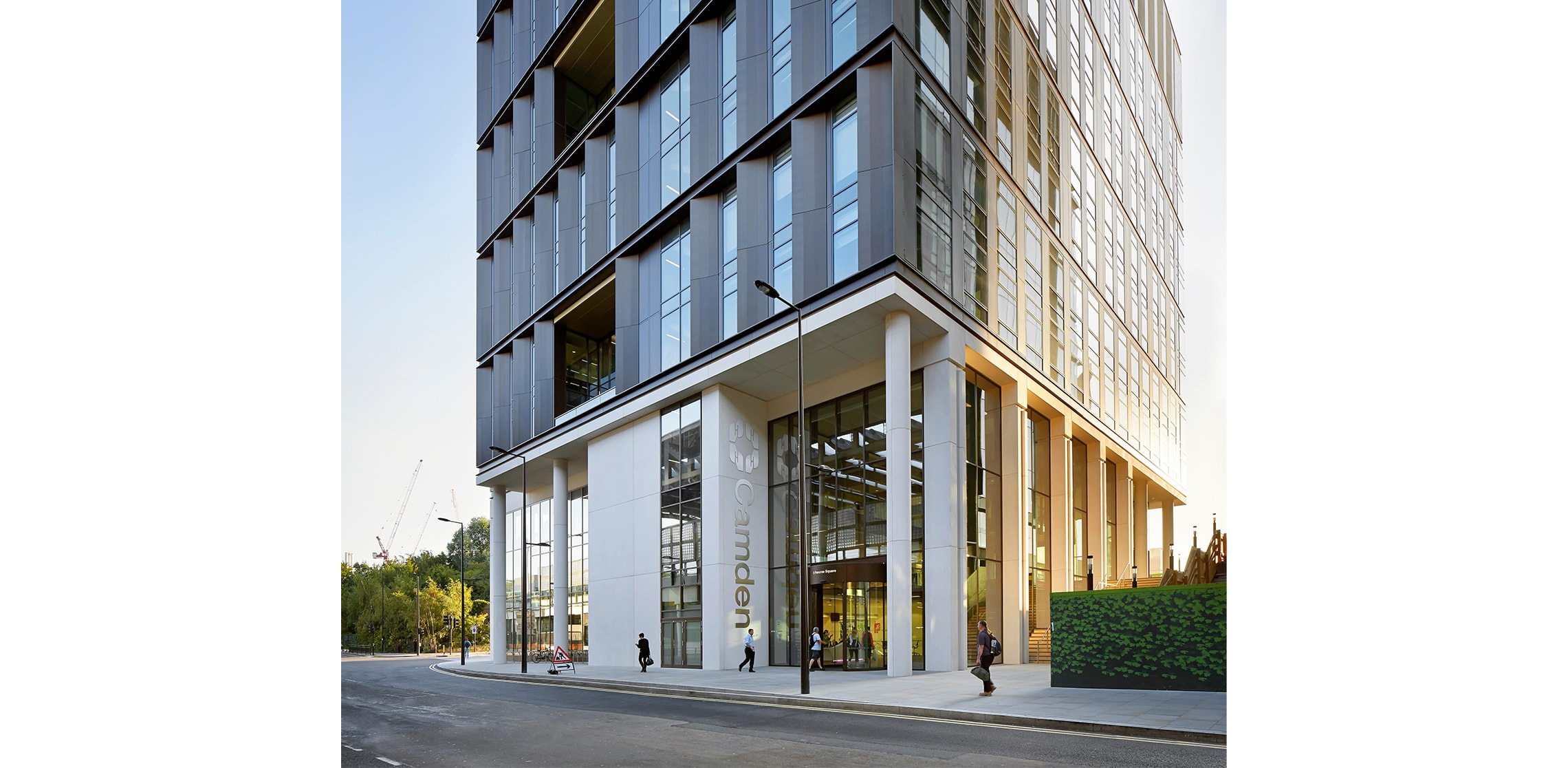
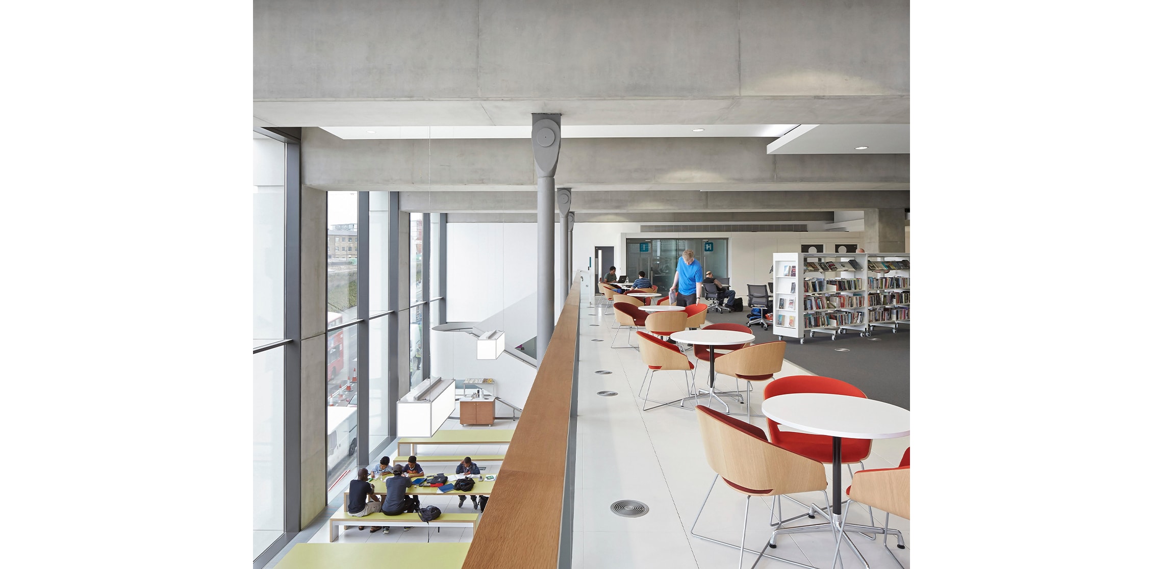
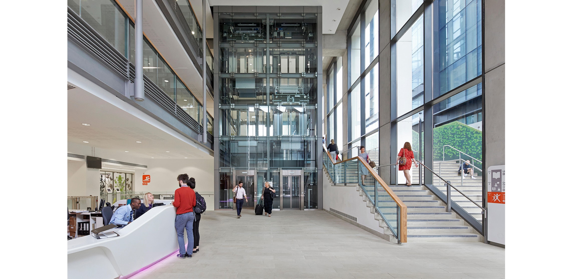
For Camden Council, that complexity once extended to its own operations, spread across a number of ageing, energy-intensive buildings. In 2015, those functions were brought together under one roof at 5 Pancras Square, an eleven-storey civic building within the King’s Cross development. It combines administrative offices with a leisure centre, swimming pools, a library, and a customer access centre. It’s a building in constant use, by people arriving with very different needs, levels of familiarity, and amounts of time.
The wayfinding needed to respond to that pace and variety. It had to work quickly for those on a tight schedule, while remaining clear and reassuring for visitors encountering the building for the first time.
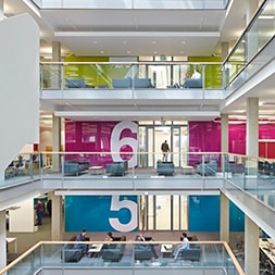
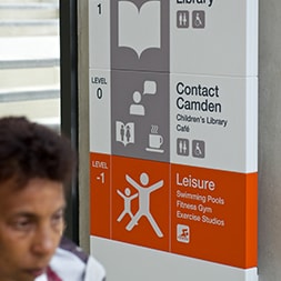
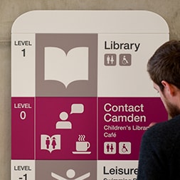
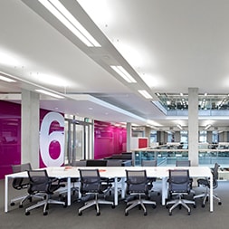
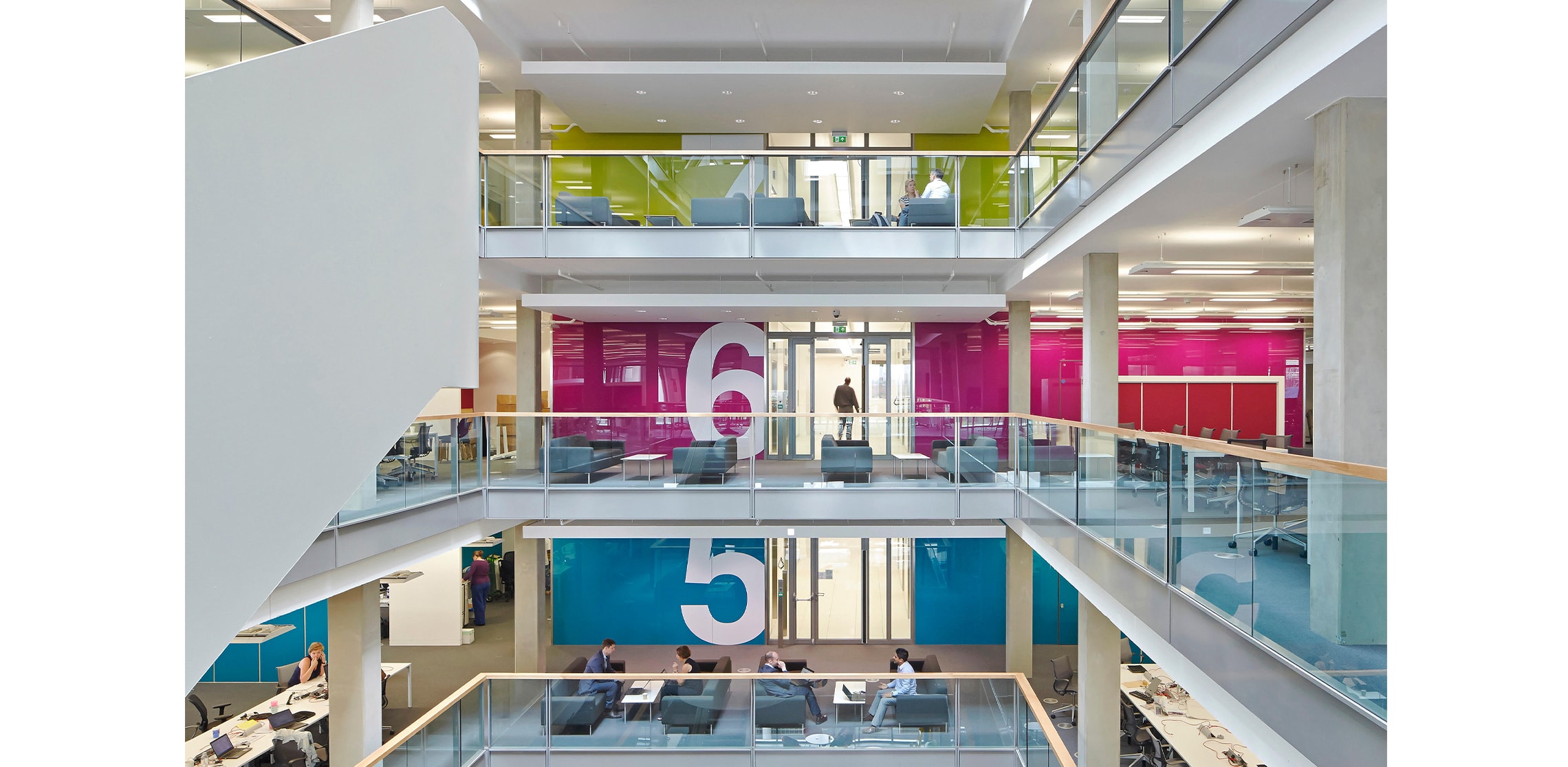
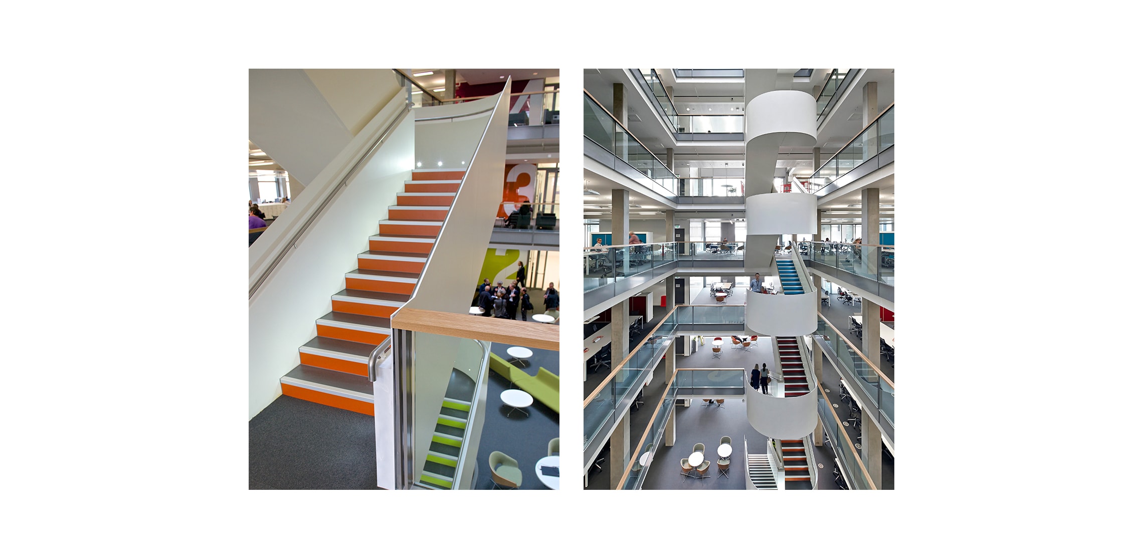
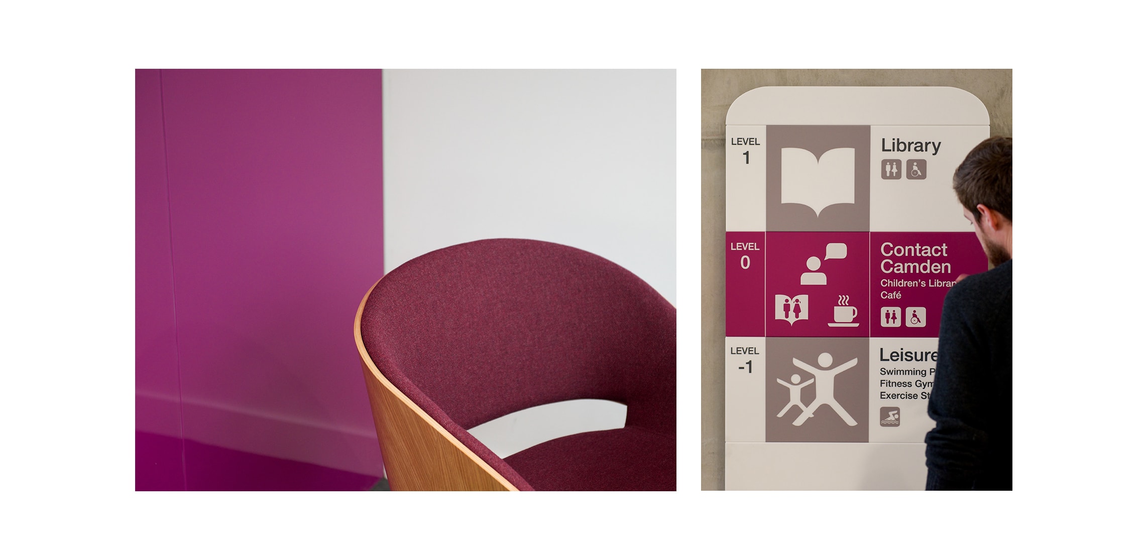
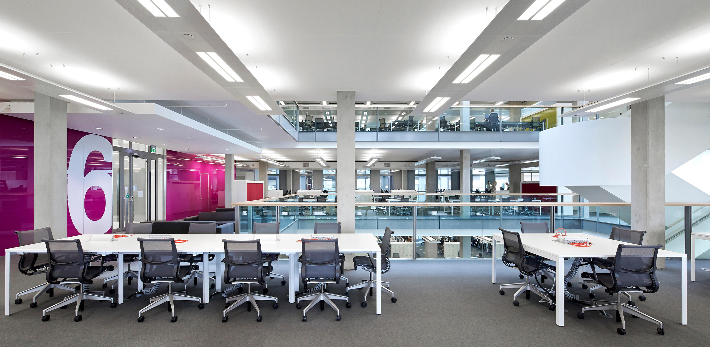
Our solution was to embed the wayfinding into the very fabric of the interior design… we developed a system based on colour-coded floors, taking advantage of the open atrium so that bold floor identifiers are visible across multiple levels. This allows people to orient themselves almost immediately, reducing the need to stop and search. The colours extend into furniture and glass manifestations, so the navigation system is not an overlay but something embedded in the visual language of the building itself.
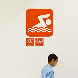
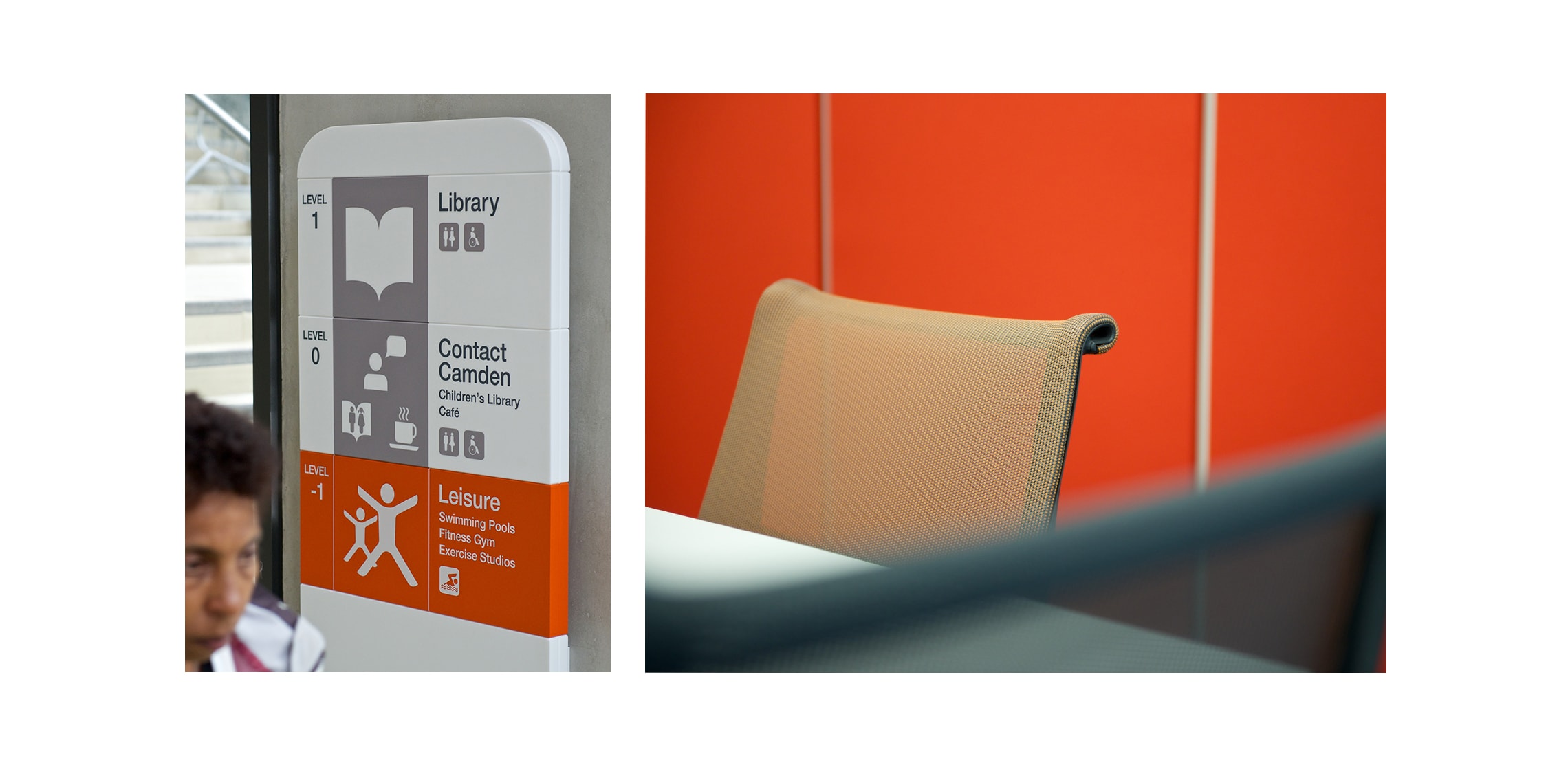
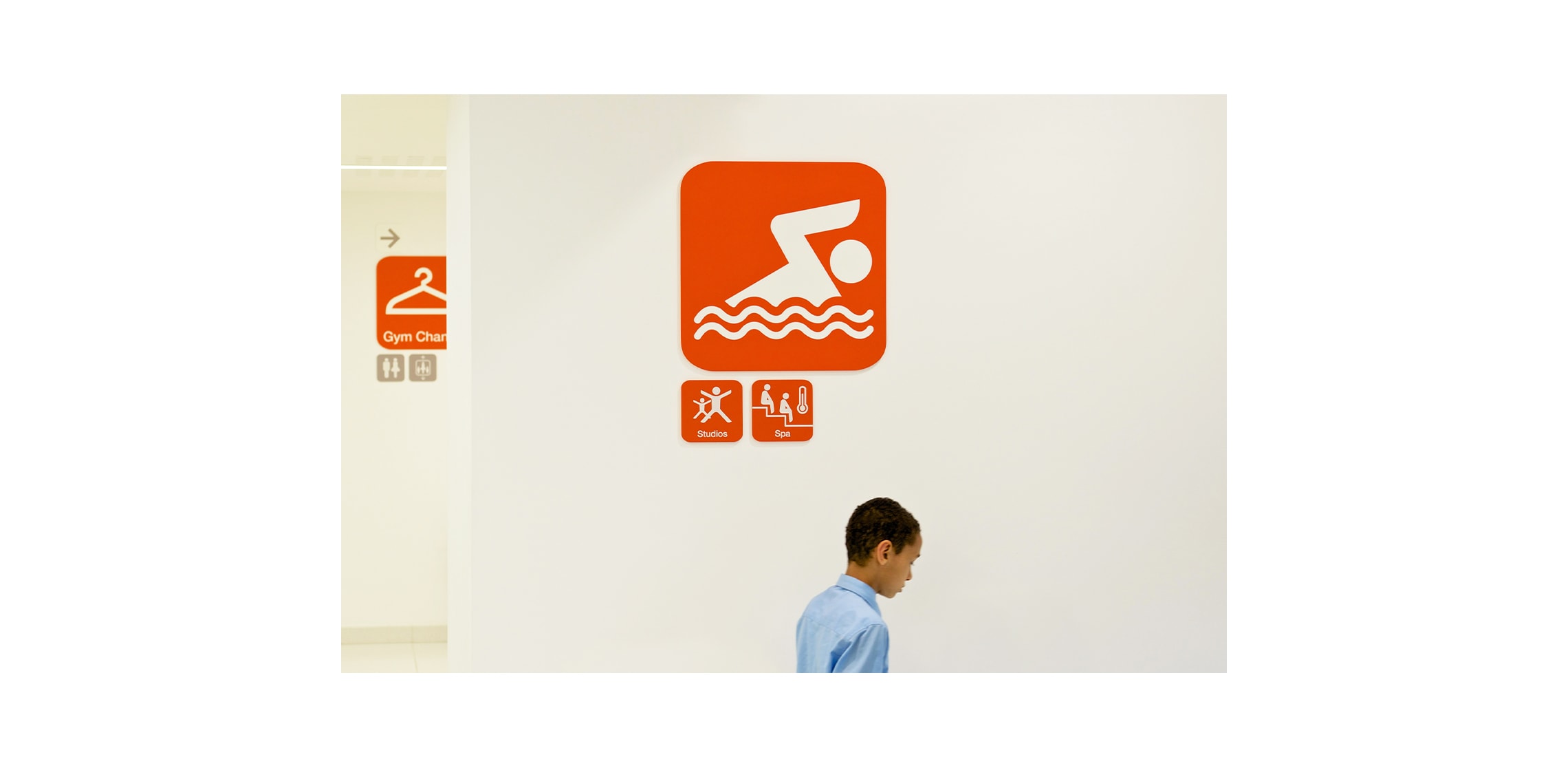
Material choices were equally driven by use. This is a high-traffic public environment, so durability and ease of maintenance were essential. We specified HI-MACS across directories, freestanding totems, and wall-mounted signs – the same material used in the reception furniture – creating consistency while ensuring the scheme stands up to daily wear. Pictograms play a central role, supporting a borough where many residents do not speak English as a first language, and allowing information to be understood quickly, without a reliance on text.
5 Pancras Square has been widely recognised, particularly for its energy efficiency and low-emissions design. Our contribution was acknowledged in the Wayfinding and Signage category at the 2017 Transform Awards Europe, and the project has since been featured in RIBA’s Are You An Inclusive Designer as an example of good practice. What underpins it all is a simple principle: in a building used by so many, in so many different ways, clarity is not just helpful – it is what allows everything else to function.