You might know Castle Howard because you’ve joined the 260,000 visitors who pass through its gates each year, programme in hand, ready for domes, drama and at least one photograph you’ll insist on framing. Or perhaps you know it from the screen – Brideshead Revisited, where it wasn’t so much a location as a fully fledged cast member, radiating melancholy and magnificence in equal measure. More recently it has glided through Bridgerton, and in 2022 it even starred in its own Channel 4 series, Castle Howard Through the Seasons – here’s a link if you’re curious – which feels exactly right for a house that understands narrative.
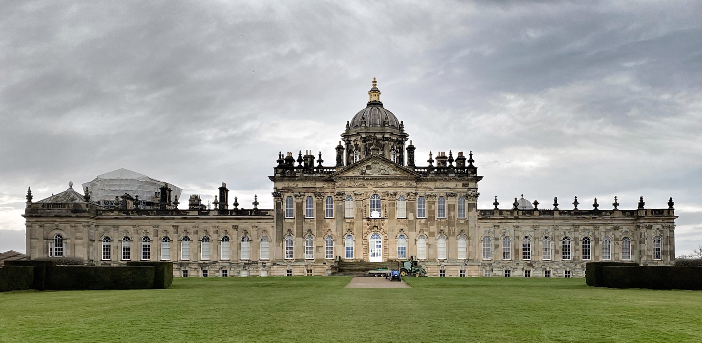
It is unapologetically magnificent. English baroque at full tilt, set within rolling Yorkshire countryside that appears to have been arranged by someone with a particular fondness for the word “verdant.” But beyond the grandeur, beyond the tour routes and filming schedules, it is a home. An ancestral home. The Howard family actually live there.
And so the house exists in two modes.
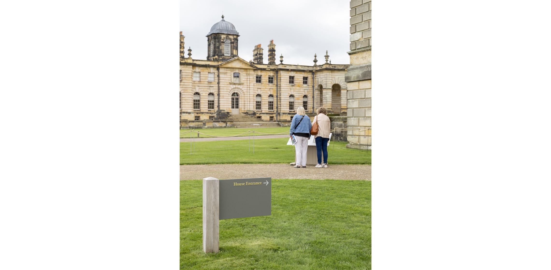
In season, it performs. Visitors arrive, events unfold, footsteps echo. Out of season, it softens. It returns to being private, familial, lived-in.
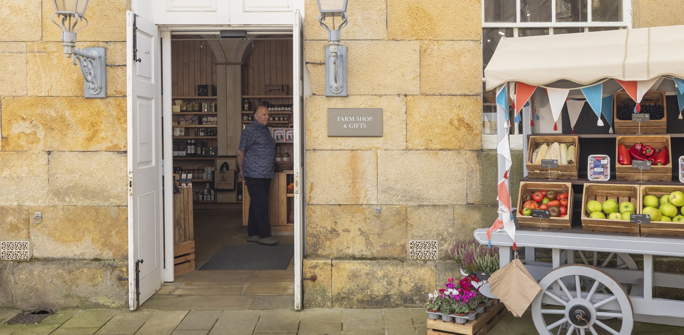
This was the heart of the brief. The signage needed to honour Time. Not just historically – although three centuries do rather insist upon respect – but operationally. The house moves through time in cycles: open, closed, public, private. The solutions had to move with it.
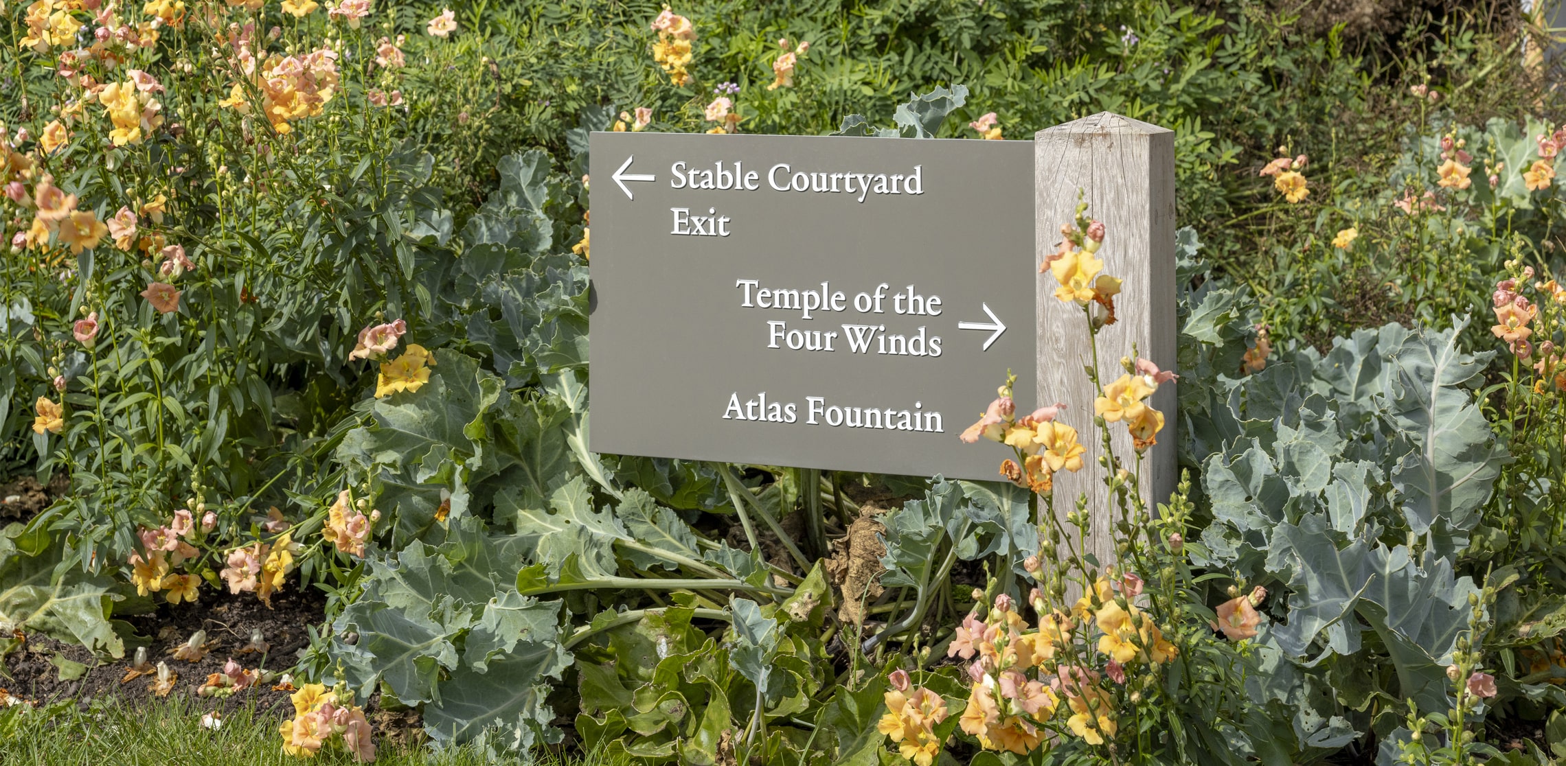
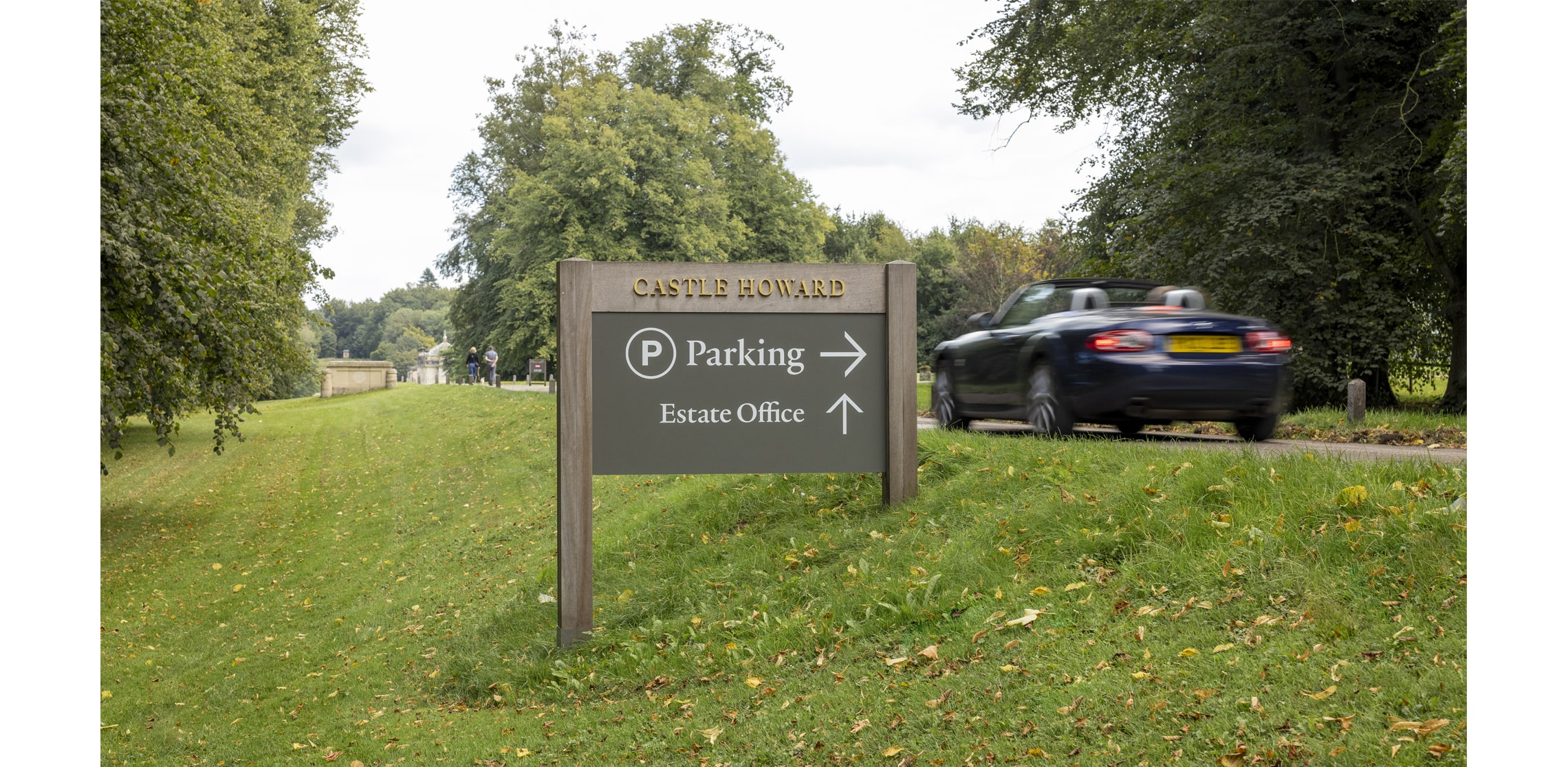
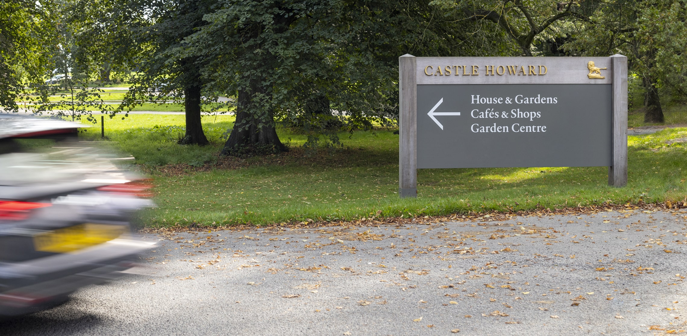
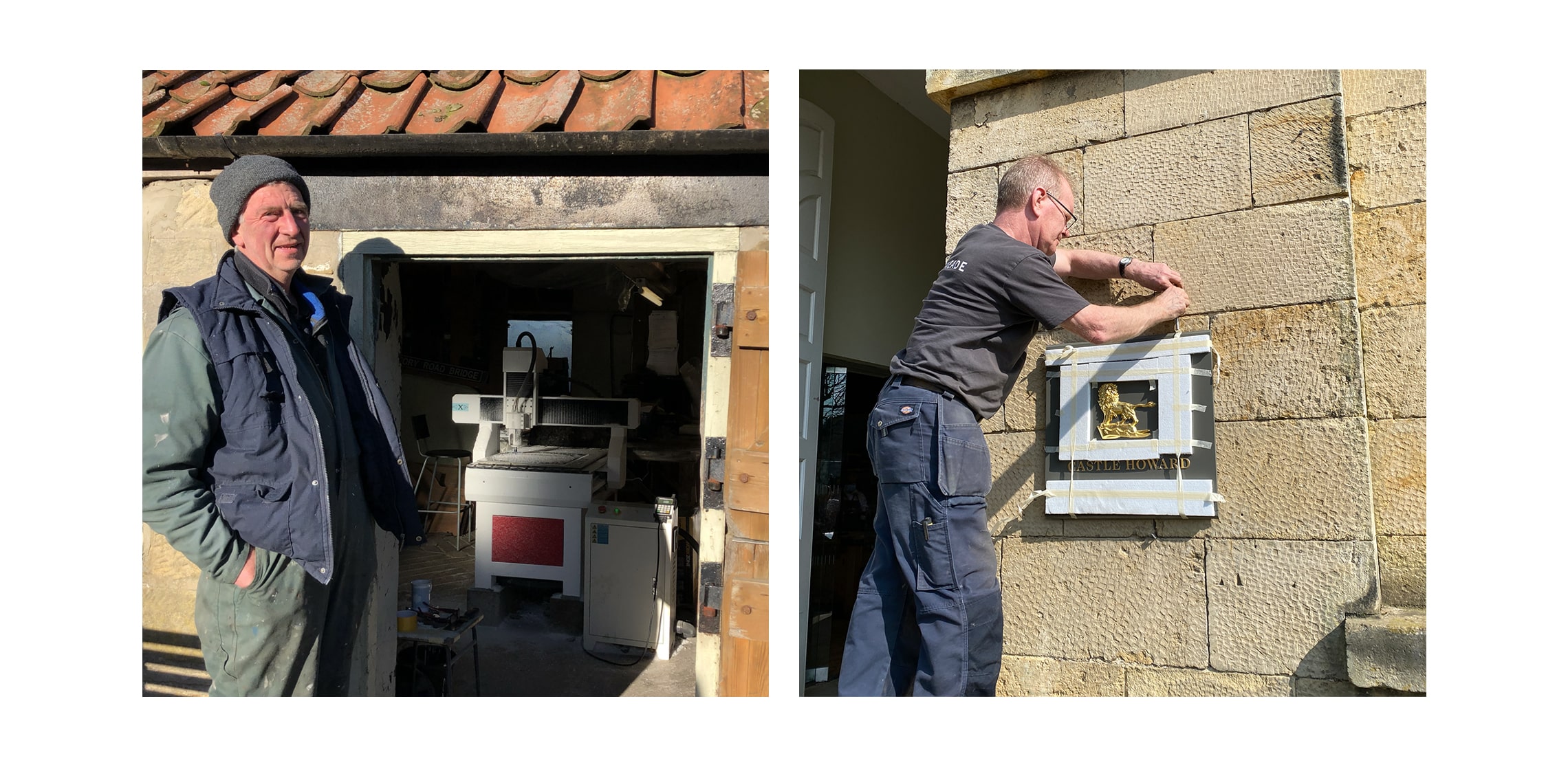
They needed to be agile. Easy to remove with minimal trace. Straightforward to reinstall. Robust enough to store safely through the closed months. Designed to be repaired, not replaced. Beautiful, yes – guided by Graphic Thought Facility’s brand refresh – but also practical in the most grounded, sleeves-rolled-up sense.
Projects like this don’t call for theatrics. They call for fluency. A deep understanding of materials, production specification and functional design – the quiet expertise that ensures something works just as elegantly in February storage as it does in July sunshine.
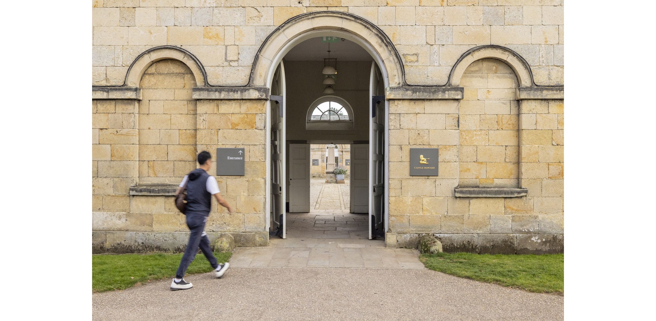
As ever, we began with character and history. Because no two journeys are the same – not for visitors navigating the house, and not for a building that shifts between spectacle and sanctuary each year. Any intervention had to feel considered, not imposed.
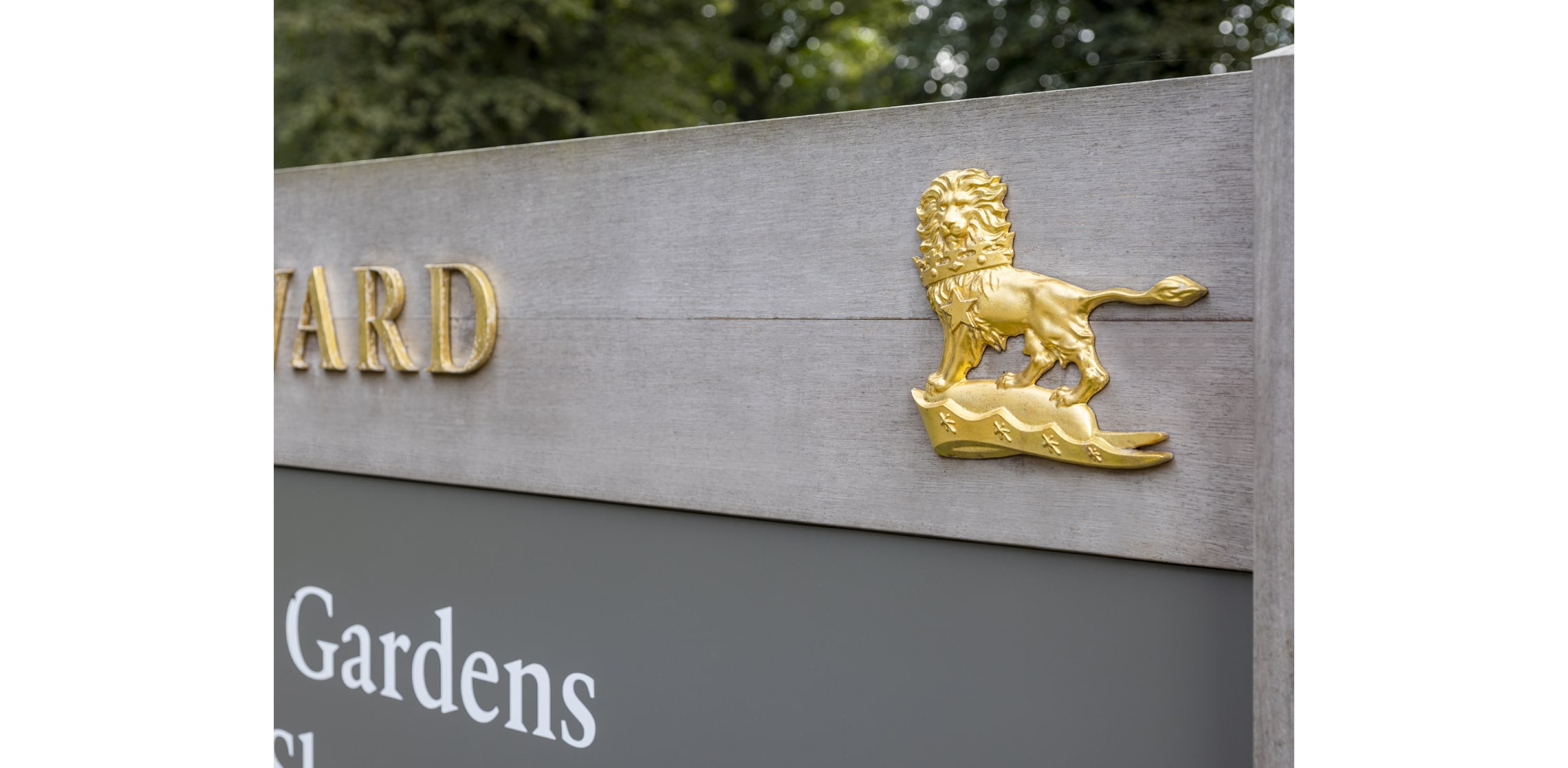
So, in Yorkshire, we sourced locally. Sandcast aluminium panels from Sneatonthorpe. Cast-iron features formed and crafted in Milton. Materials with weight and honesty. Things that feel as though they belong to the landscape rather than merely visiting it.
We had hoped to use local English oak from the estate – because what could be more fitting? But English oak, gloriously knotty and full of personality, isn’t always suited to precision detailing. Sometimes practicality quietly overrules romance. So we travelled a little further – to France – for oak that could deliver the clarity the design required.
Grand yet grounded.
Historic yet agile.
Public and private, held in timely balance.