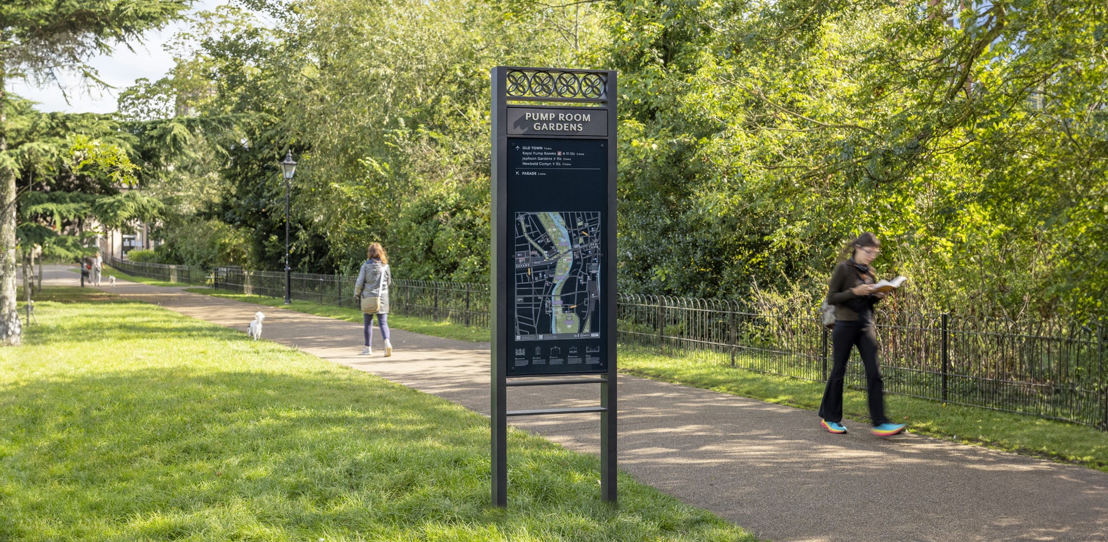
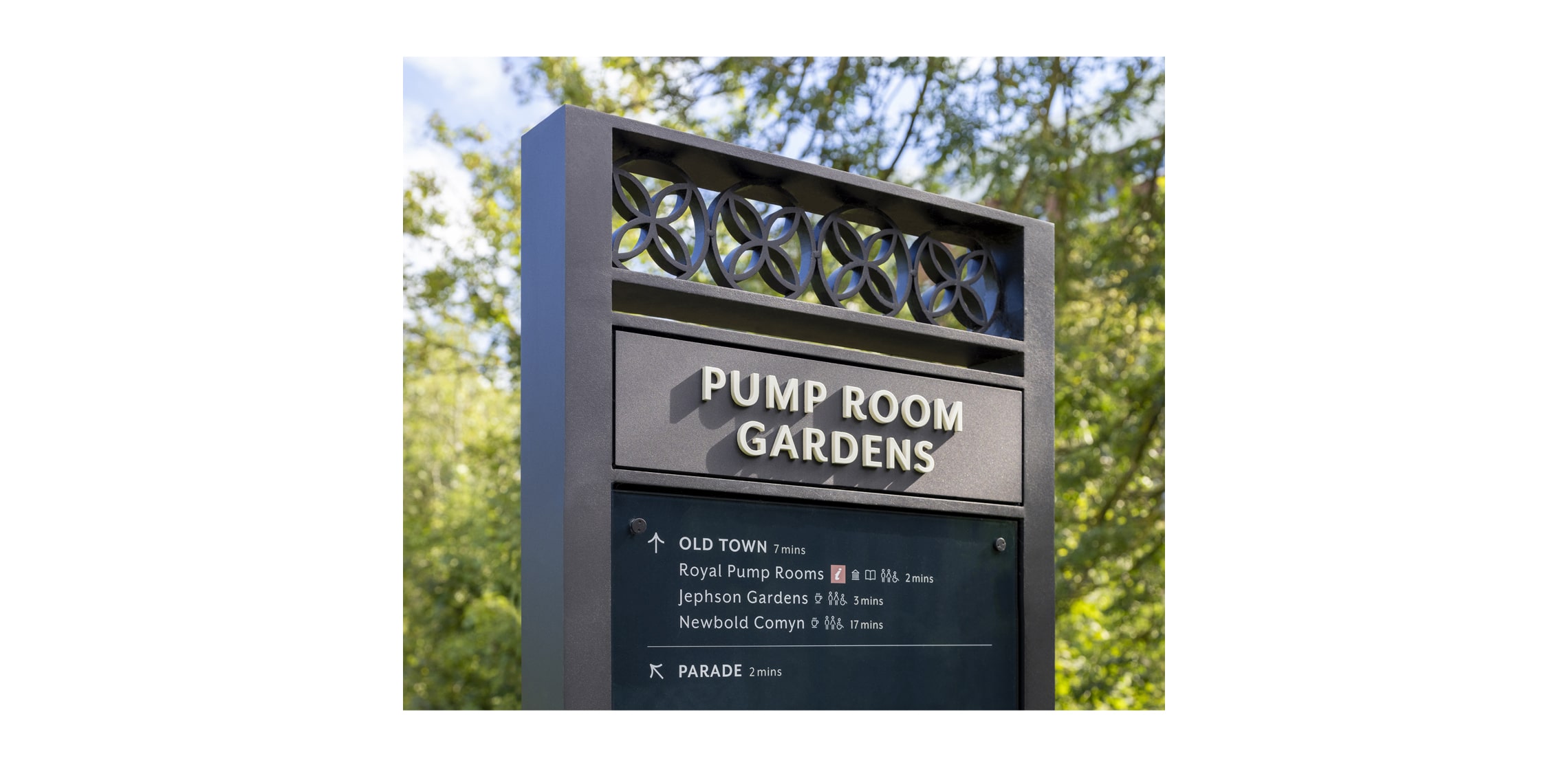
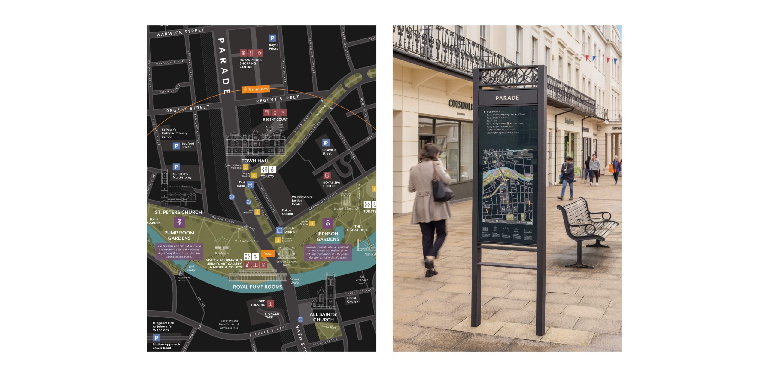
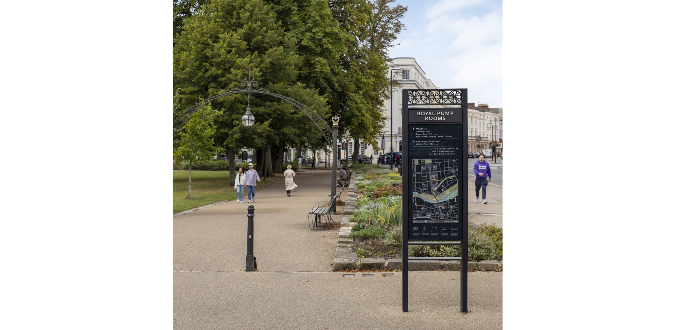
Warwick District Council asked us to create a new town centre wayfinding scheme for Royal Leamington Spa. The name gives away that the town was founded for wealthy health seekers and socialisers of the Regency era. This grand start gives Leamington Spa a legacy of fine architecture and promenading parks.
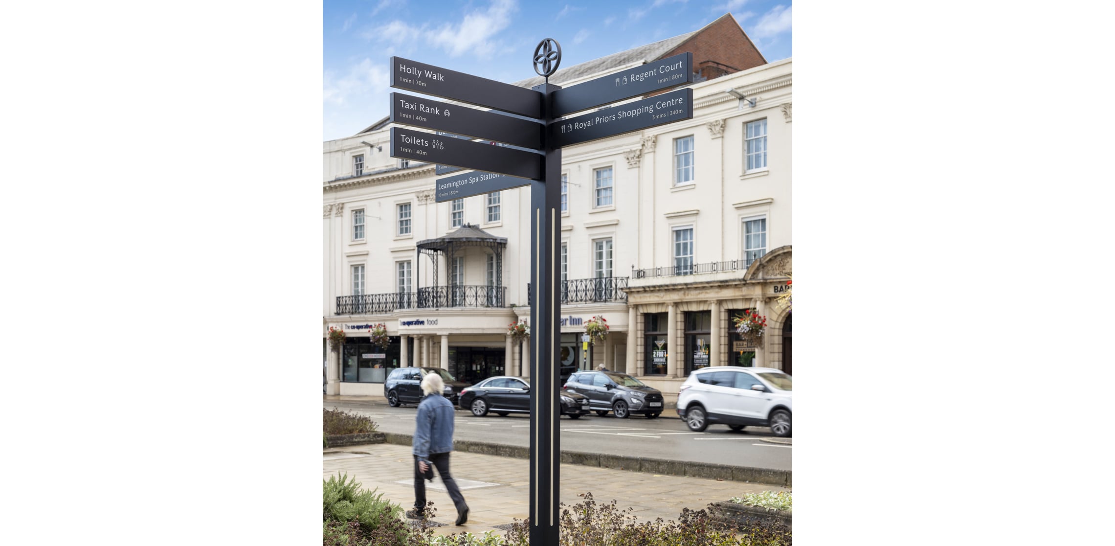
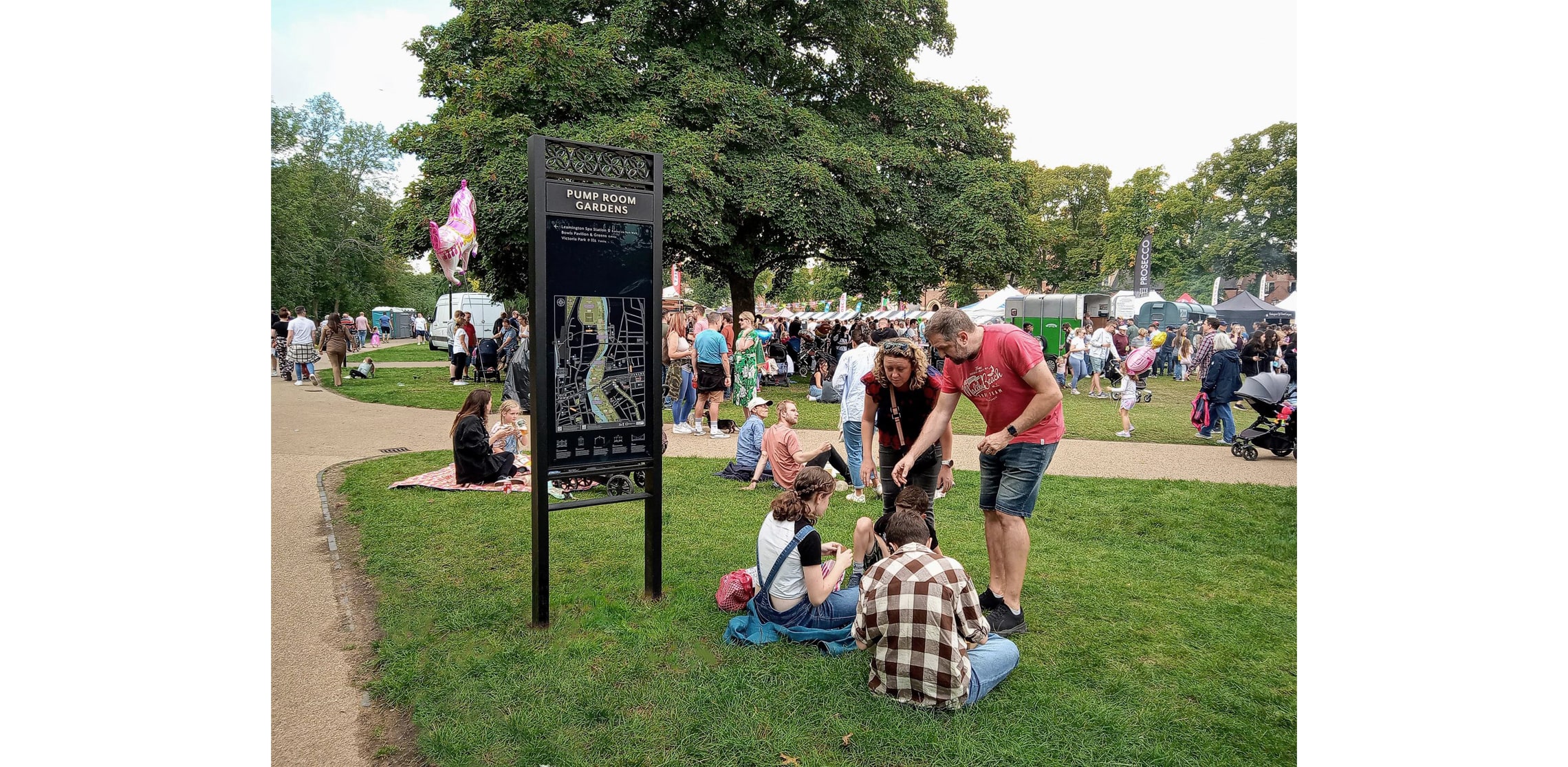
When the town was invited to host the 2022 Commonwealth Games Lawn Bowls and Para Lawn Bowls, the District Council’s attention focused on how to help first time visitors find their way smoothly through the town centre to the Victoria Park venue. The venue has a 3,300 capacity so additional footfall would be high. Existing direction and orientation messaging had grown up randomly and inconsistently and had that ‘anyplace’ generic feel. It wasn’t helpful and it didn’t do justice to the setting.
Analysis showed two key thoroughfares: the north south oriented ‘Parade’ shopping centre and the parks and gardens running east west along the River Leam.
We were asked to help visitors move easily through these areas and get to know about the town heritage along the way: the Royal Pump Rooms, Leamington Spa Art gallery (formerly a 19th-century bathhouse); ‘The Elephant Wash’ where once the circus animals bathed and the site where the first ever lawn tennis matches were staged.
It’s an active commercial and social community running events year round so our scheme covered interpretative information using QR codes linked to heritage trails and town events. Primary and secondary information nodes were identified along thoroughfares to help encourage visitor movement and connectivity between the north (Parade) and south (Old Town) areas whilst also highlighting key entry points, visitor destinations and places of interest.
Our key insight to bring the scheme together was to take inspiration from the Regency architecture particularly the iron balustrades. Ornate wrought-iron detailing on balconies and porches is central to Regency architecture. The typography lauds local historic architectural lettering and the colour palette fits seamlessly.
We were inspired and respectful of the Conservation Area status of much of the town and worked closely with the local conservation officers and the active local community. Aesthetics and function working together beautifully.