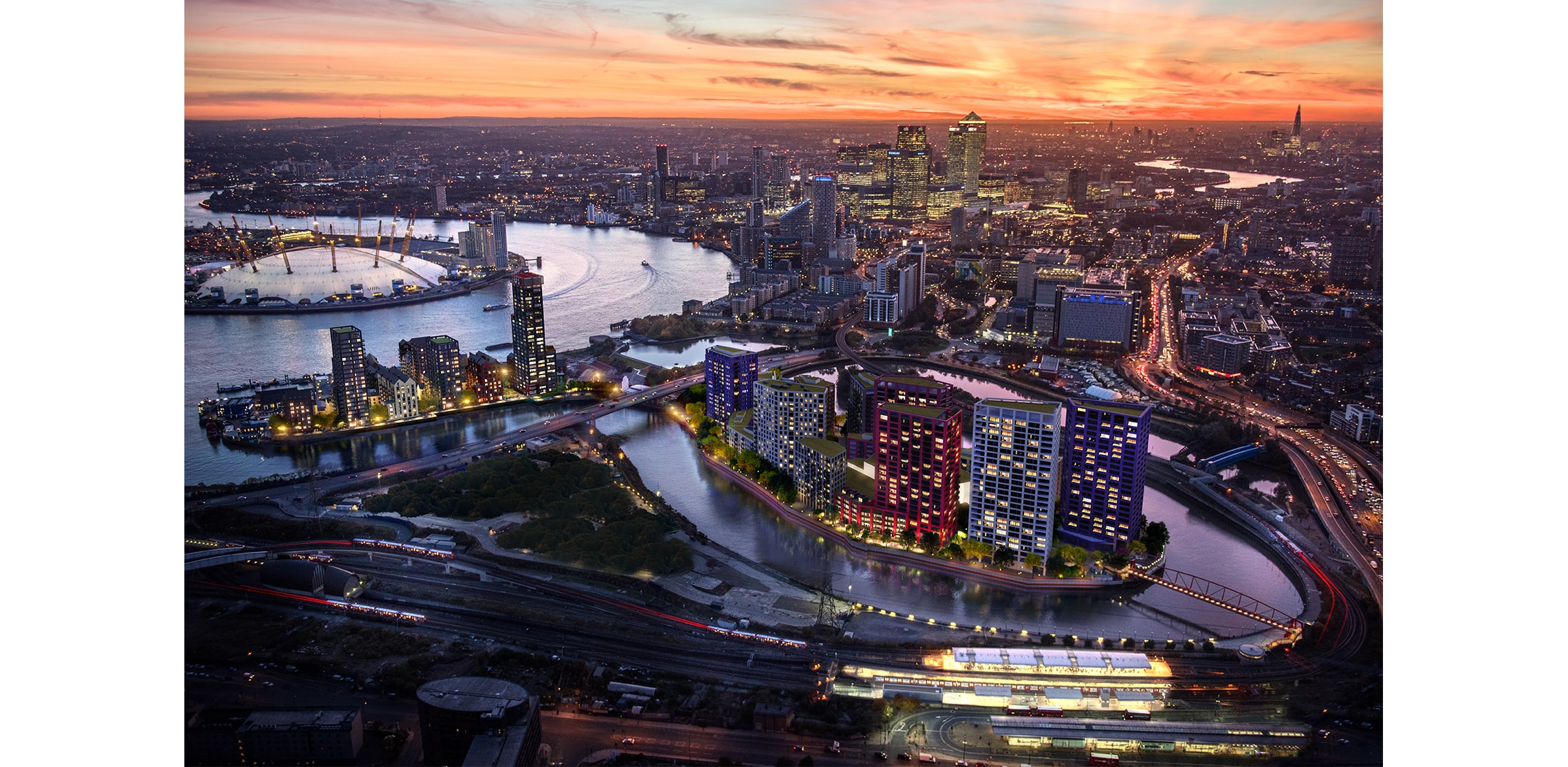


What we now call London Docklands is a story of reinvention measured over decades. After the devastation of the Second World War, the docks of East London were left in ruins, and as containerised shipping took hold, the smaller docks became obsolete. With them went 83,000 jobs and the sense of purpose that had defined the area.
Forty years on, the landscape is almost unrecognisable. Canary Wharf rises where warehouses once stood; London City Airport, the DLR, ExCeL, and a network of housing and public spaces have reshaped the area into something new. But even within that broader transformation, there are places that feel more concentrated, more intentional, where the story tightens rather than spreads.
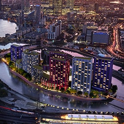
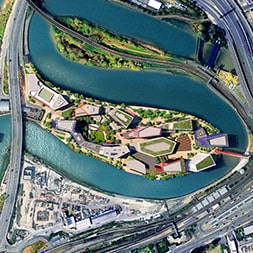
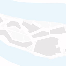
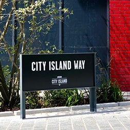
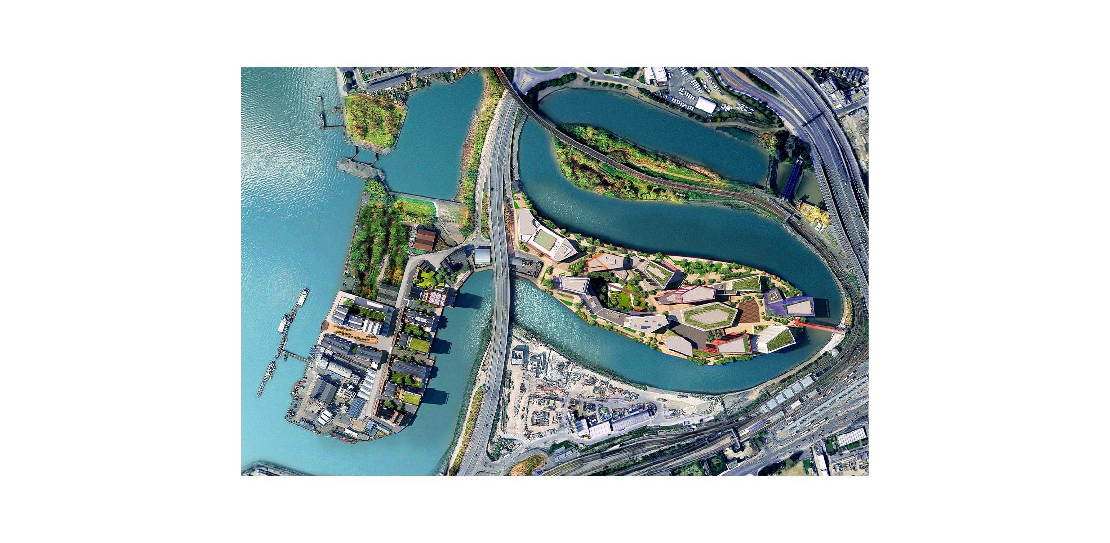
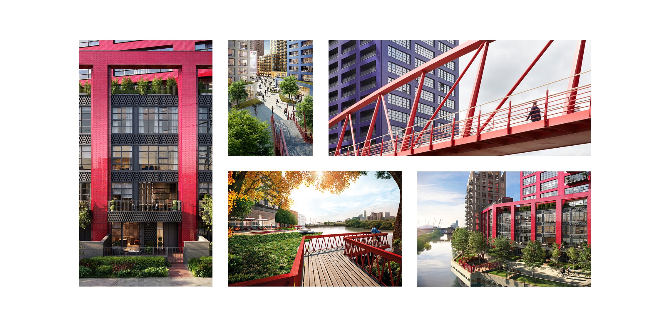
London City Island is one of those places. Small in scale, roughly the size of nine football pitches, but with the distinctiveness that comes from being an island. You cross onto it, and something shifts. movement slows slightly, attention sharpens. It is contained, but not constrained.
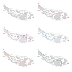
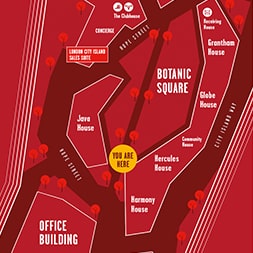
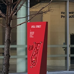
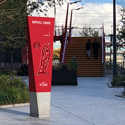
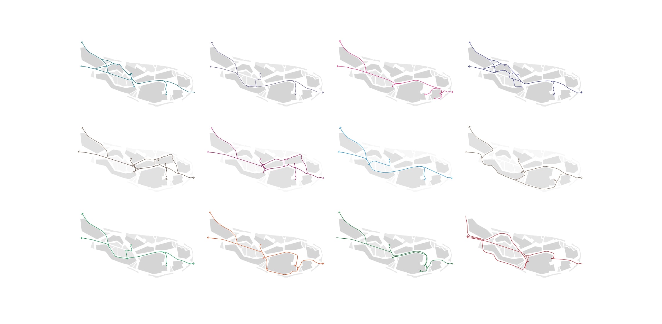
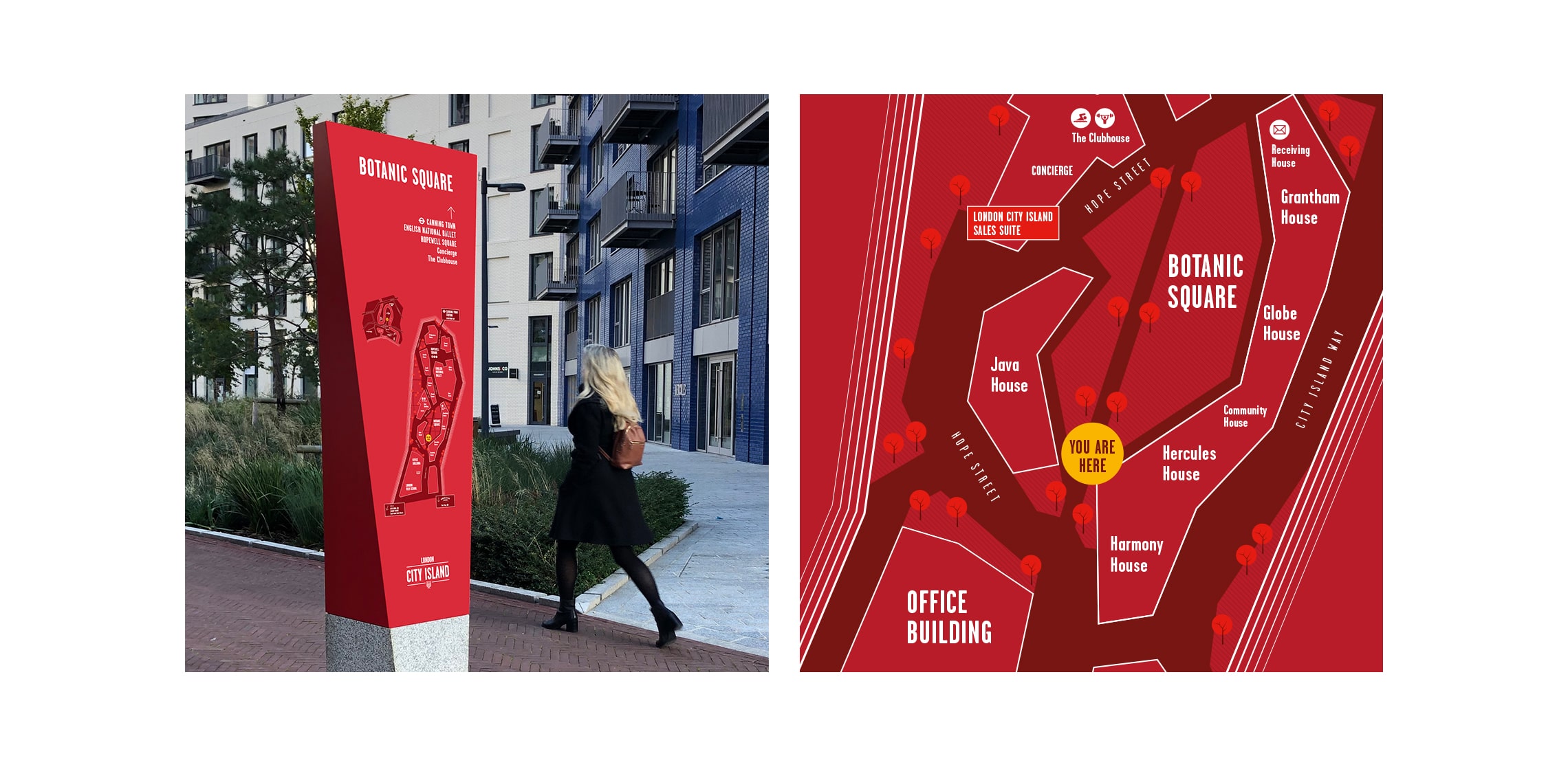
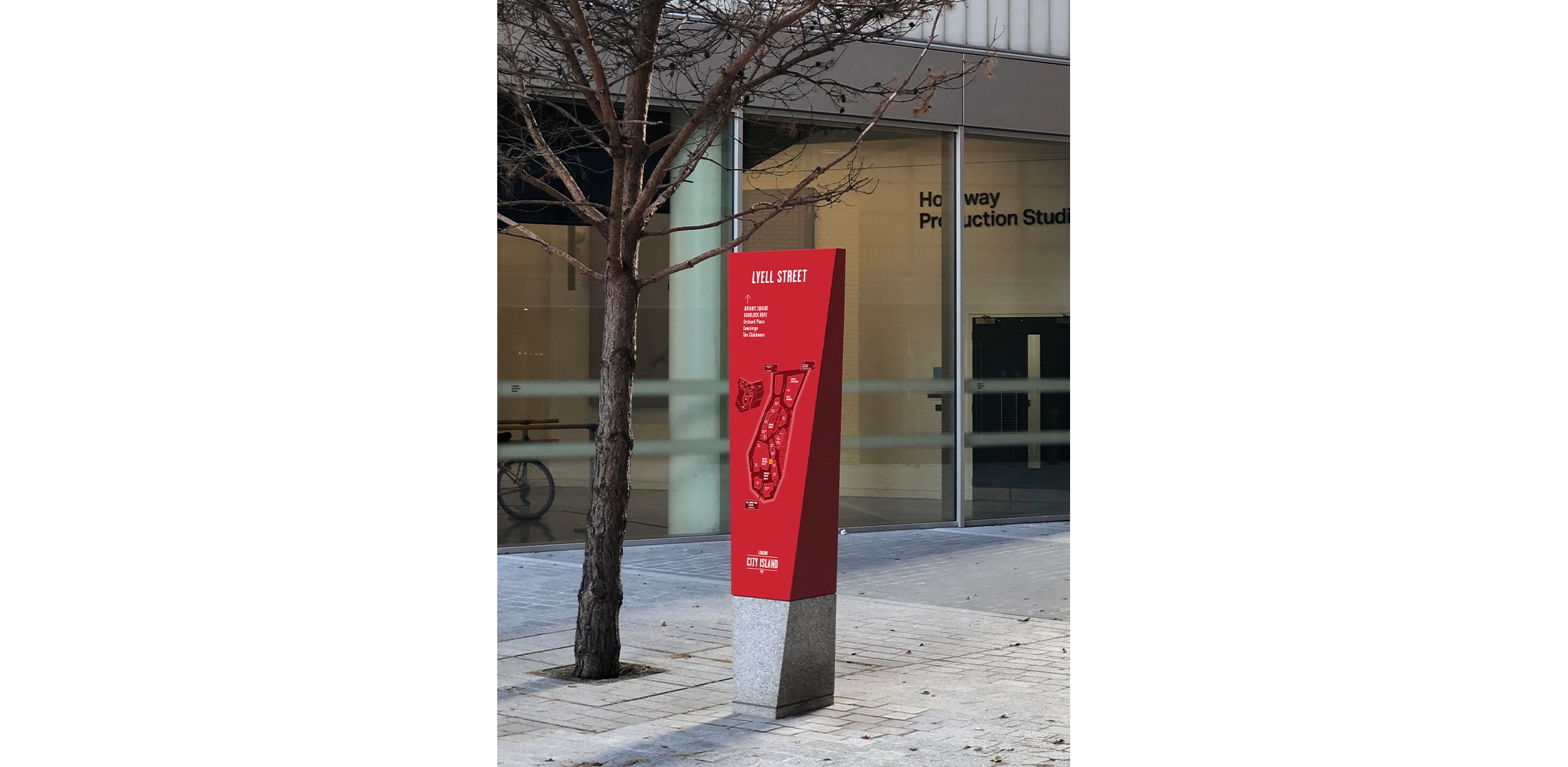
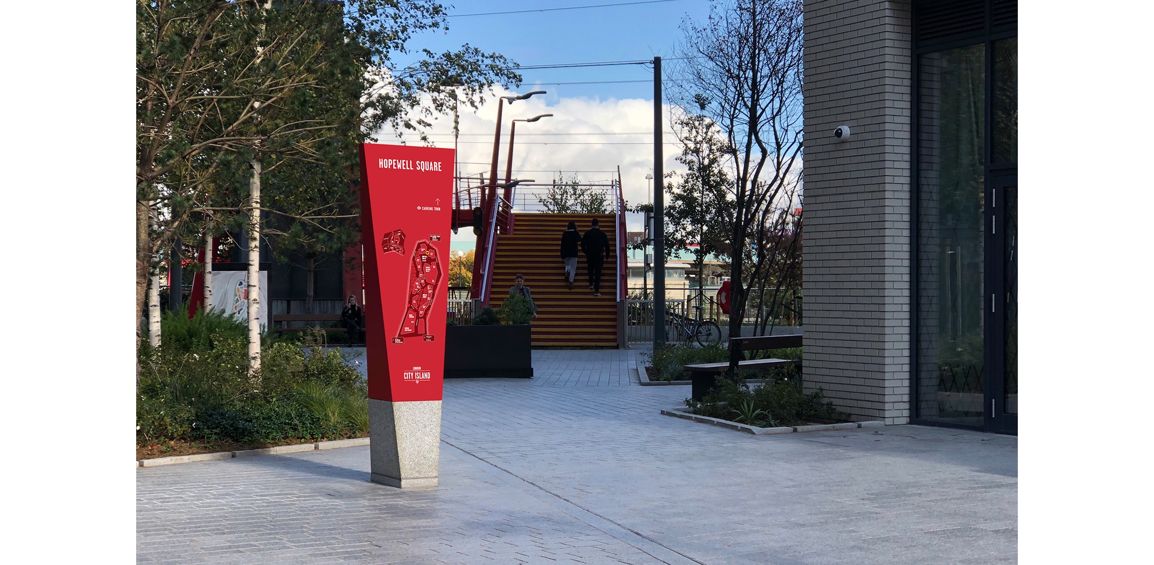
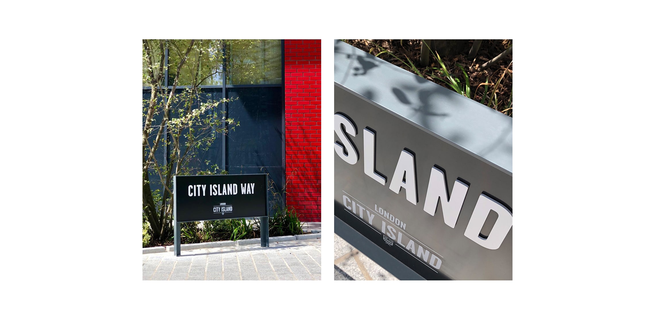
We were asked to extend Glen Howells Architects’ vision into the street signage – to support how people move through the island and how they understand it. The task centred on two things: maintaining a sense of calm, uninterrupted movement, and expressing a visual identity that is deeply rooted in the place itself.
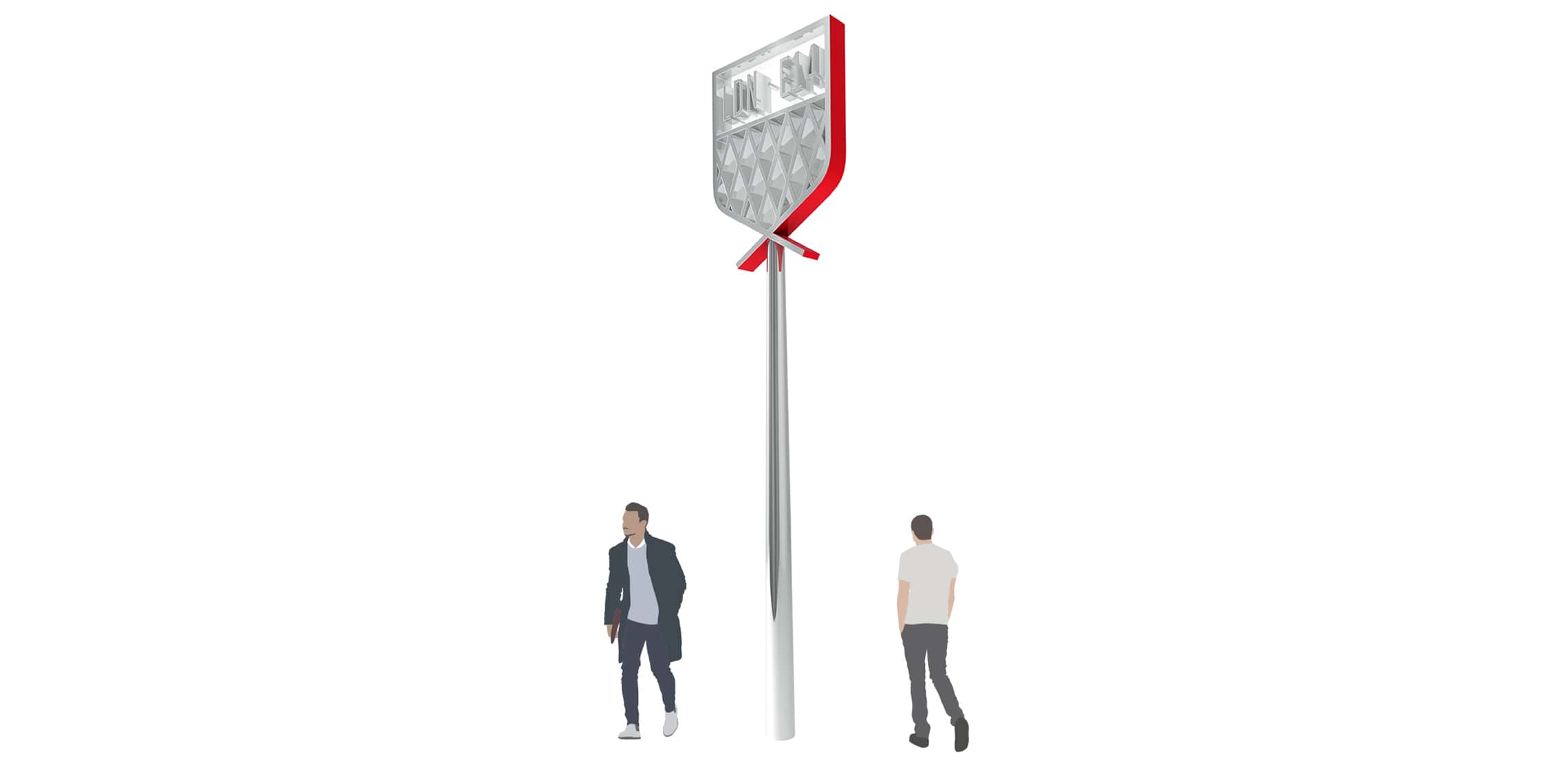
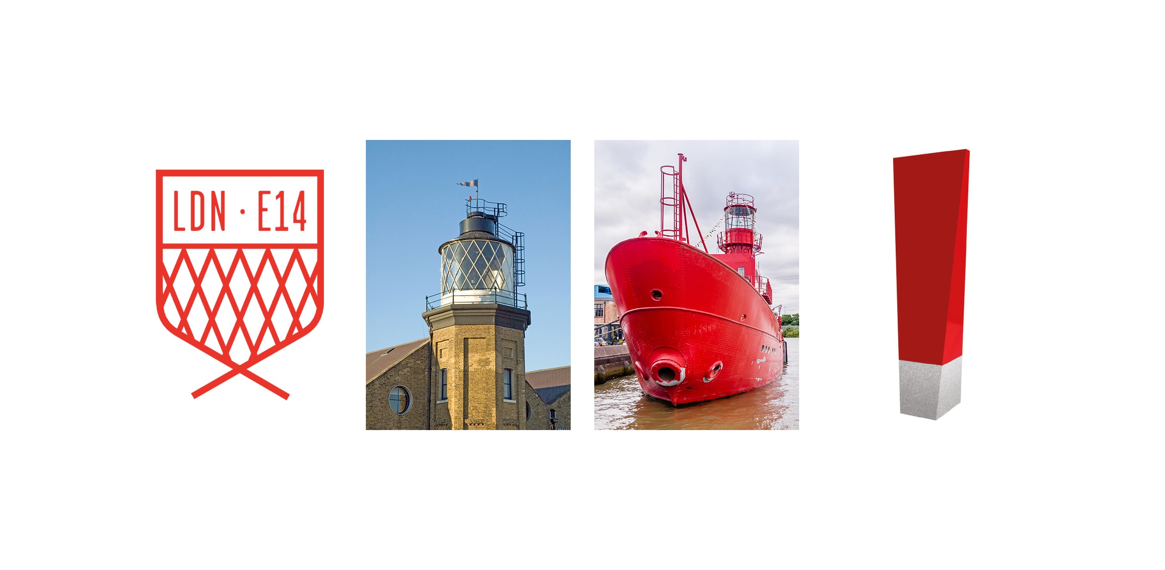
That identity is deceptively simple. A vivid red and a pattern of diamond forms drawn from the London City Island LDN–E14 mark. But both carry stories that unfold over time, rewarding a closer look.
The red is taken from the lightship moored nearby – one of the floating beacons that once guided vessels safely along the river, a lighthouse set adrift. The same red marks the bridge that brings you onto the island, and we carried it through the signage so that arrival, direction, and orientation all feel part of a single continuous experience.
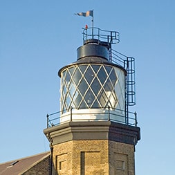
Then there is the lighthouse… unexpected, slightly surreal, and entirely real. Built not to warn ships, but to train lighthouse keepers and test ideas, it now stands as a quiet landmark at the heart of the island. The diamond pattern in the identity echoes the panes of glass in its lantern – it’s a detail that connects graphic language to physical form in a way that reveals itself gradually.
Today, that lighthouse houses The Longplayer Trust – an artwork that began playing on 31 December 1999 and is designed to continue without repetition until 31 December 2999. It is a piece measured not in minutes or hours, but in centuries. You can sit in the listening room and experience it directly, or tune in remotely, but either way it alters your sense of duration… stretching time, asking you to dwell. Perfectly in tune with our Time Agile Wayfinding™.
That idea sits comfortably at the centre of London City Island: it is now home to English National Ballet and the London Film School, and has become a place where creativity is both practised and lived. The signage plays its part quietly, helping people move with ease while giving them just enough to notice, to pause, and to understand where they are.
Not everything here demands attention immediately. Some things reveal themselves over time, which feels entirely in keeping with an island that is small in size, but expansive in what it offers.