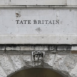
In collaboration with John Morgan Studio, our work with Tate Britain unfolded in two intertwined chapters: the careful refurbishment of the original Main Floor galleries, and the opening of Caruso St John’s rotunda at the Millbank Entrance. Together, these moves asked not simply how the building should look, but how it should be read – how visitors might orient themselves within a place where architecture, collection and time are inseparable.
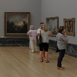
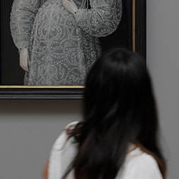
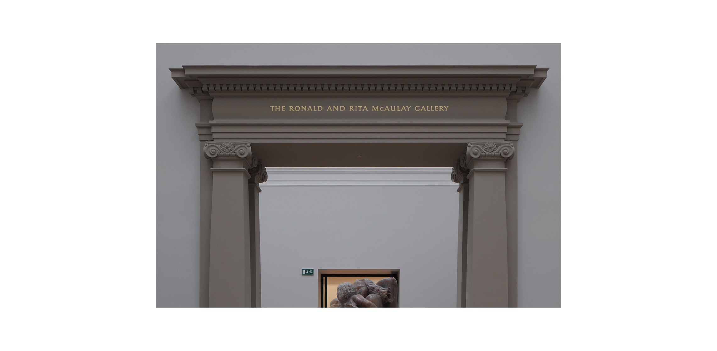
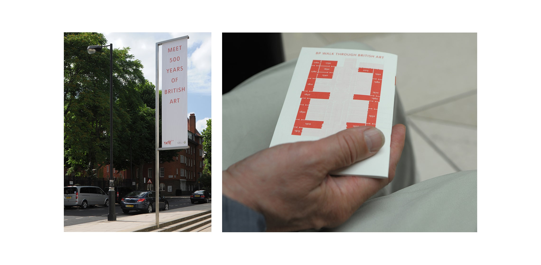
Tate Britain is the national home of British art from 1500, and the inaugural display within the renewed galleries (a chronological rehanging of the permanent collection) set the conceptual ground. As director Penelope Curtis described, “What seems historical fades into the modern and into the contemporary.” Our role was to support that continuum, shaping an experience where building and collection are encountered as a single unfolding walk through British art, rather than a sequence of discrete rooms.
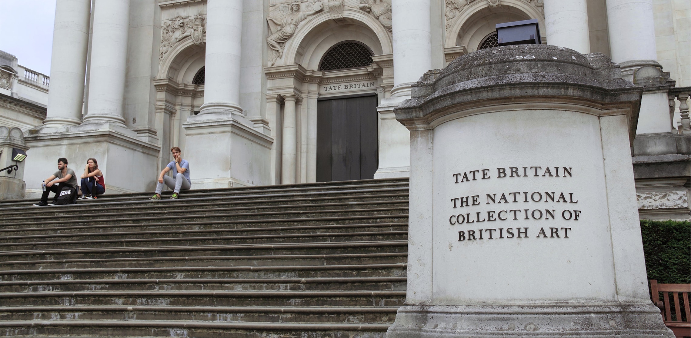
With 1.5 million visitors each year, the challenge was both poetic and practical: to help people find their way, while deepening their understanding of what this building is and has been.
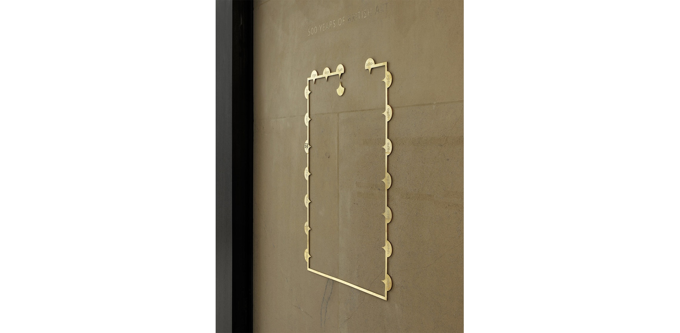
Our response was grounded in a time-based, agile wayfinding strategy – one that allows orientation to emerge progressively, through cues embedded in the fabric of the journey rather than imposed upon it. Wayfinding here is not a layer added on, but something discovered, reinforcing the sense of moving through time as much as through space.
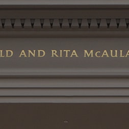
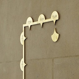
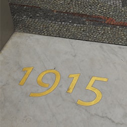
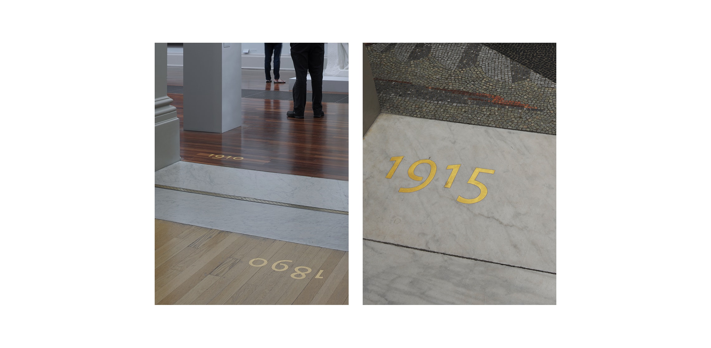
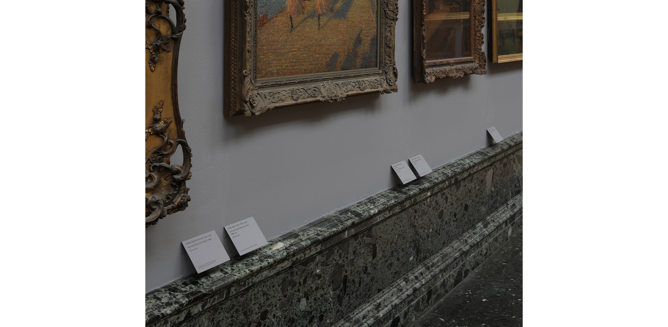
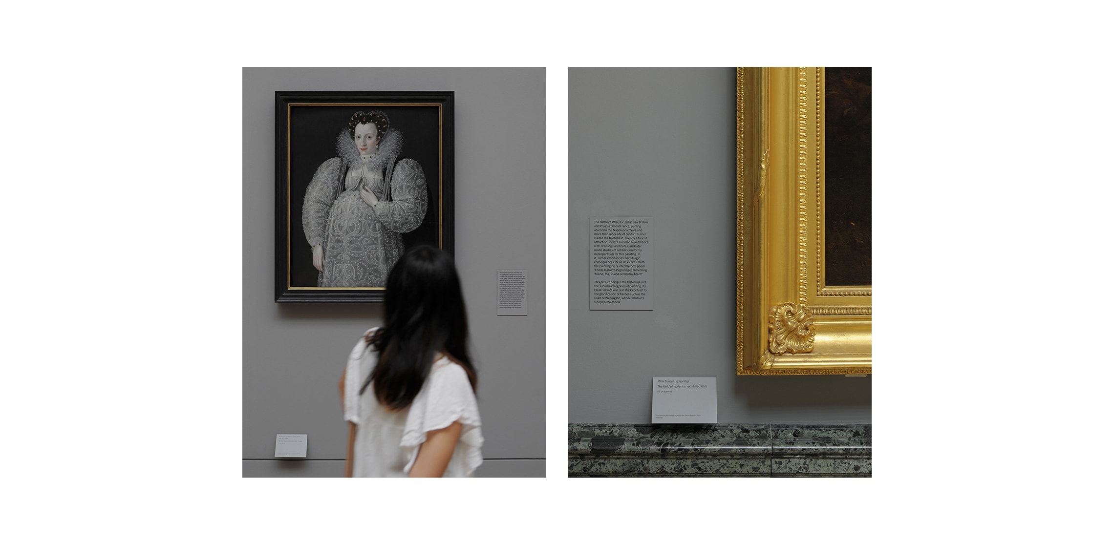
Hand-painted, lacquered, gold leaf numbers mark the thresholds between rooms, each one a moment on the timeline. Wall-mounted schematic guides situate the visitor within the broader chronology, quietly reinforcing progression without interrupting it. Crafted in brass, these elements echo the marble scallop geometries of the rotunda, creating a dialogue between new insertions and the architectural language of the building.
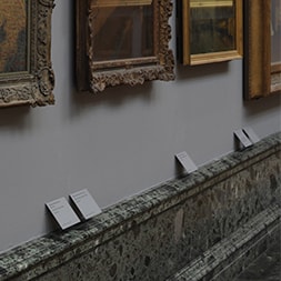
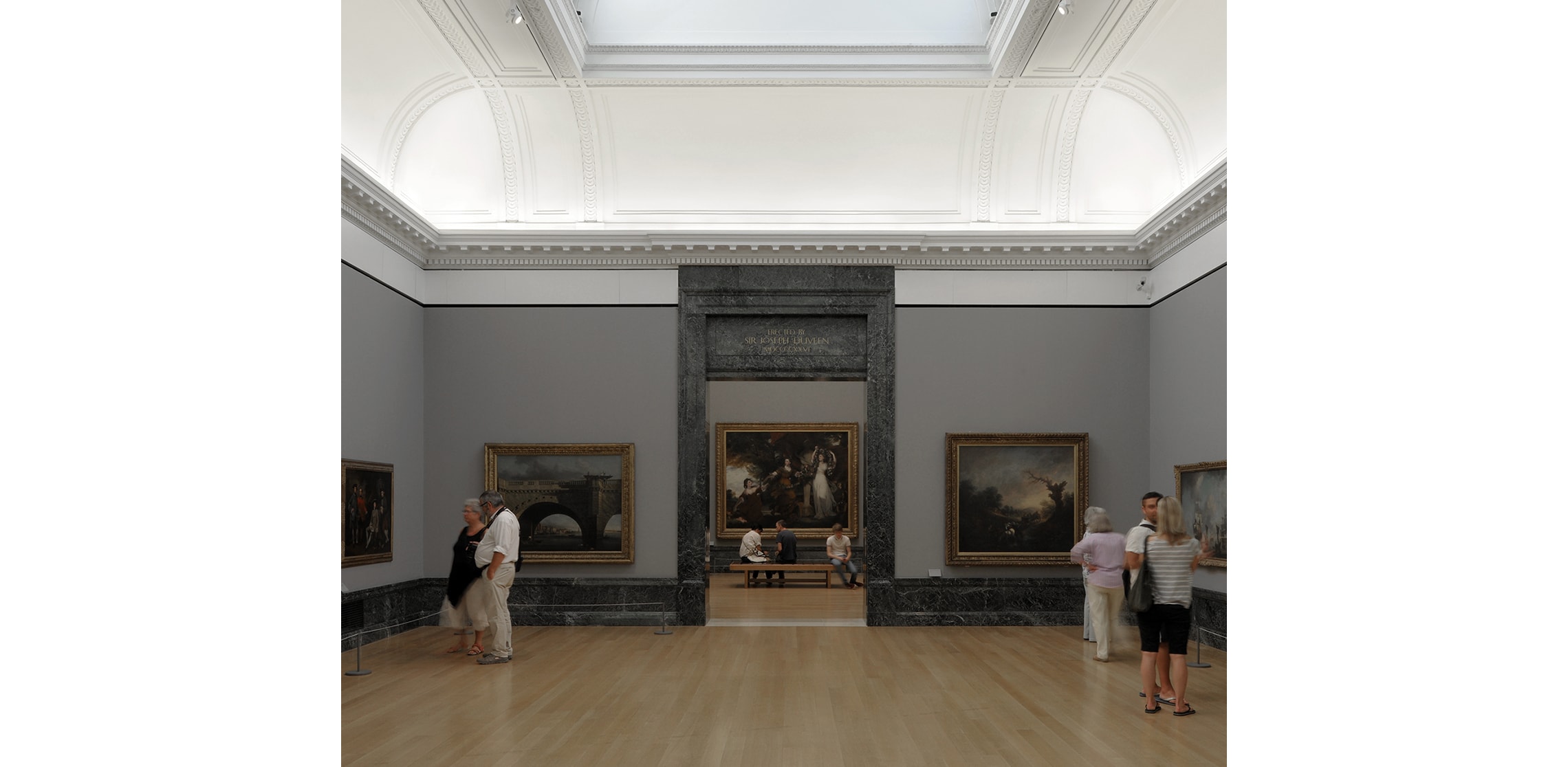
The gallery wall colours draw directly from Sidney Smith’s 1897 specification, grounding the experience in the building’s original intent. Against this, we developed a captioning system of angled, silkscreen-printed plates, colour-matched precisely to the walls so that information feels embedded rather than applied. Typography further supports orientation: one typeface for permanent elements, another for temporary exhibitions, an understated but clear distinction between what endures and what changes.
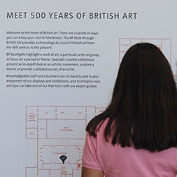
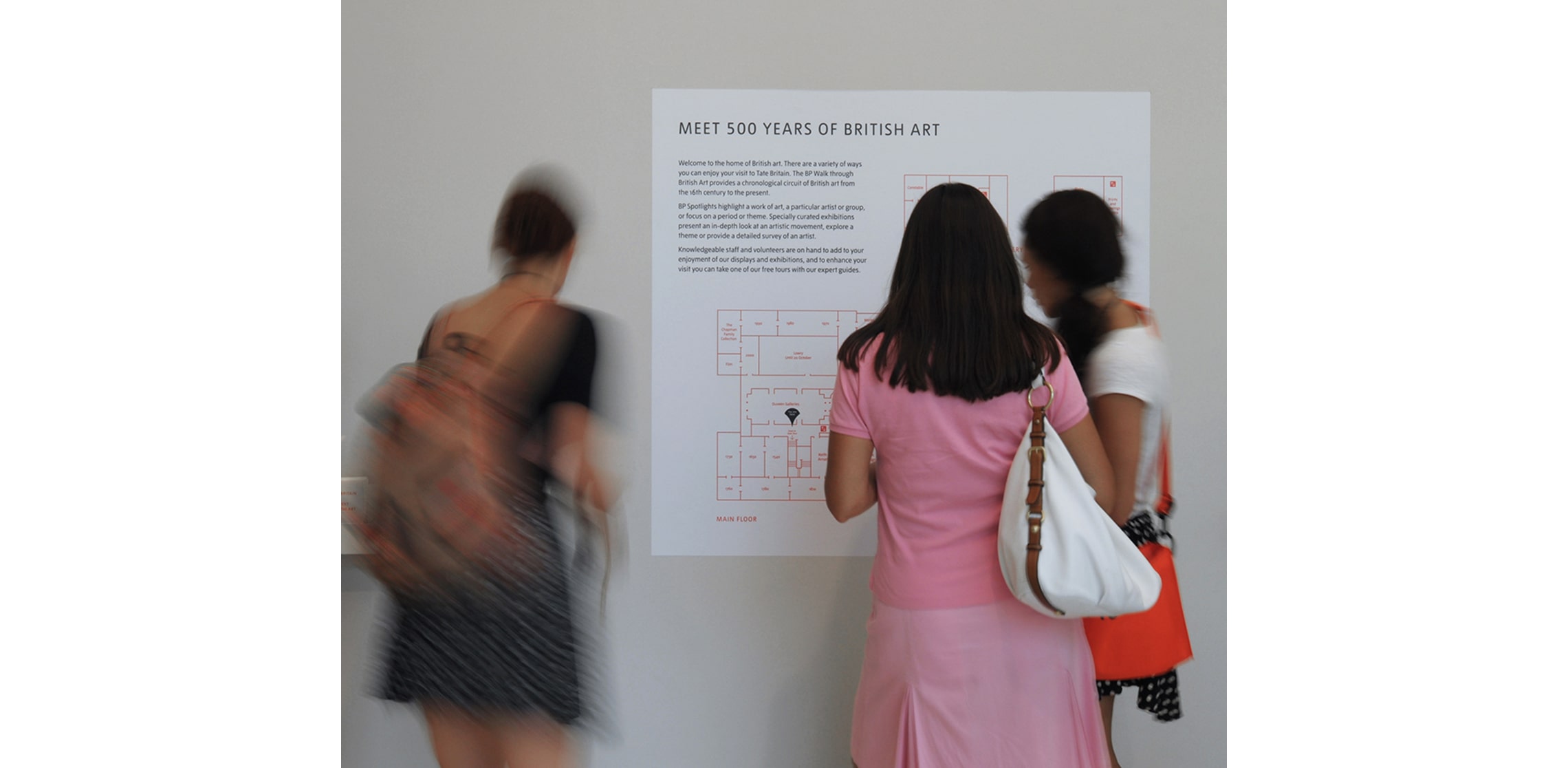
Across a building shaped by multiple eras – 1897, with significant additions in 1979, 1981 and the 2013 Millbank development – consistency could not come from uniformity. Instead, we introduced a family of graphic panels mounted on freestanding anodised aluminium frames: contemporary in expression, yet calibrated to sit comfortably within the historic fabric. They speak Tate, fluently and without friction.
The project as a whole is an exploration of old and new – not in contrast, but in continuity – working towards a quality of timelessness. Every decision is rooted in place: informed by the building’s materiality, its history, its rhythms of use. Function and meaning are inseparable and the choices feel intuitively right.
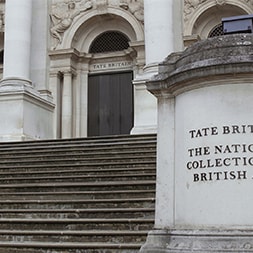
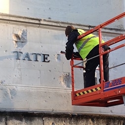
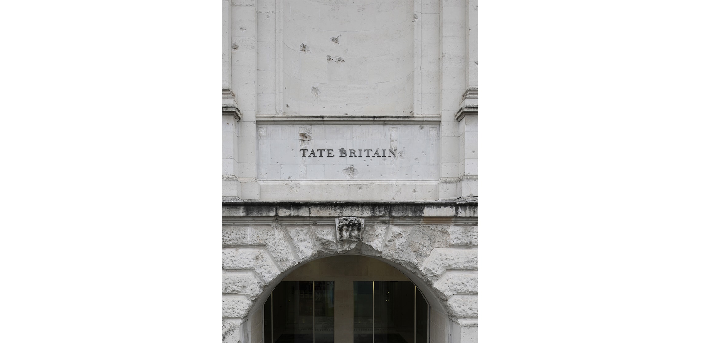
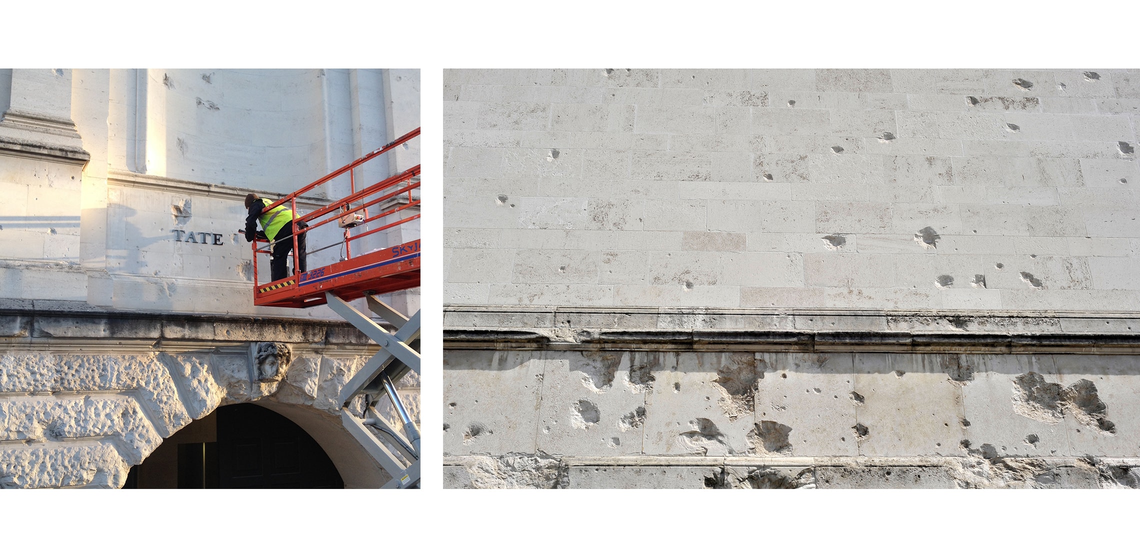
Perhaps nowhere is this more evident than at the Millbank Entrance where we uncovered shrapnel scars hidden behind the original signage. Rather than conceal them, we chose to reveal them, allowing the building to tell its own history of rupture and resilience. It is a quiet but powerful moment within the journey: a reminder that wayfinding here is not only about navigation, but about understanding where you are in time, as well as in space.