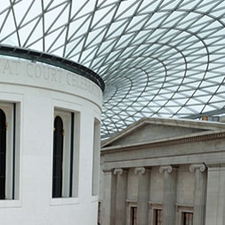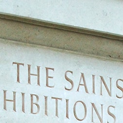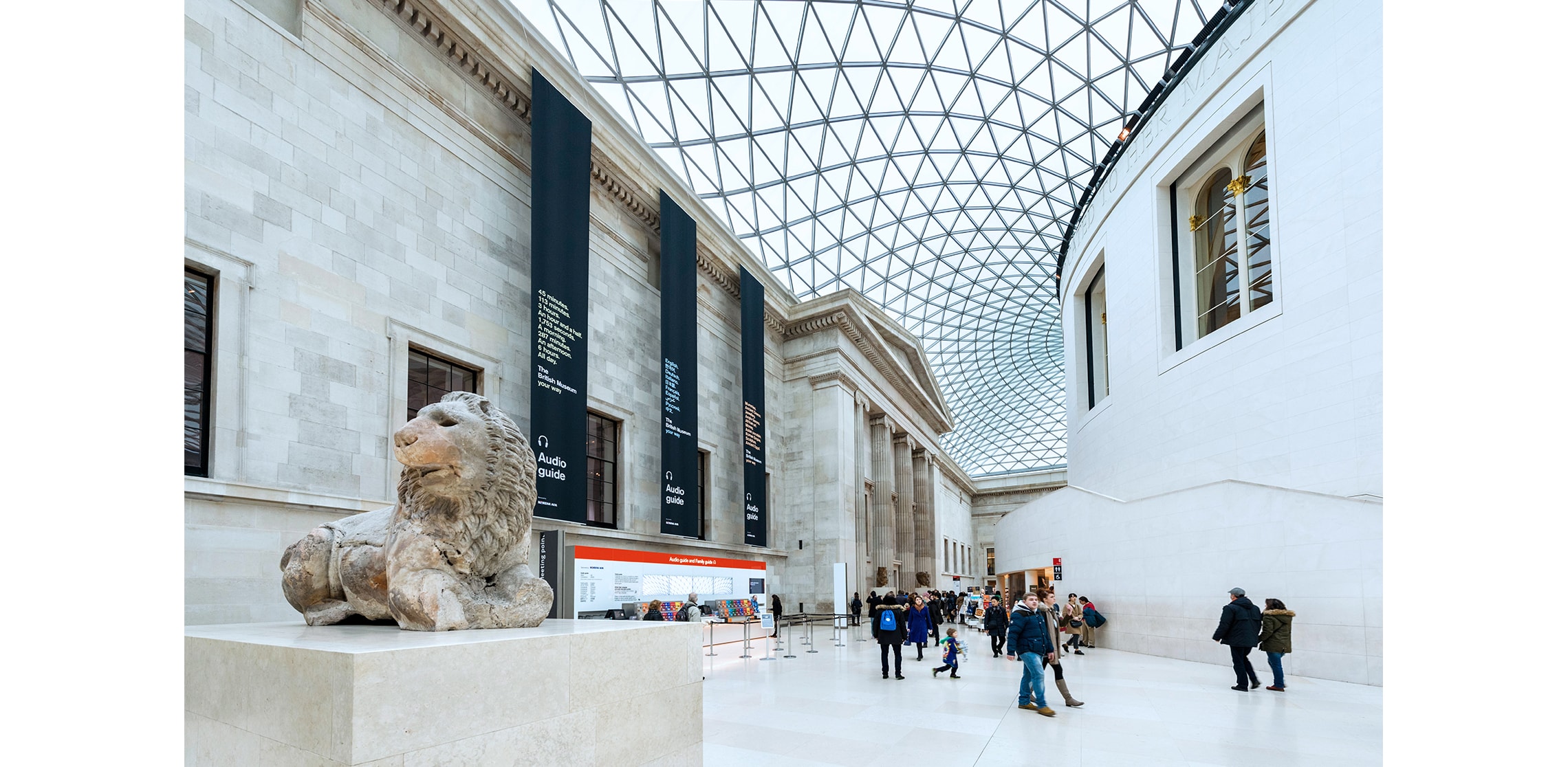
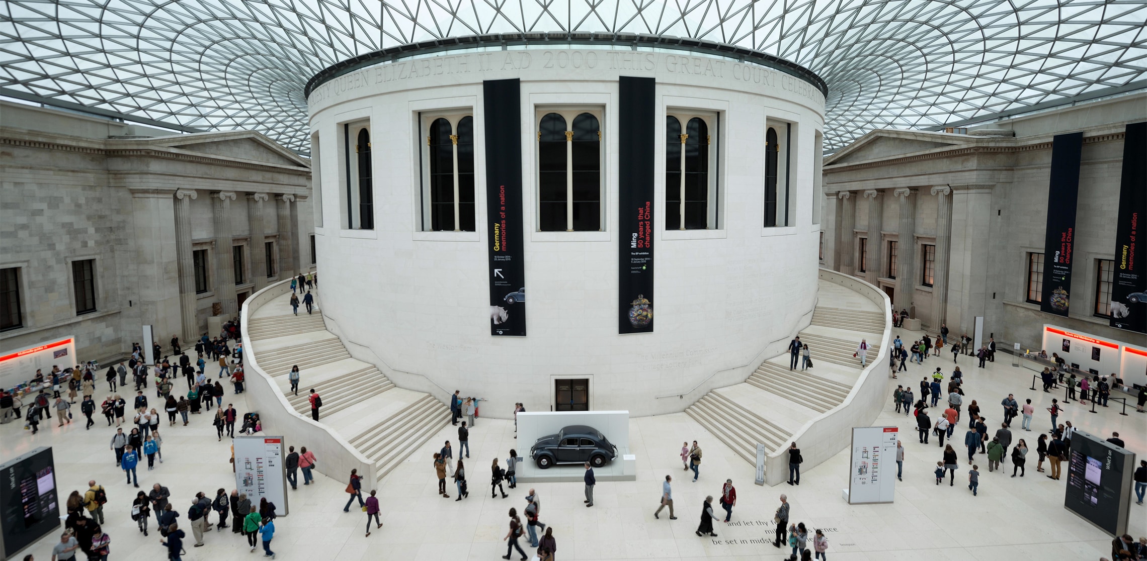
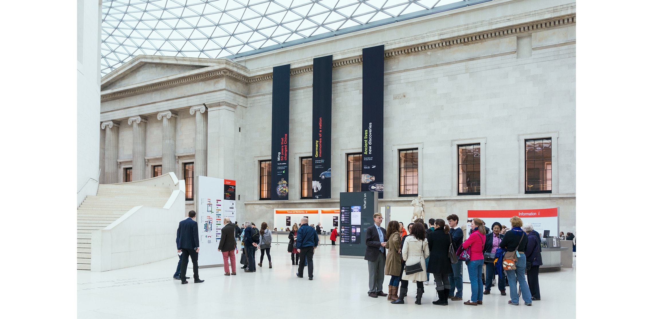
In 2000, Foster + Partners did something rather audacious at the British Museum. They took what had been a courtyard garden, quietly containing the celebrated rotunda of the old British Library Reading Room, and enclosed it beneath a vast, shimmering glazed canopy engineered by BuroHappold.
The result? The largest covered square in Europe. Which sounds triumphant, and is, but also slightly terrifying.
Before the Great Court existed, the Museum’s linear plan meant visitors had to retrace their steps to move between galleries – an architectural version of “Oh. Back we go, then.” The new space solved that, transforming circulation into something fluid and generous; a central civic room, a place to gather, orientate, ascend, descend, decide.
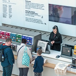
Jonathan Glancey wrote in The Guardian that it would become one of the most popular, and certainly busiest, meeting places in London outside Waterloo and Victoria stations. He was absolutely right – over six million people a year now pass through the British Museum. Most of them enter via the Great Court. And inside this immense, luminous space sit information points, a bookshop, a café, stairs rising and falling towards restaurants, learning spaces and temporary exhibitions.
It is breathtaking and when something is breathtaking, humans do what humans do: they stop, they stare, they hesitate. Which becomes a problem when six million of you are doing it!
The scale of the Court can accommodate vast numbers but not if everyone clogs the main entrance portico while trying to work out where to go. That was the issue we were asked to address.
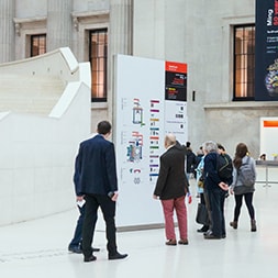
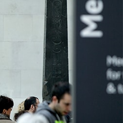
What we observed was simple: too much information, too many signs (or “stele,” as they were known). Nineteen of them, layered with messaging. Some positioned at heights that disappeared entirely once a crowd formed.
Visitors would enter this unexpectedly massive, startlingly beautiful space and pause to decode it. And that pause, multiplied by thousands, created lag.
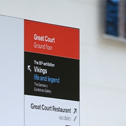
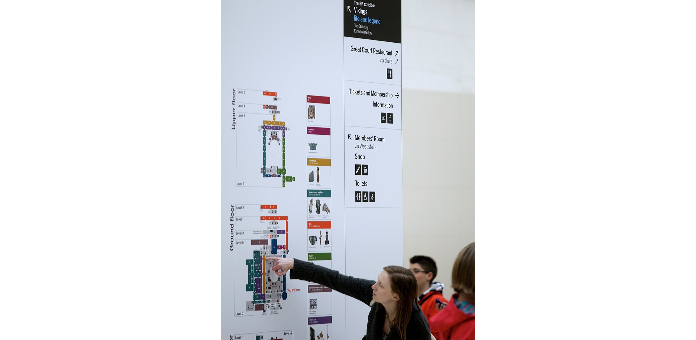
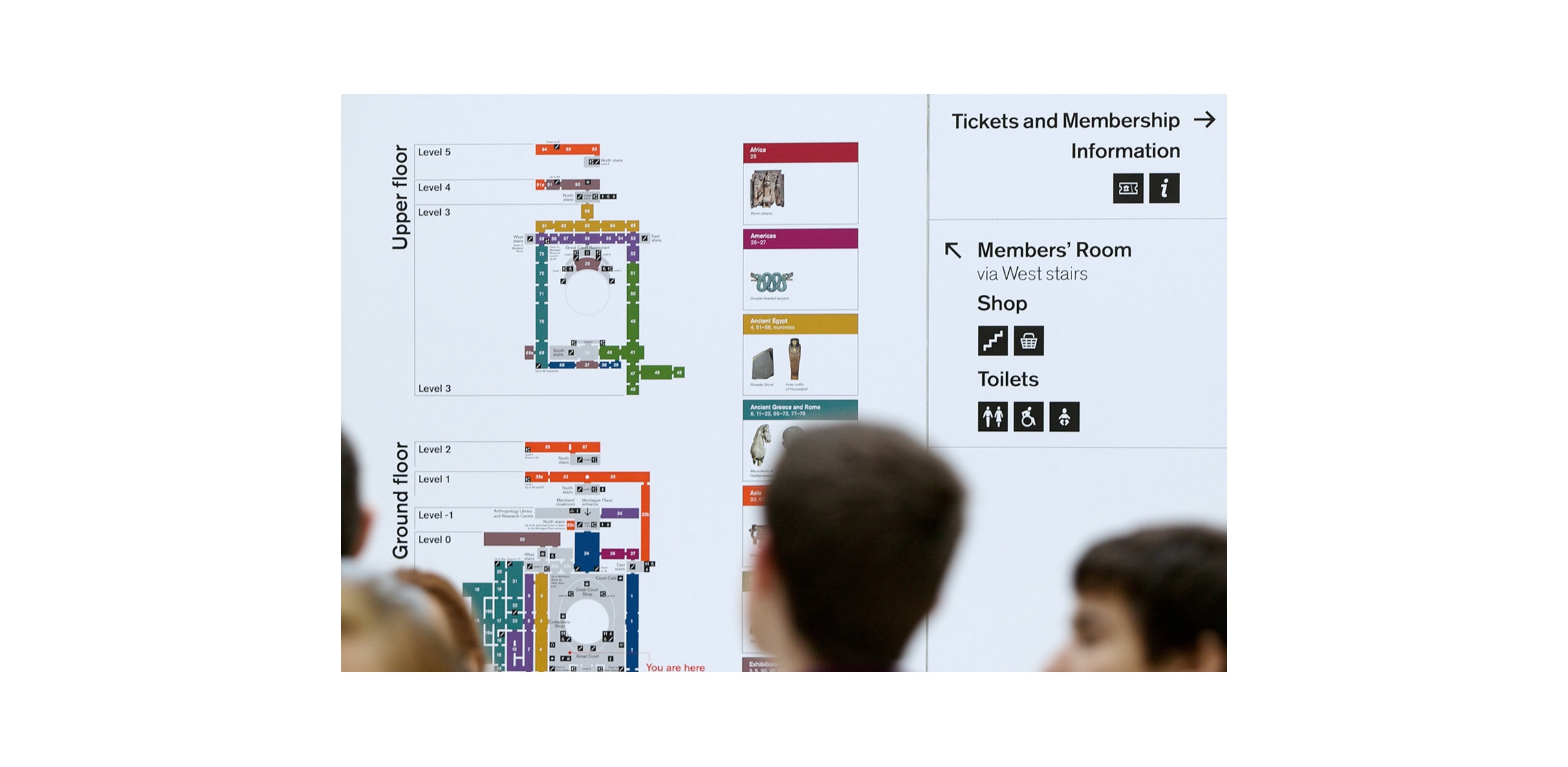
So our first move was decisive: separate wayfinding from promotion. The Museum’s directional information needed clarity, exhibition messaging needed presence. They did not need to compete on the same surface.
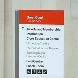
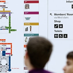
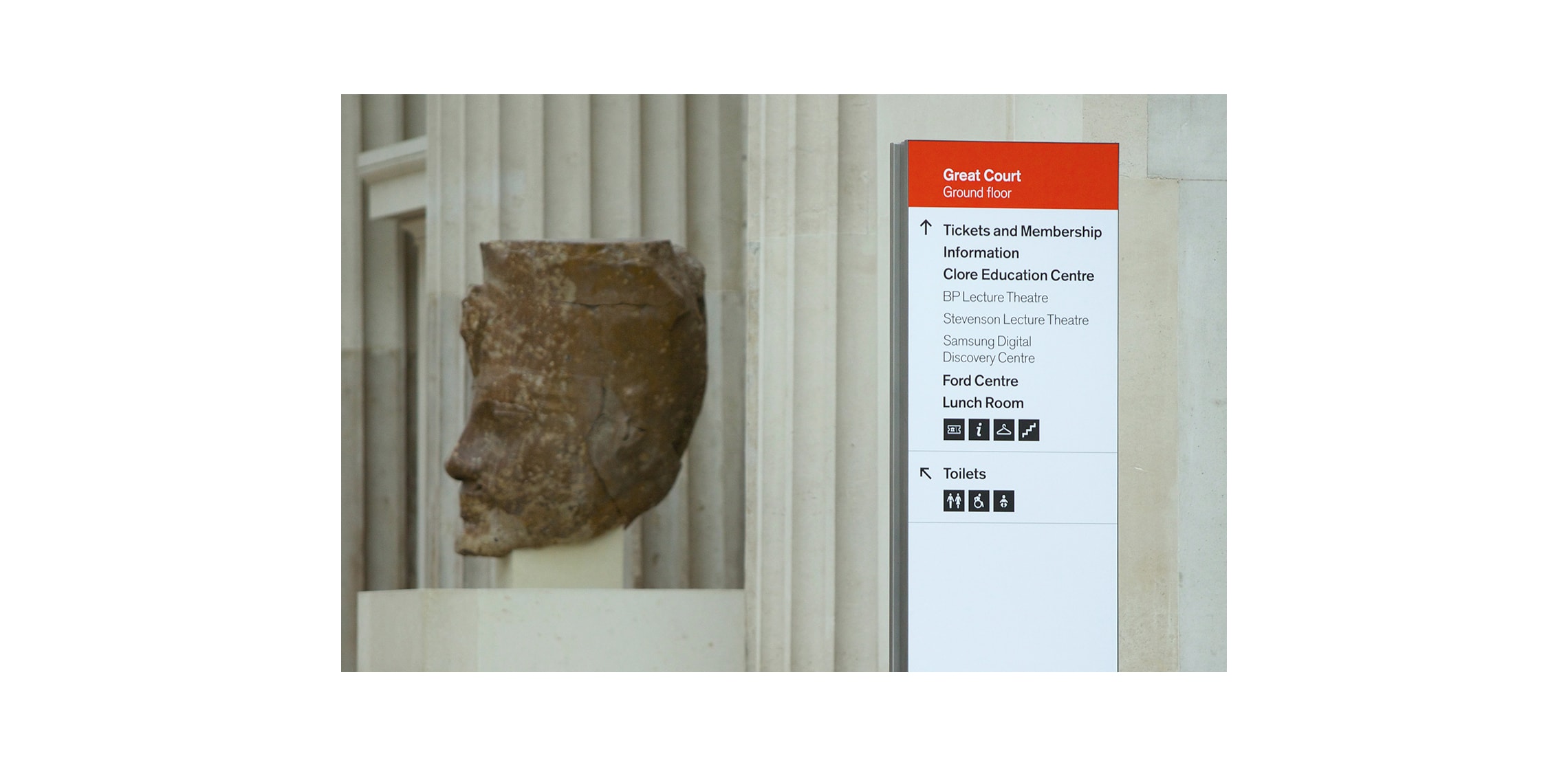
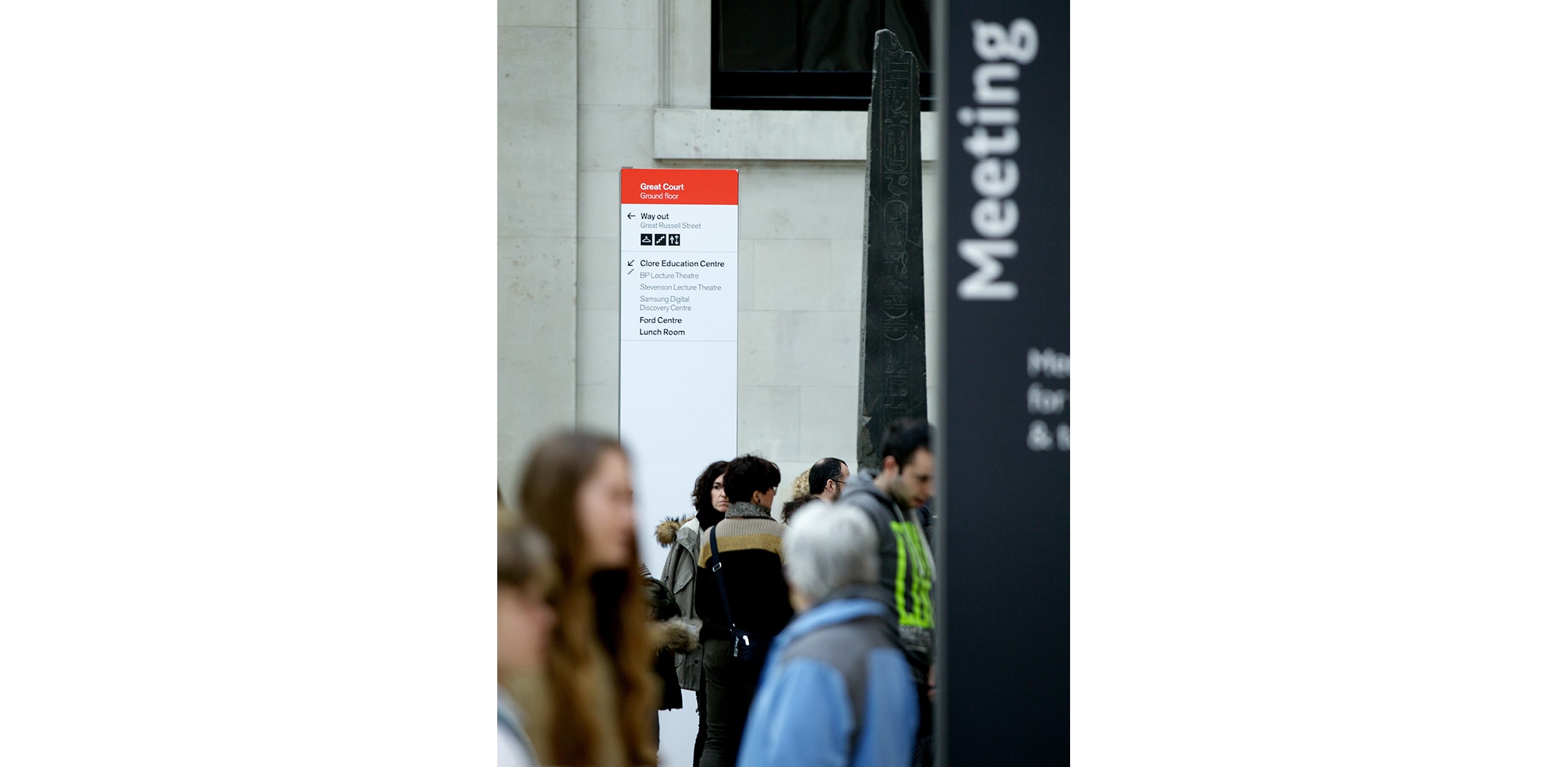
By dividing the two, we were able to reduce the number of wayfinding stele from nineteen to ten. Immediately, the visual noise softened and the mental load eased with the wayfinding information elevated above head height – visible across crowds, readable at distance.
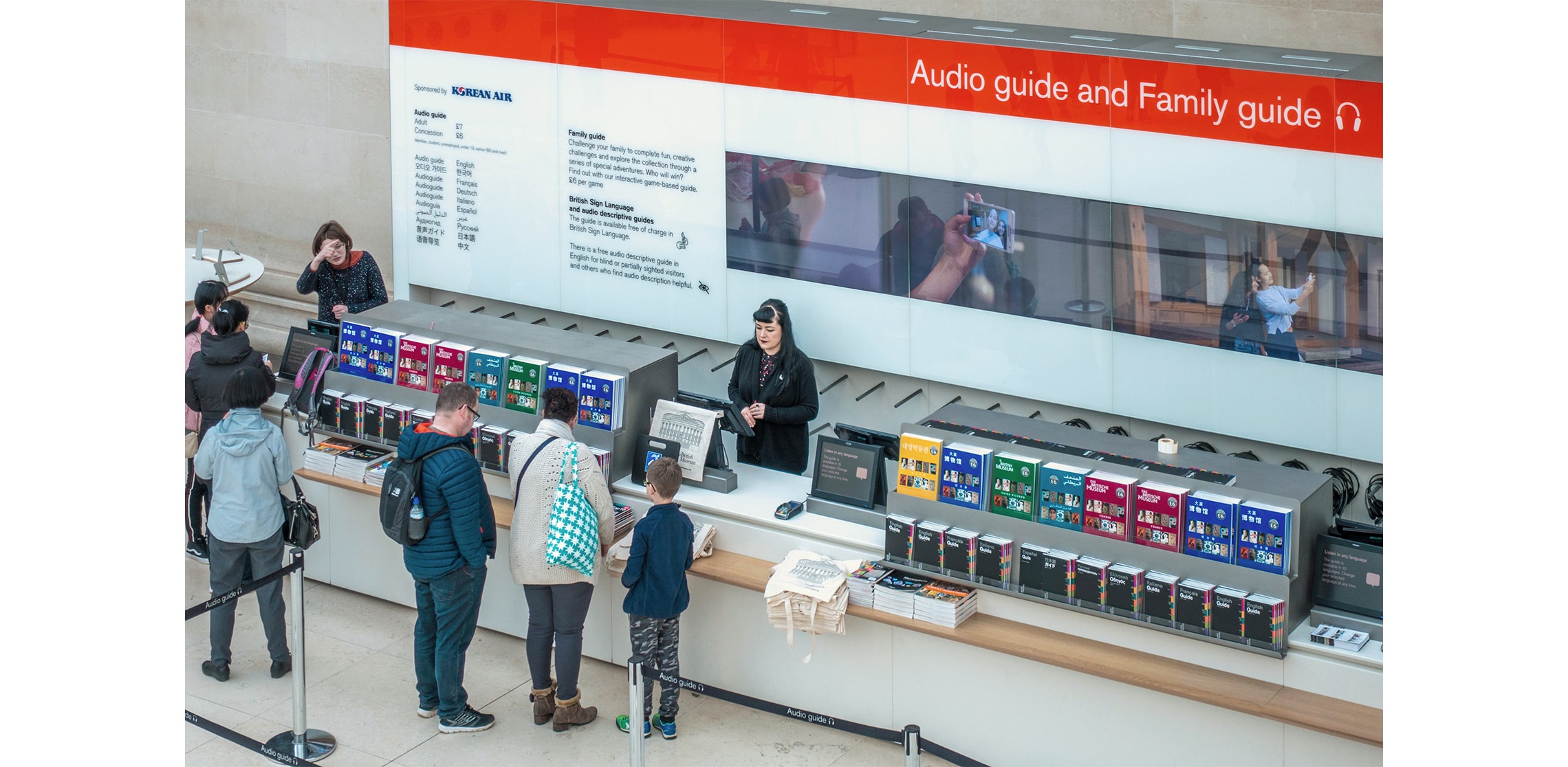
Promotional messaging moved to high-level banners around the perimeter of the Great Court, where it could be bold, expressive and unmissable without interrupting navigation.
When viewed through the lens of Time Agile Wayfinding™ – that disciplined balance of movement, instinct and intent – the outcome is simple and powerful. In a space of this scale, decision-making must be swift. You cannot ask six million people a year to decipher a puzzle at the threshold. Movement should feel instinctive, clear, and confident, because this is not an airport concourse – it is one of the world’s great cultural institutions – visitors should feel awe not administrative confusion!
All graphics aligned with the British Museum’s identity, but we introduced something new: a beacon colour, a visual anchor, at the top of each wayfinding stele.
But there was a challenge, and that was the light…
The Great Court is flooded with a shifting, green-tinged daylight filtered through that immense glass canopy. Reds behave unpredictably in it – some flatten, some vanish, and some don’t look red at all.
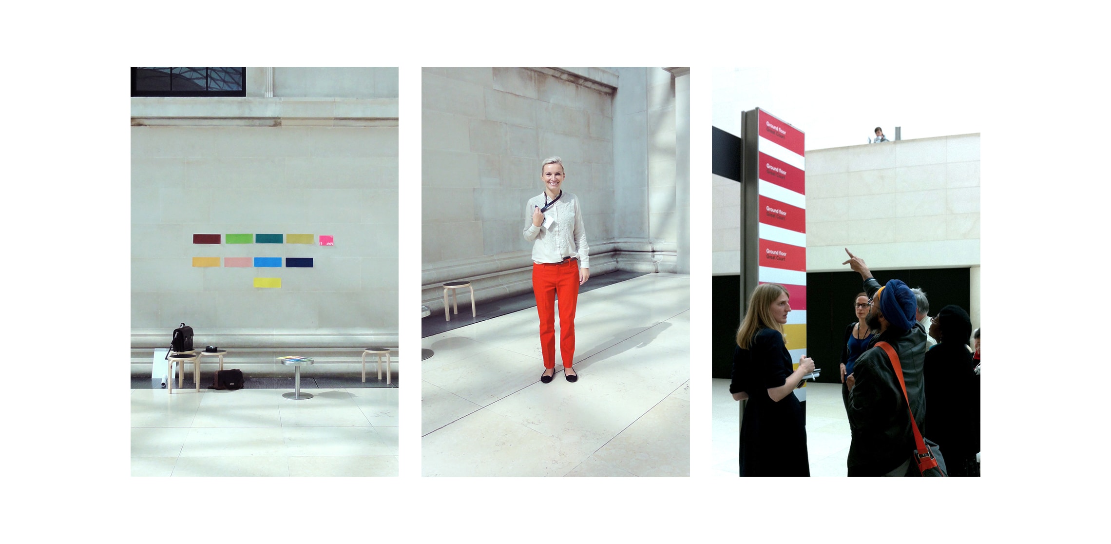
So we tested… and tested… searching for a red that would hold its ground in constantly changing light conditions.
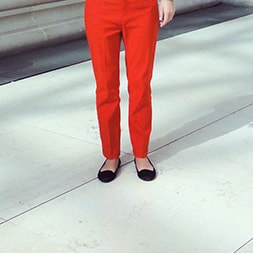
And then – salvation in denim! A catering manager walked across the space wearing red jeans. A very specific red. A red that worked, that cut through the green light without vibrating or fading.
We looked at one another: that’s the one! The beacon red now matches those jeans perfectly.
The result is a Great Court that still astonishes, still lifts the gaze, but no longer overwhelms at the threshold. Movement is smoother, decisions quicker and the space breathes properly.
And somewhere, quietly, a pair of red jeans made design history…