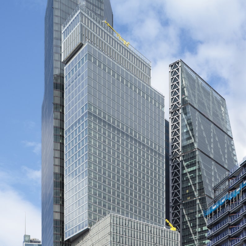
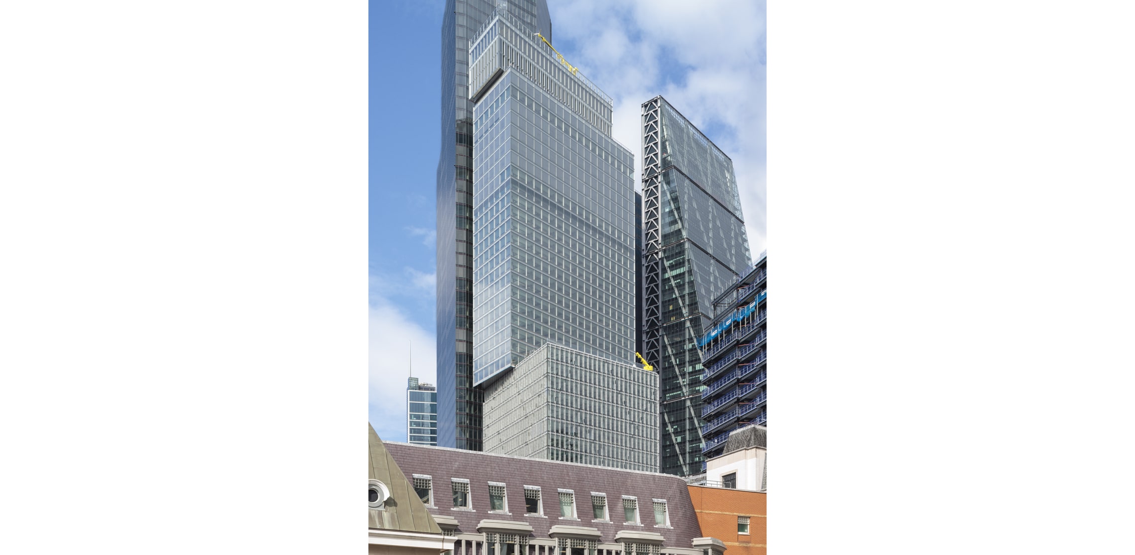
The London skyline is in many ways, the city’s most recognisable piece of branding – an ever-evolving composition of spires, domes and glass towers, all negotiating politely (and occasionally less so) for their place in the view. It is a skyline that speaks of progress and prosperity, certainly, but also of constraint: every new addition must earn its position, working within tightly controlled parameters to protect historic sightlines while still delivering the space a global city rather insistently requires.
8 Bishopsgate manages this balancing act with a kind of quiet confidence. Designed by WilkinsonEyre for Mitsubishi Estate London, it is a 50-storey, office-led, mixed-use building that navigates complex right-to-light constraints with ingenuity rather than compromise. The result is a composition of stacked volumes and cantilevered sections that give the building its distinctive profile… substantial, but never overbearing. It provides the space it needs to, while appearing, rather cleverly, to take up less of it.
There is a similar lightness in its environmental approach. As the first speculative-use tall building in the UK to achieve a BREEAM Outstanding rating, it reflects a rigorous commitment to reducing carbon impact. The architectural response is one of restraint: materials are used honestly and sparingly, with concrete cores and steel frames left exposed, unnecessary linings removed, and a consistent, pared-back aesthetic allowed to emerge. It is, in essence, a building that resists the temptation to overcomplicate – something one rather wishes more buildings would do.
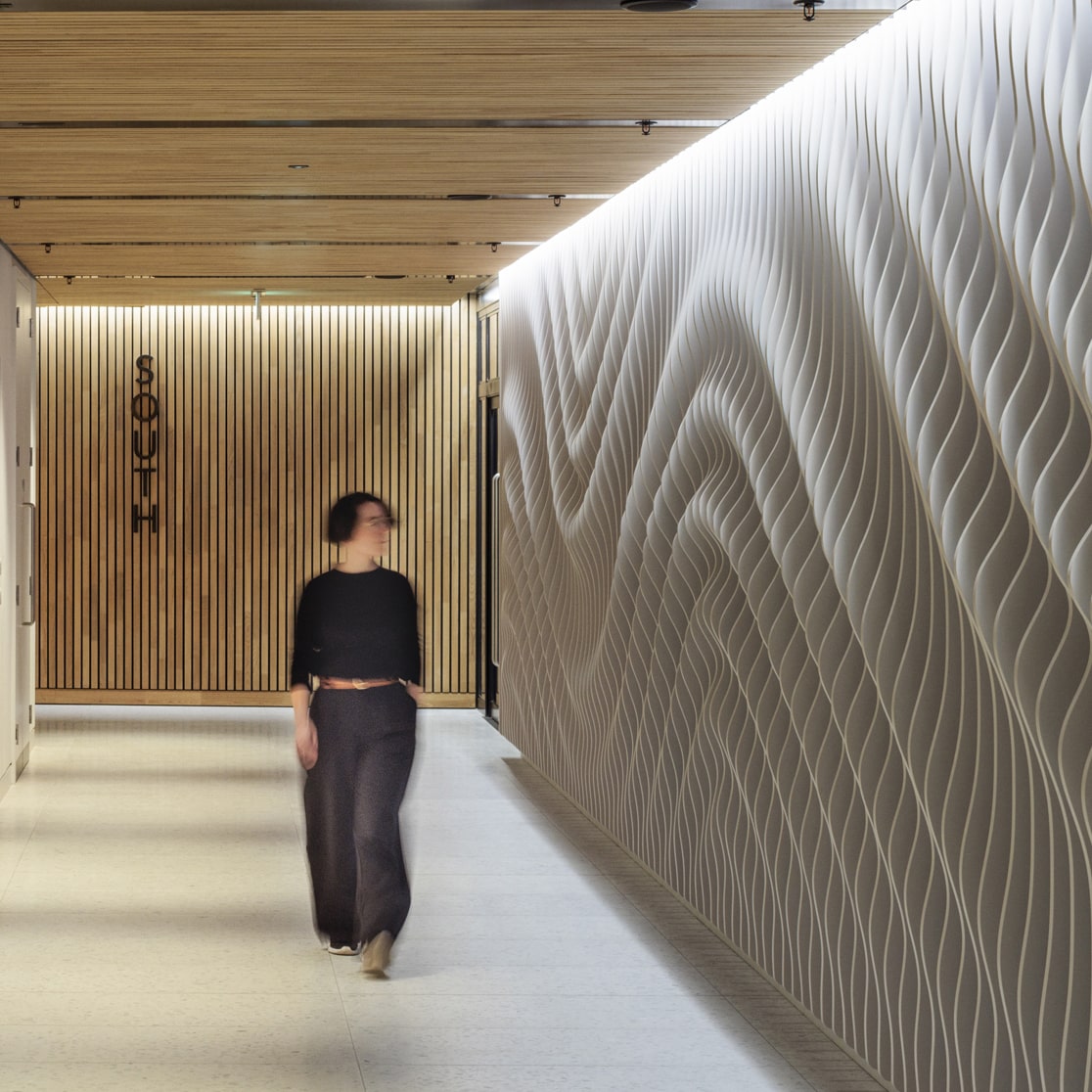
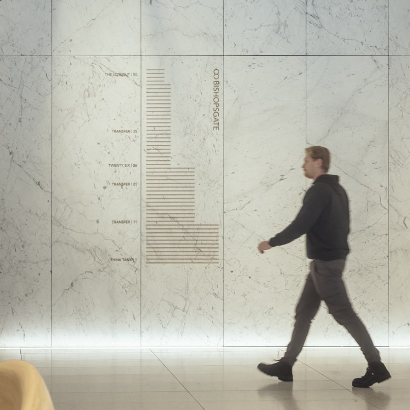
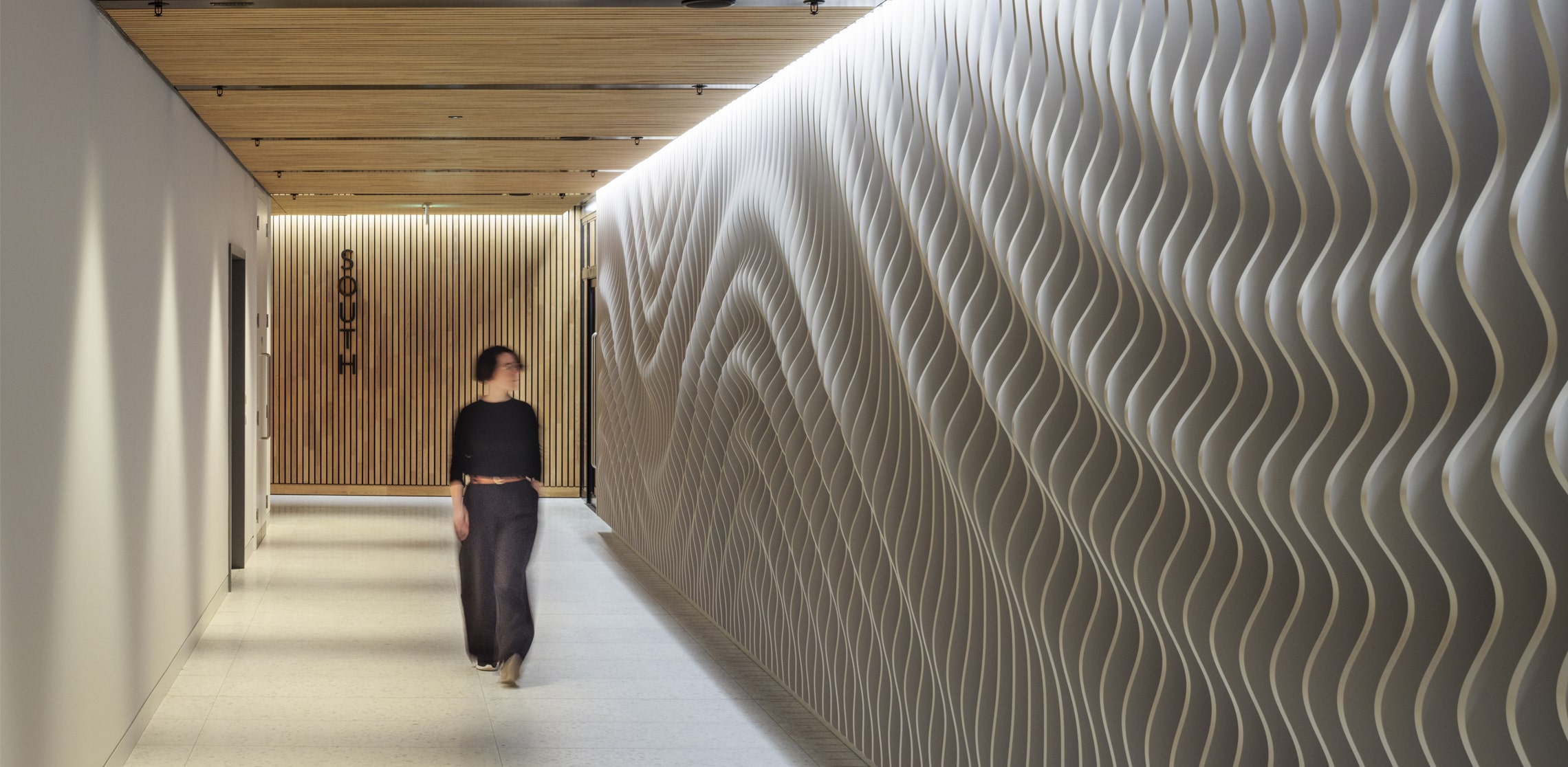
Our brief was to extend this philosophy into a wayfinding strategy that would support movement through the building, particularly vertical circulation, without disturbing its carefully calibrated simplicity.
The challenge, as ever, was not to add, but to refine: to create a system that feels entirely at home within the architecture, and ideally one that you barely notice until you need it.
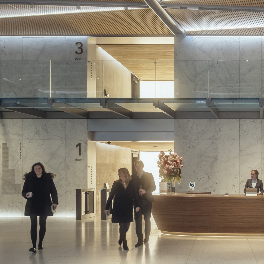
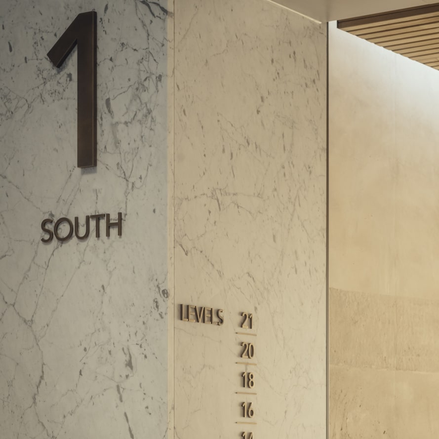
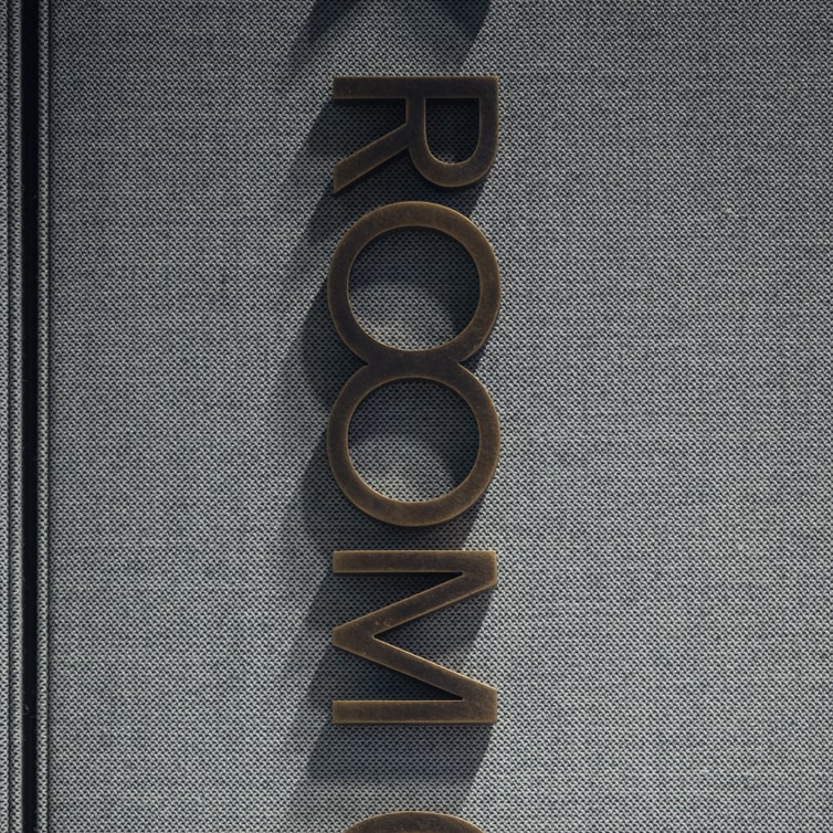
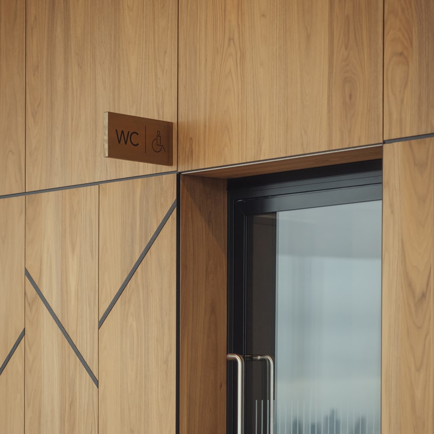
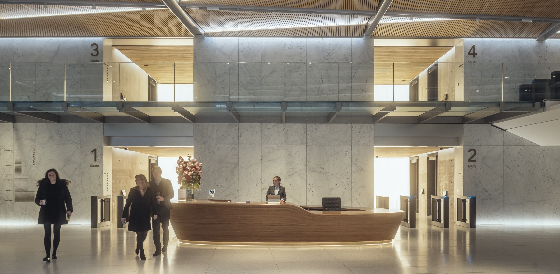
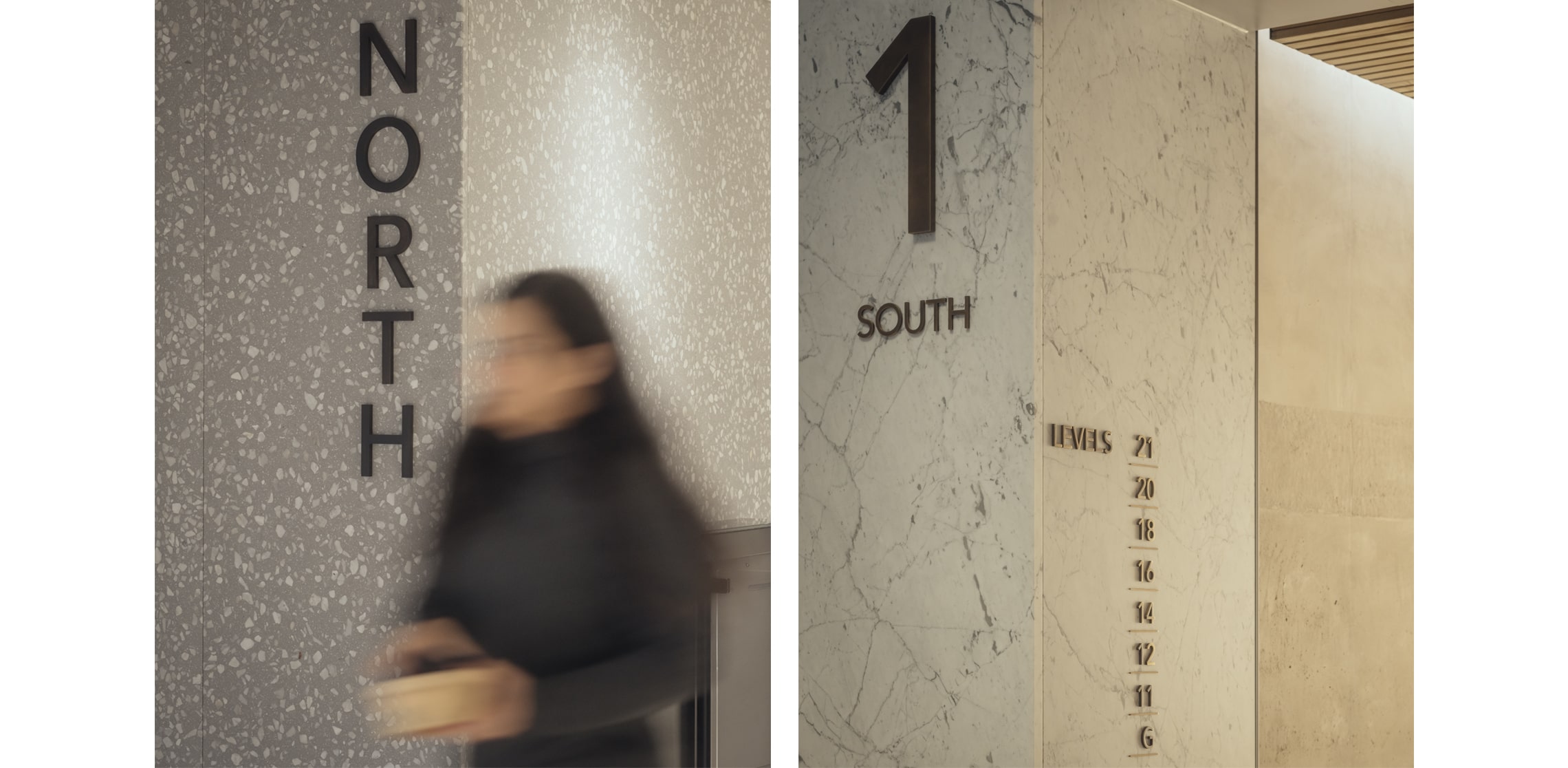
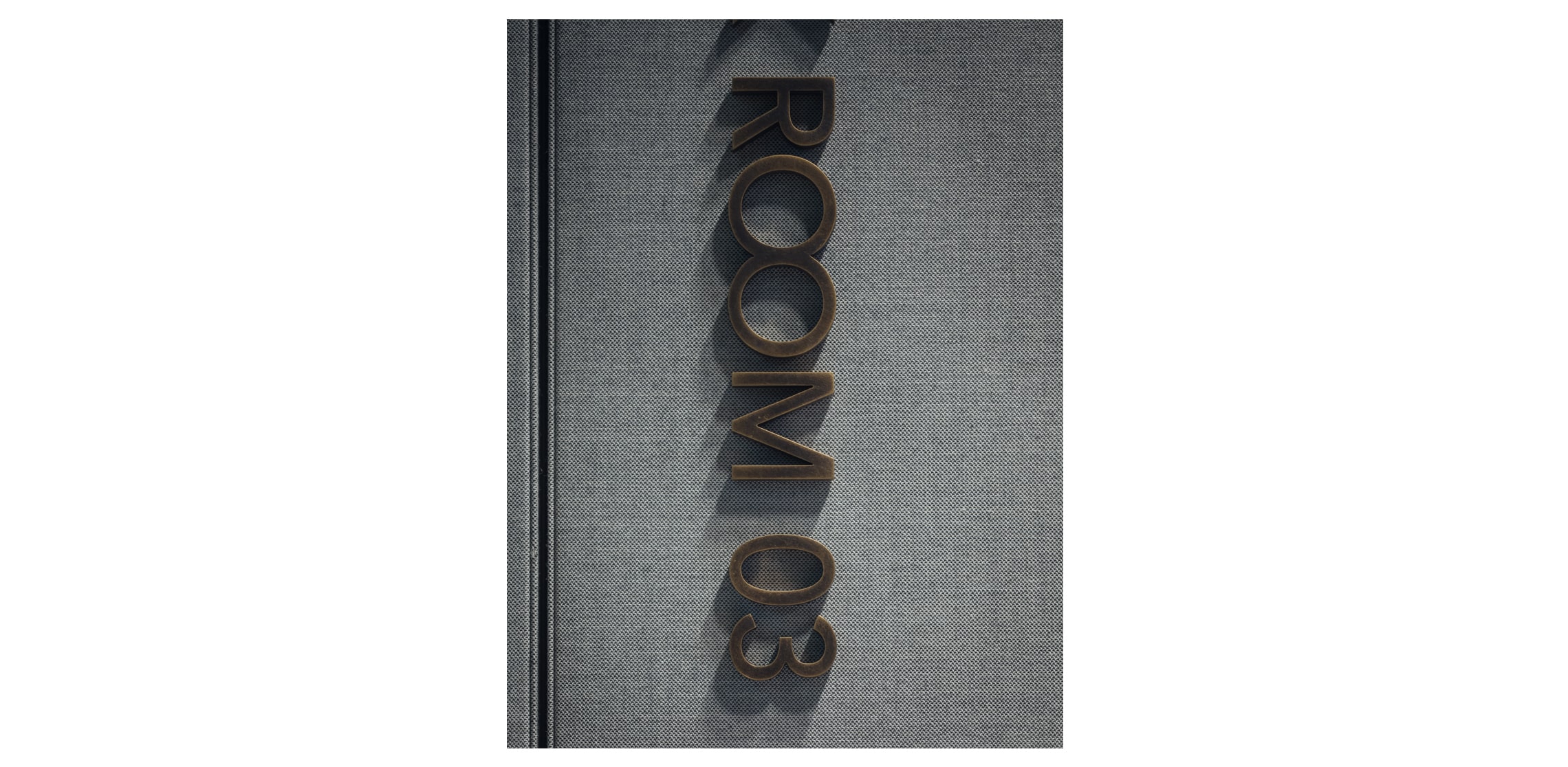
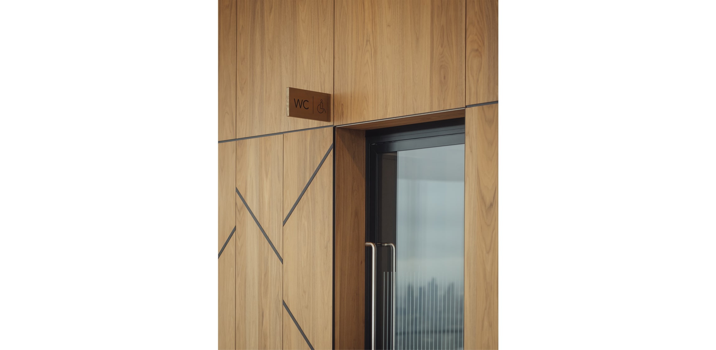
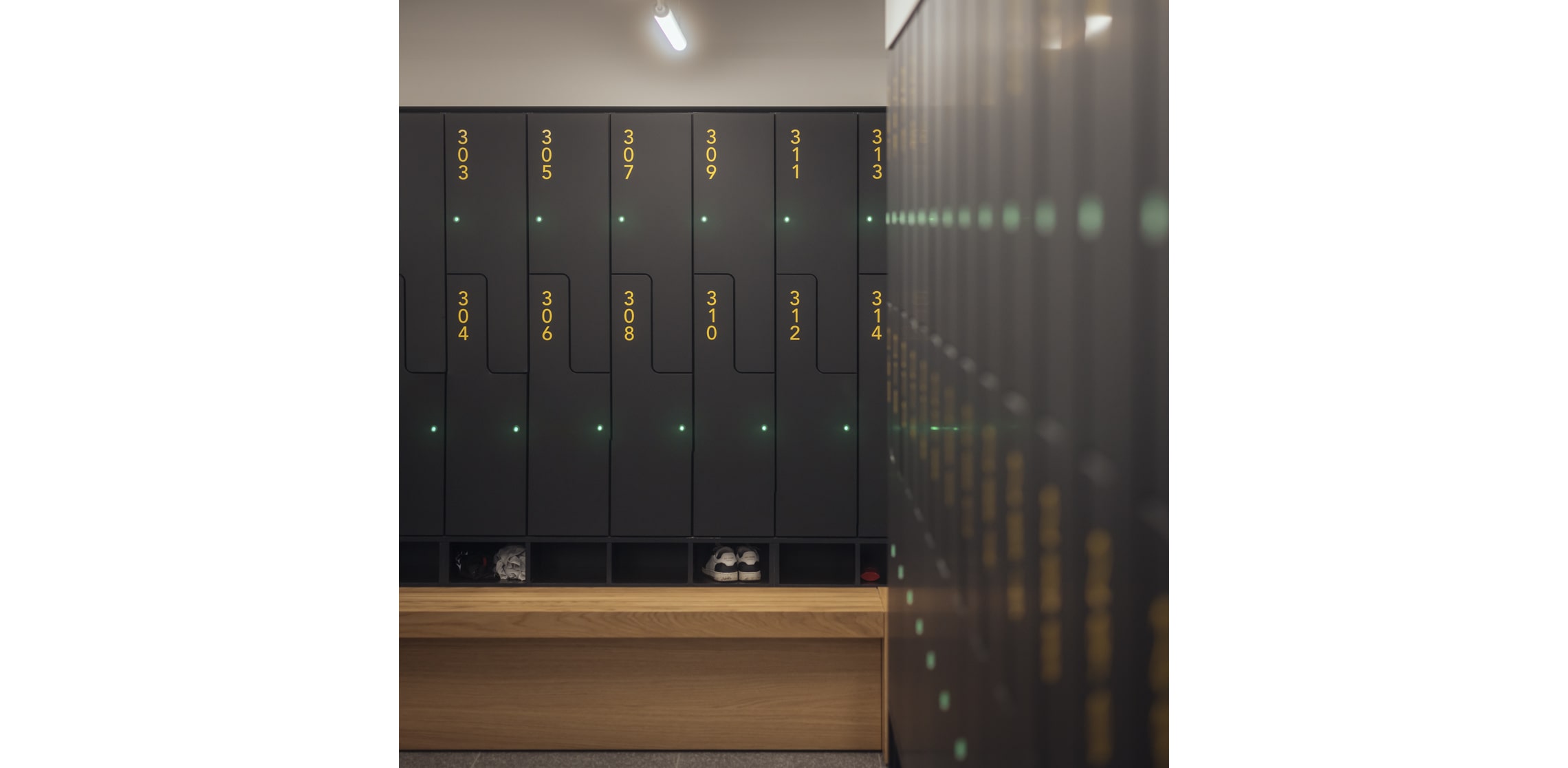
Working in collaboration with Studio Sutherland, we developed a wayfinding approach aligning information with the moments at which it becomes useful. In a building of this scale, that means prioritising clarity at key decision points – lifts, cores, transitions between public and private realms – while allowing the rest of the experience to remain visually calm. It is a system designed to be learned quickly and then relied upon without conscious effort, which is, ultimately, the highest compliment anyone can pay to signage.
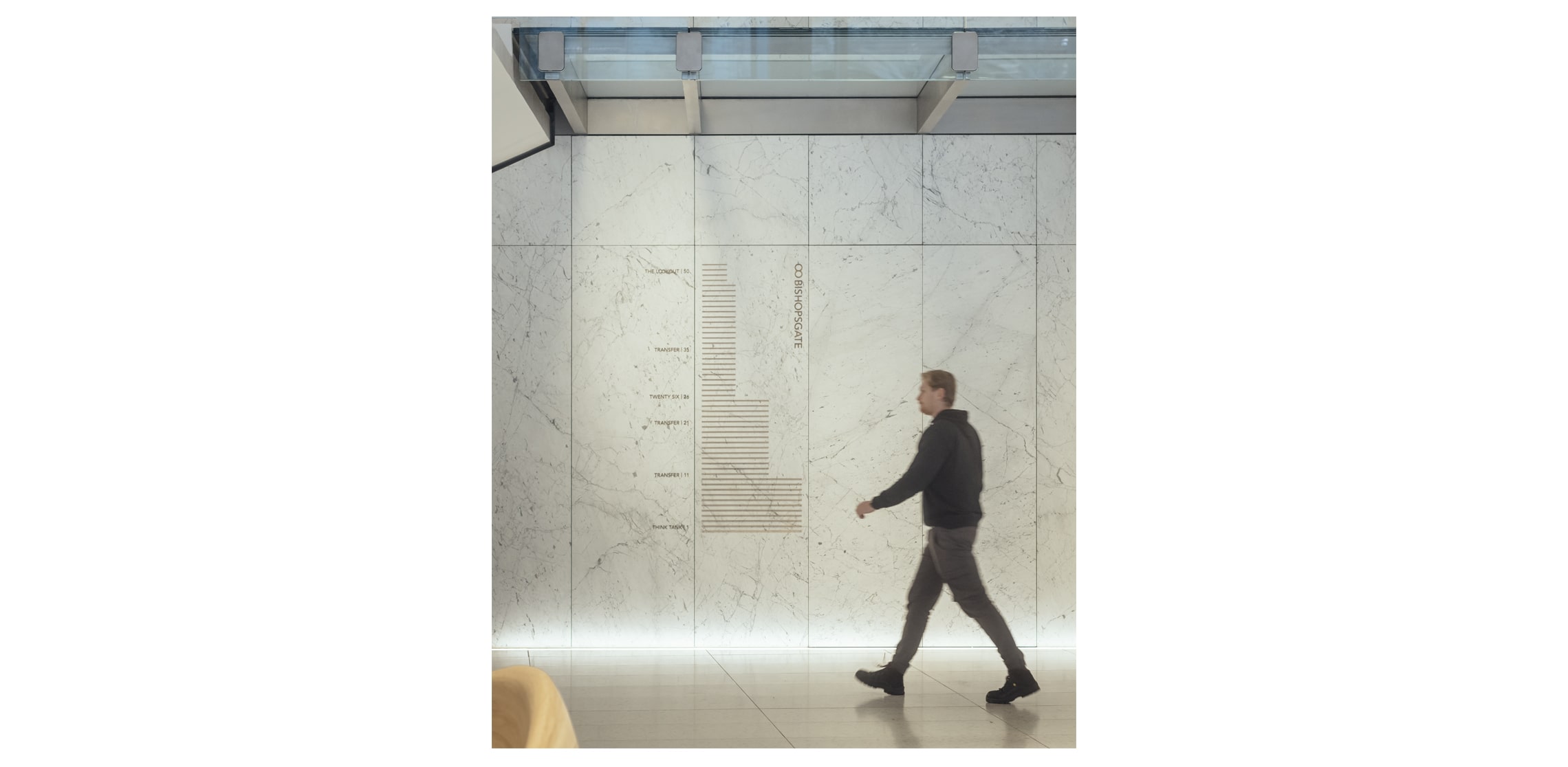
The material and graphic language follows suit. Clean, precise typography and iconography are rendered in patinated brass, chosen for its quiet warmth and ability to sit comfortably within the building’s neutral palette. Colour is used sparingly and sensitively, just enough to support differentiation without tipping into decoration. The effect is understated, almost self-effacing; wayfinding that does its job with minimal fuss and no need for theatrics.
There is, perhaps, a particular satisfaction in this kind of work. In a building that has achieved so much through reduction – less material, less visual noise, less unnecessary complexity – our contribution continues that line of thinking. Light touch, in this context, is not about doing less for the sake of it, but about doing exactly what is needed and nothing more.
Which, in a 50-storey building, is rather important. No one wants to get lost halfway up.