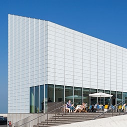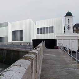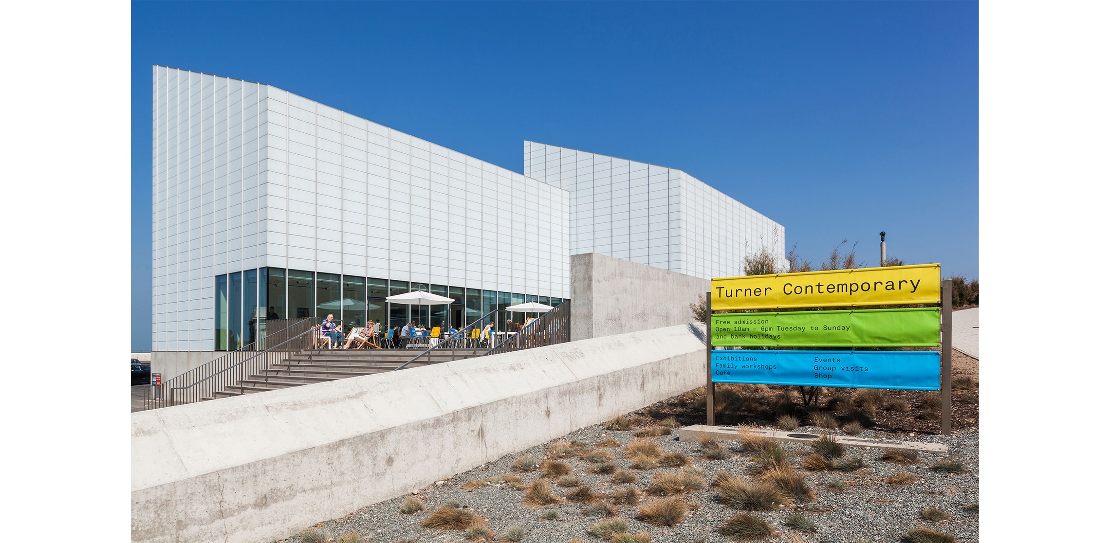
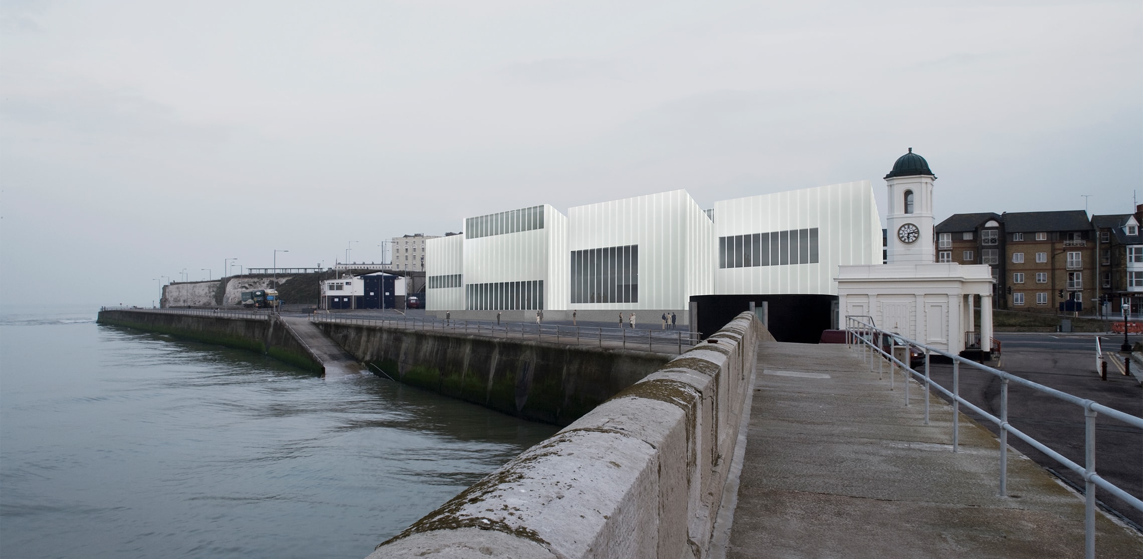
Turner Contemporary begins, as all good things do, with the weather. Or more precisely, with the light – vast, shifting, slightly theatrical North Sea light that refuses to behave itself and is all the better for it. The building, an art gallery by function but very much an echo of old boat sheds in form, sits close enough to the shoreline to require a certain pragmatism: raised against high tides, armoured with glass robust enough to withstand the occasional enthusiastic wave. It is in essence, a structure that knows exactly where it is and what it is up against.
And where it is, of course, is everything. J.M.W. Turner stood on this very spot, lodging at Mrs Booth’s now-vanished guest house, declaring with characteristic certainty that “the skies over Thanet are the loveliest in all Europe.” It is a bold claim but then Turner was not known for half-measures. The particular quality of light here – cool, steady, reflected off the sea – creates the kind of conditions artists tend to get quietly obsessed with. The gallery exists because of that light; everything else follows.
David Chipperfield’s vision for the building was what he described as “building space”: an architecture of restraint, clarity and orientation, where light does the heavy lifting and the rooms remain deliberately, almost stubbornly, simple. From the outset, it was about creating pure spaces for art, aligned to the same skies that drew Turner here in the first place.
Our role, in collaboration with John Morgan Studio, was to respond in kind – to develop a wayfinding approach that did not compete with this clarity, but slipped into it, quietly and precisely.
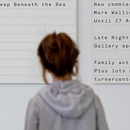
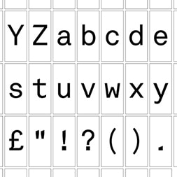
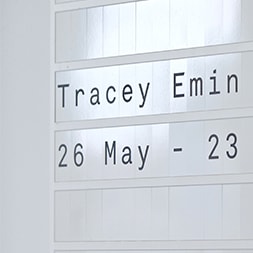
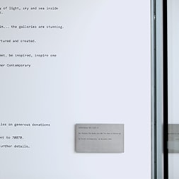
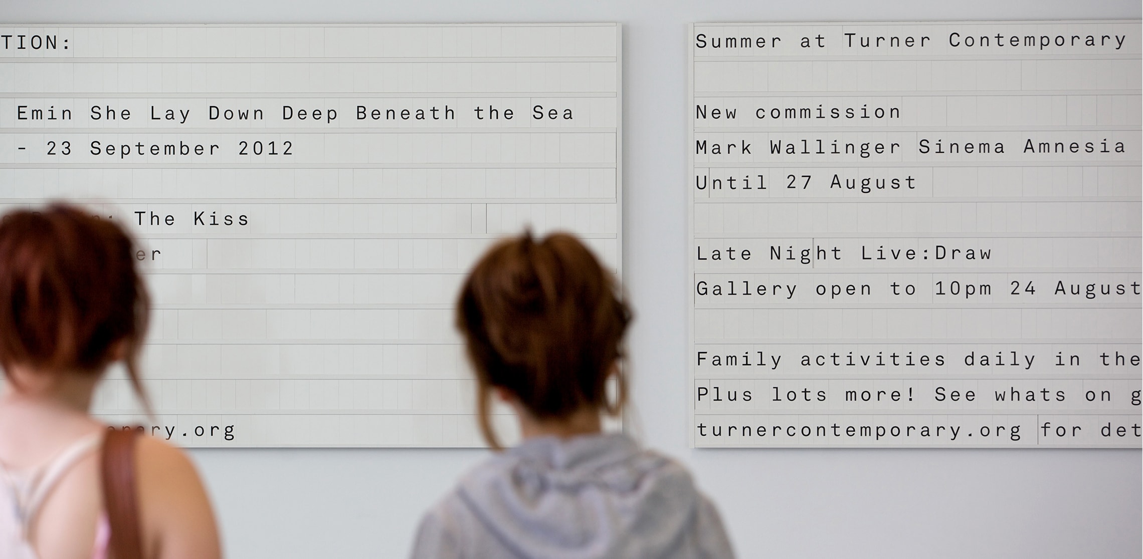
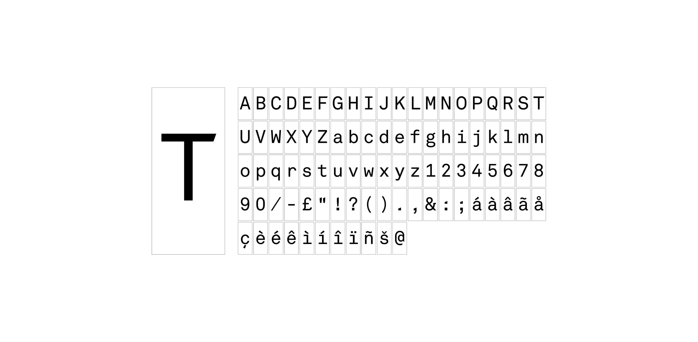
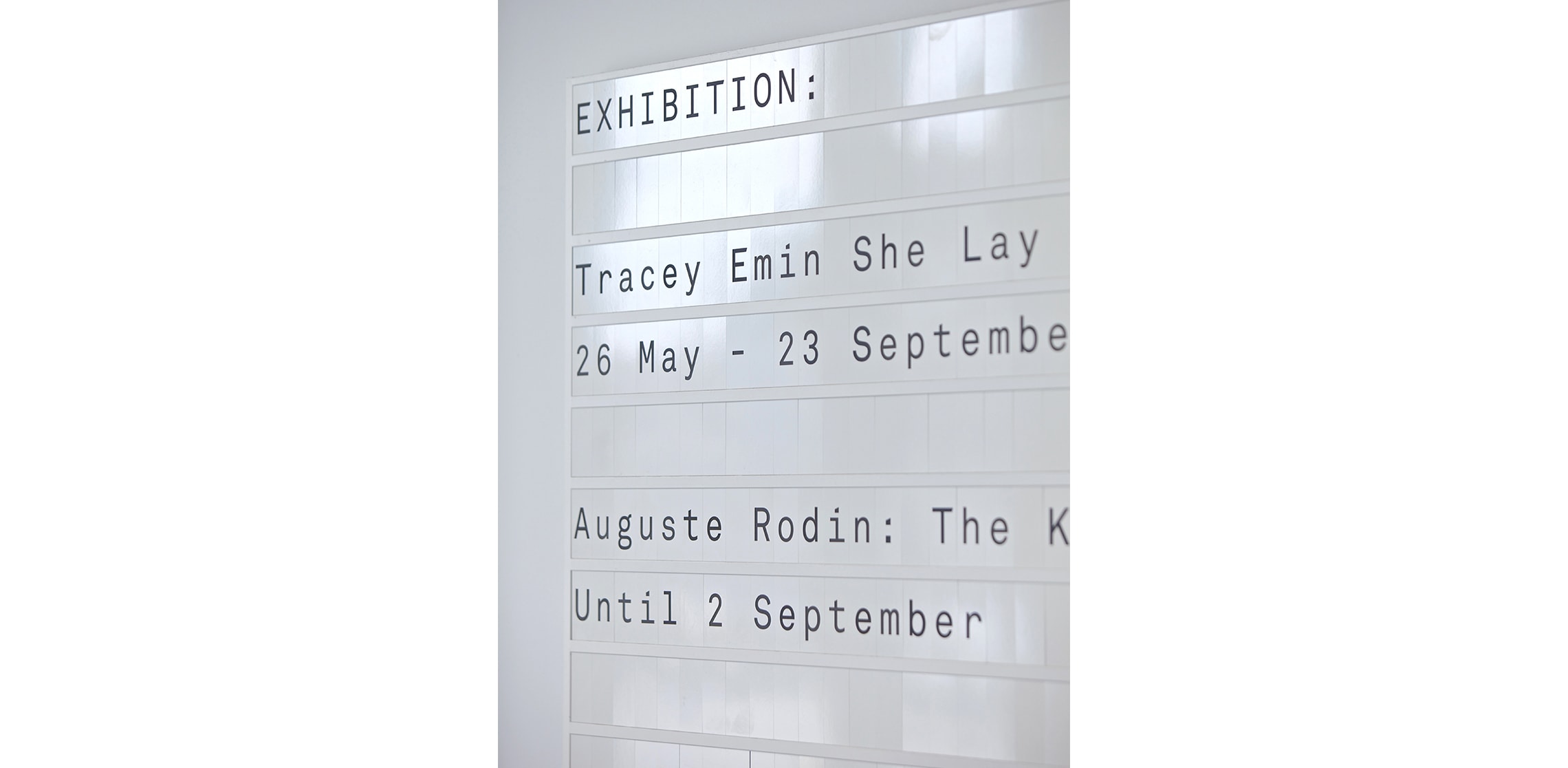
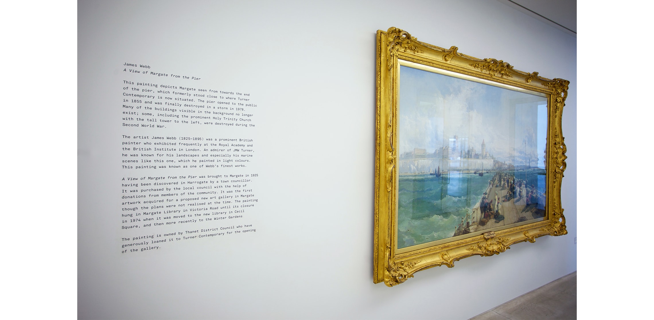
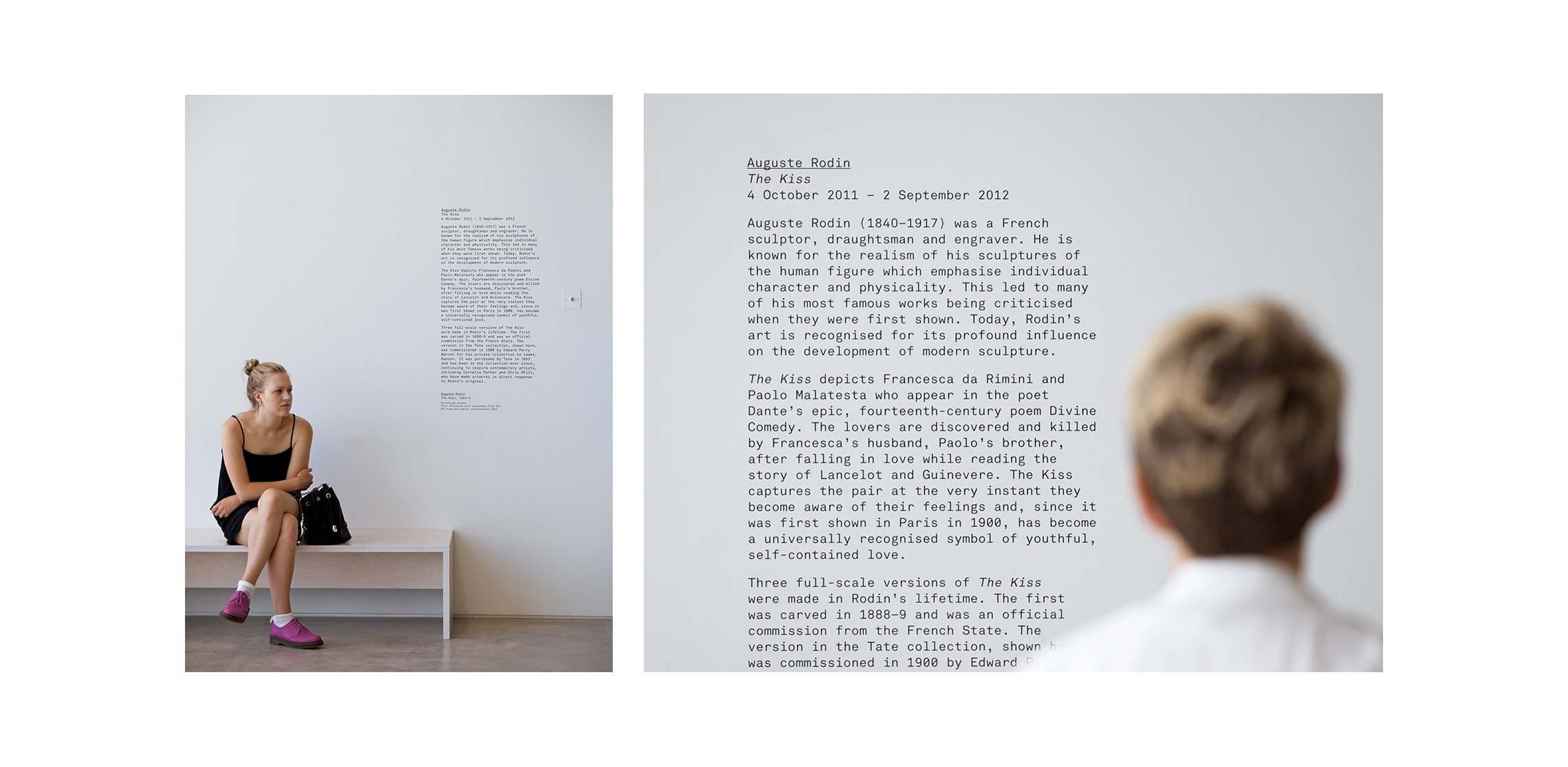
The result was an exercise in reduction, though not austerity. Using the monospaced Akkurat typeface – something of a typewriter in spirit, with a pleasingly no-nonsense, slightly utilitarian air – we established a graphic language that felt both direct and adaptable. The monospacing was not just a typographic choice but a structural one: expressed physically through Traffolyte tiles, almost Scrabble-like in their construction, which slotted into wall-mounted runners to form the foyer information boards. There was something satisfyingly analogue about them, as though one might rearrange them by hand on a rainy afternoon.
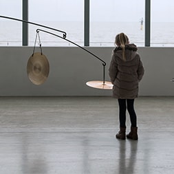
This matters because Turner Contemporary has no permanent collection. Unlike many galleries, it is defined by change, by what comes and goes, rather than what stays put. The foyer boards reflect this perfectly: flexible, reconfigurable, always slightly provisional. They looked, quite deliberately, as though they are ready to be updated at a moment’s notice (which, in practice, they often were).
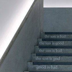
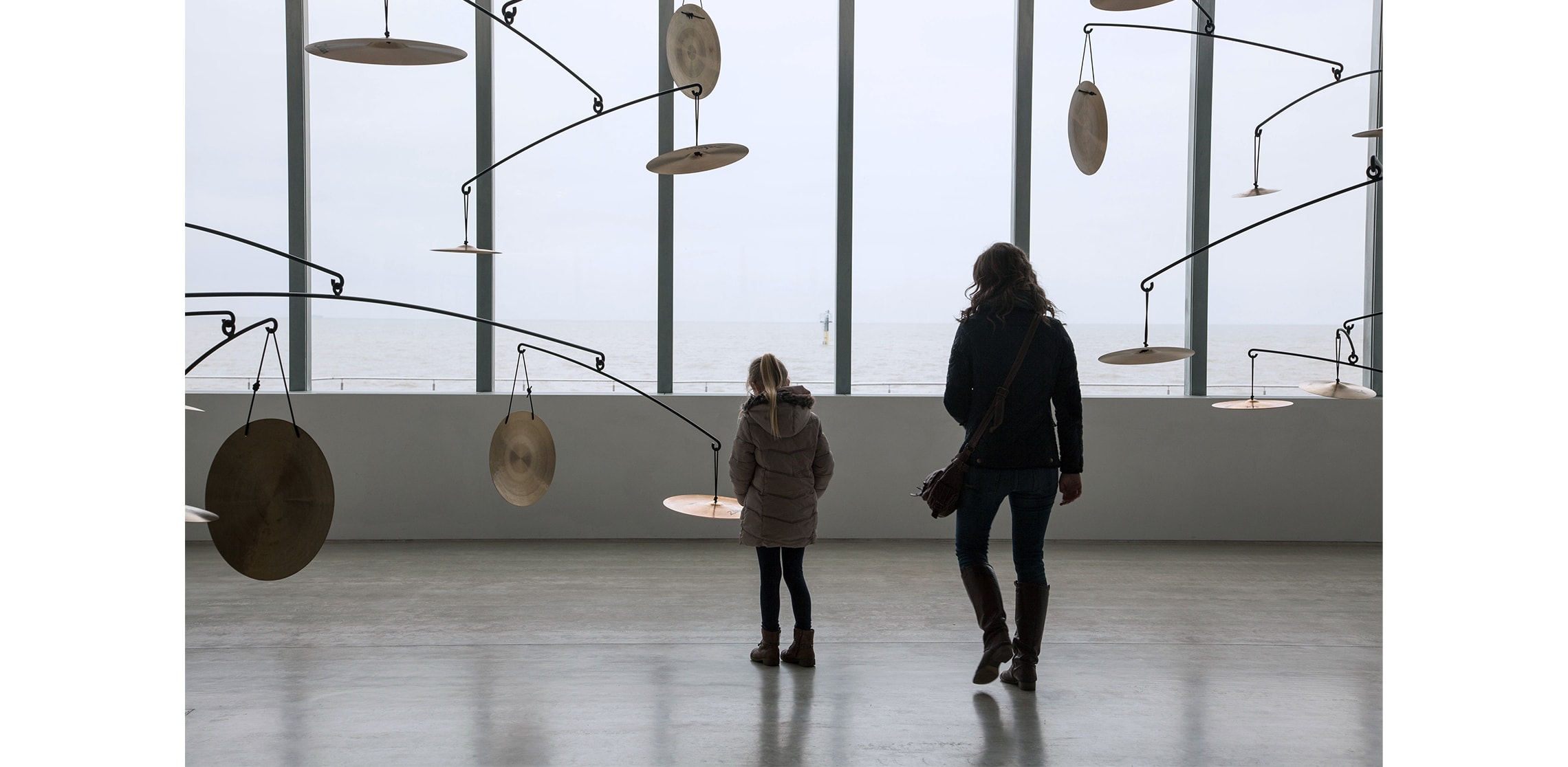
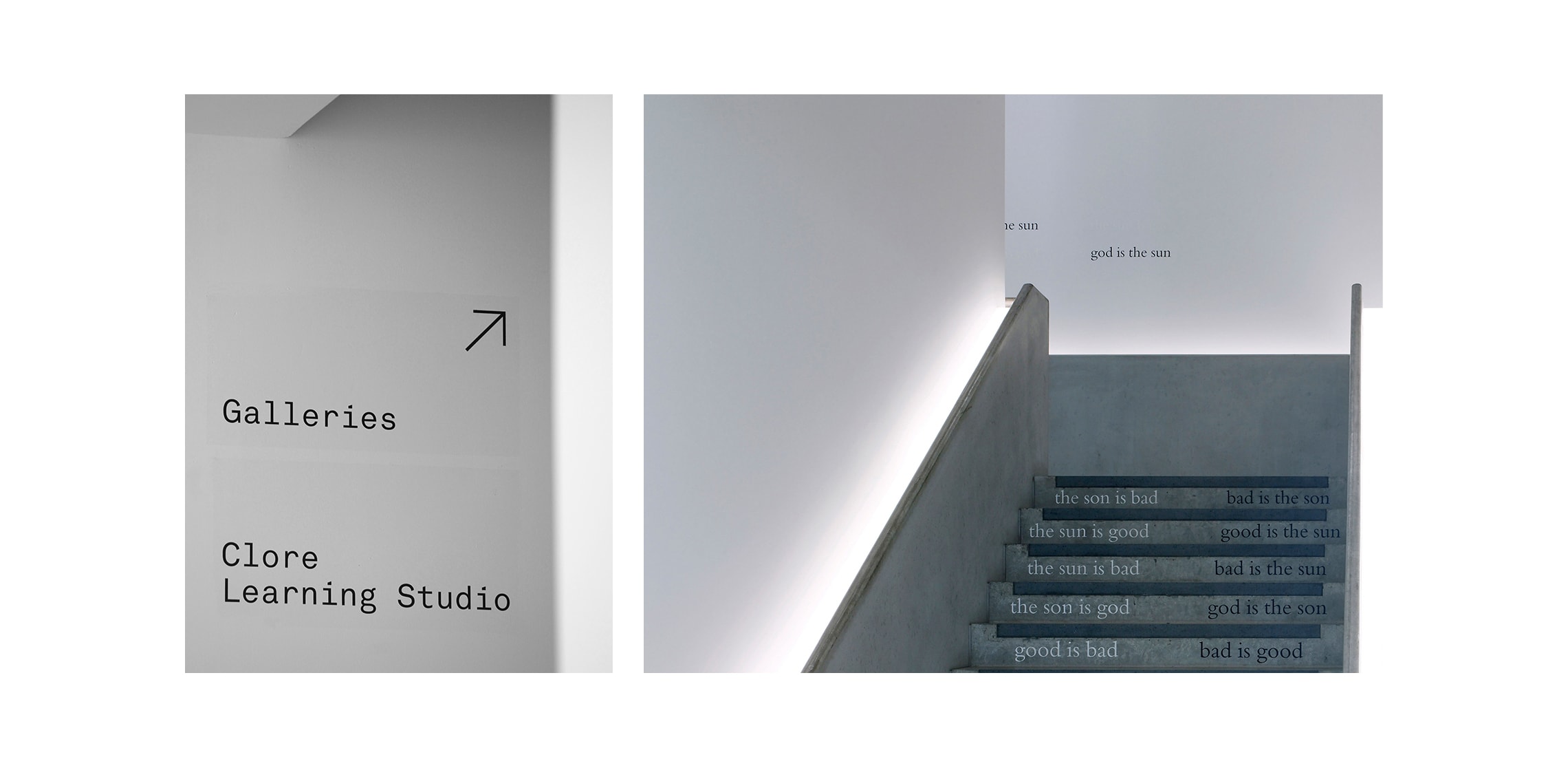
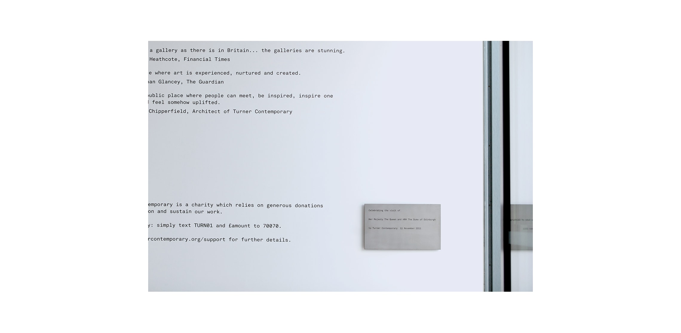
Elsewhere, the language continued directly onto the building fabric. Signage was screen printed in matt black onto gloss lacquer panels, the latter forming a subtle frame around the typesetting, just enough to catch the light, not enough to demand attention. It is signage that behaves itself: clear, calm, and quietly confident, rather than vying for prominence in a building where the sky is very much the main event.
We did, it must be said, have one moment of mild heartbreak. Our ambition was to engrave the gallery’s name into the external concrete retaining wall, cutting through the surface to reveal the stone and pebble aggregate beneath, a gesture that would have felt entirely appropriate for a building shaped by its coastal conditions. Unfortunately, the realities of concrete manufacturing intervened: a series of evenly spaced draw-hole indentations landed themselves in precisely the wrong places, rendering the idea beautifully unworkable.
Which is, in its own way, quite fitting. Even the most resolved designs occasionally meet forces they cannot outmanoeuvre… gravity, weather, or, in this case, a particularly stubborn bit of concrete logic. One suspects Turner himself, faced with such a sky, would have understood.