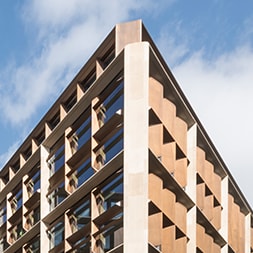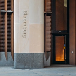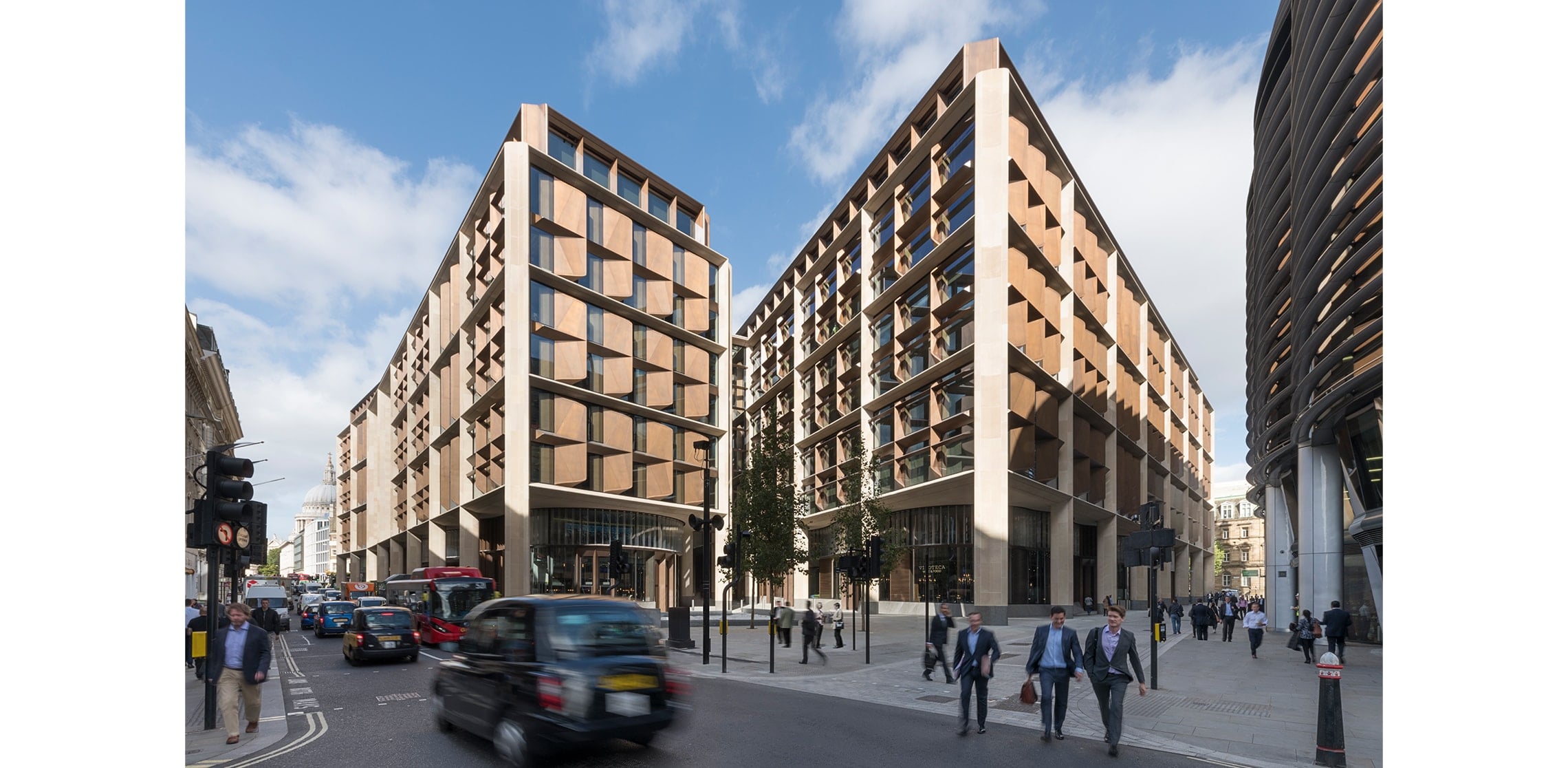
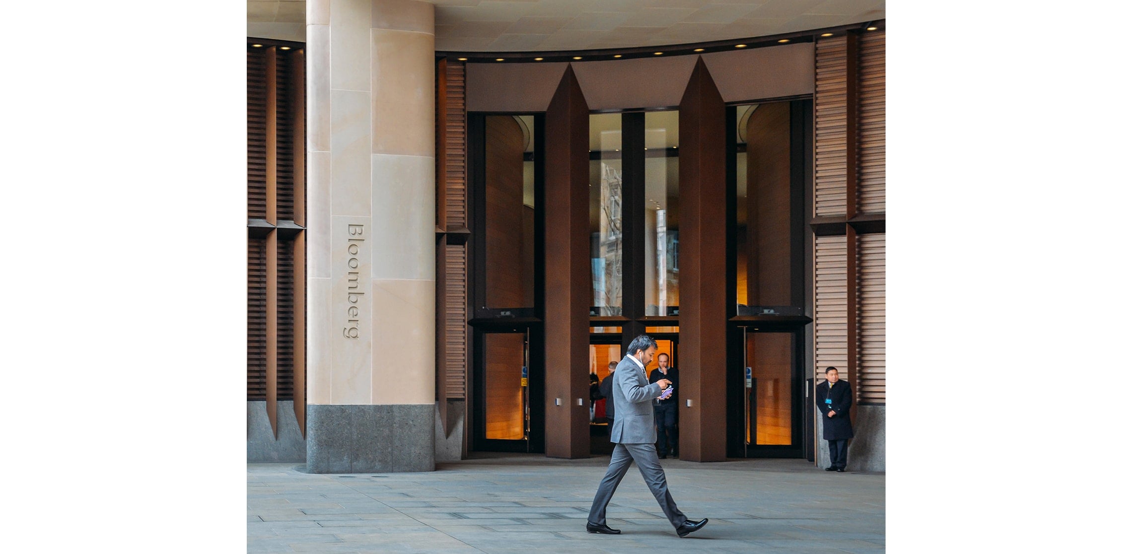
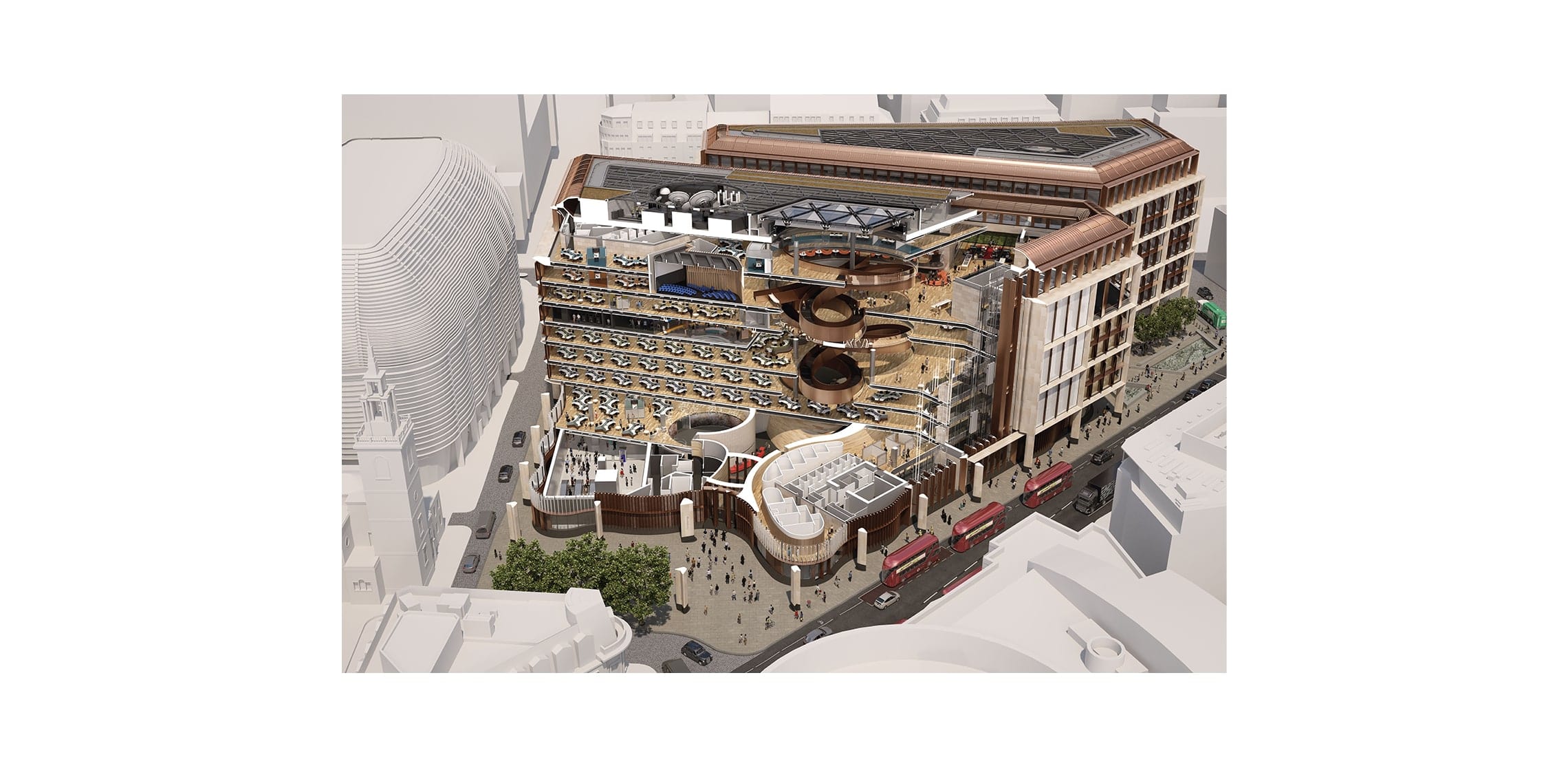
From founding vision to delivery detail, Bloomberg’s European HQ is a story of sustained commitment – what the Architects’ Journal judging panel called “a staggering commitment to design quality” when naming Bloomberg Client of the Year 2018. The building went on to win the 2018 RIBA Stirling Prize for Foster + Partners, and we were brought in as part of that team to resolve something less visible, but just as critical: how time is experienced inside the building.
This is a workplace designed around momentum. Four thousand people moving through it every day, often arriving without guidance, often needing to get somewhere quickly, and frequently returning after long gaps. In that context, navigation is not just about direction; it is about time saved, time lost, and time spent hesitating, retracing steps, or second-guessing.
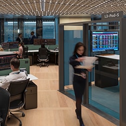
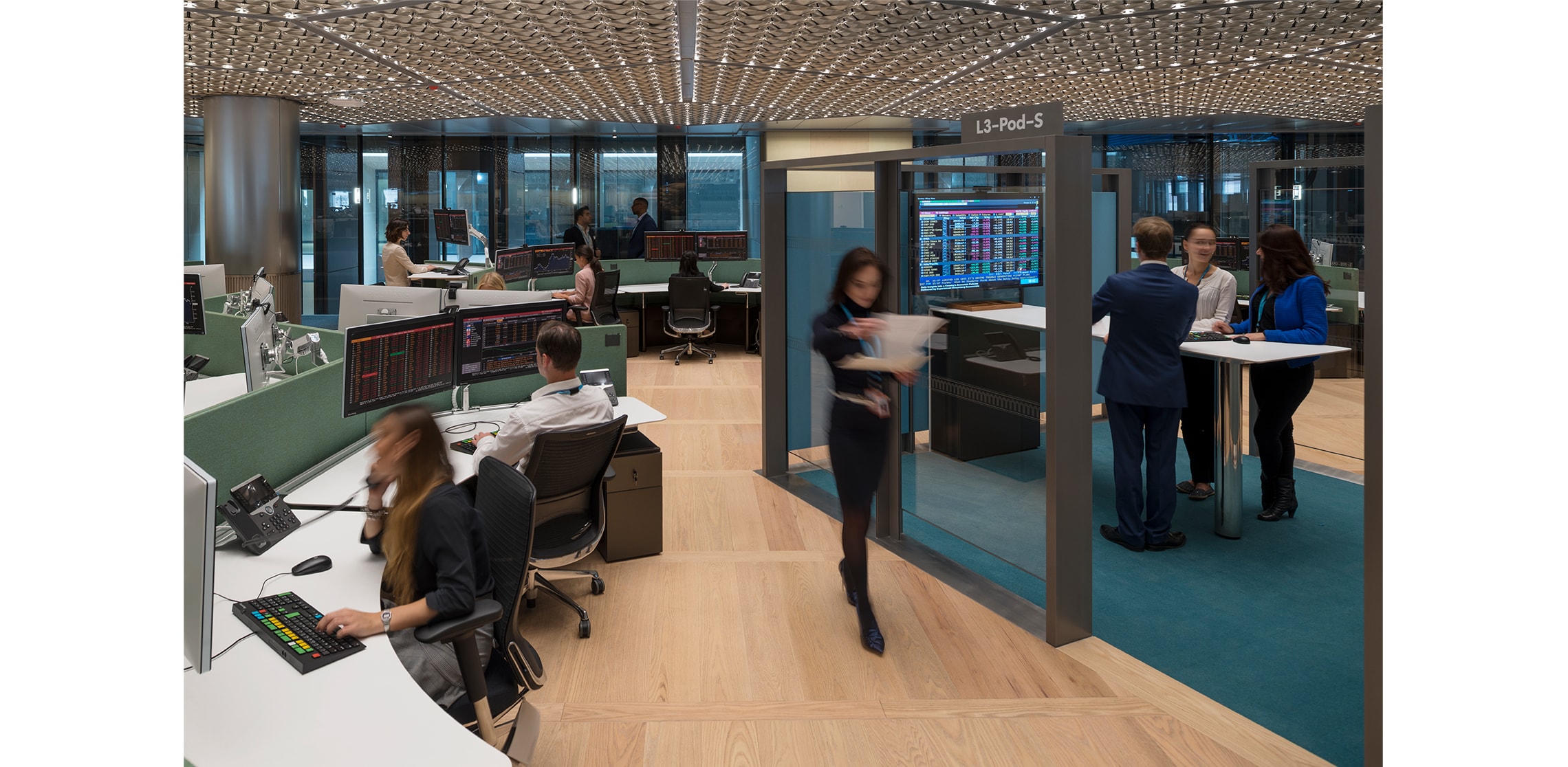
Foster + Partners created a building that encourages collaboration through “organic clusters” of up to 800 desks, arranged to promote interaction and chance encounters. It is a generous, flowing environment, but one that risks slowing people down if it cannot be read quickly. The challenge was to support that openness without introducing friction – to help people locate themselves and move with confidence, even on their first visit, without breaking the rhythm of the space.
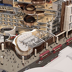
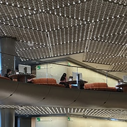
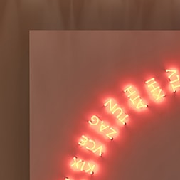
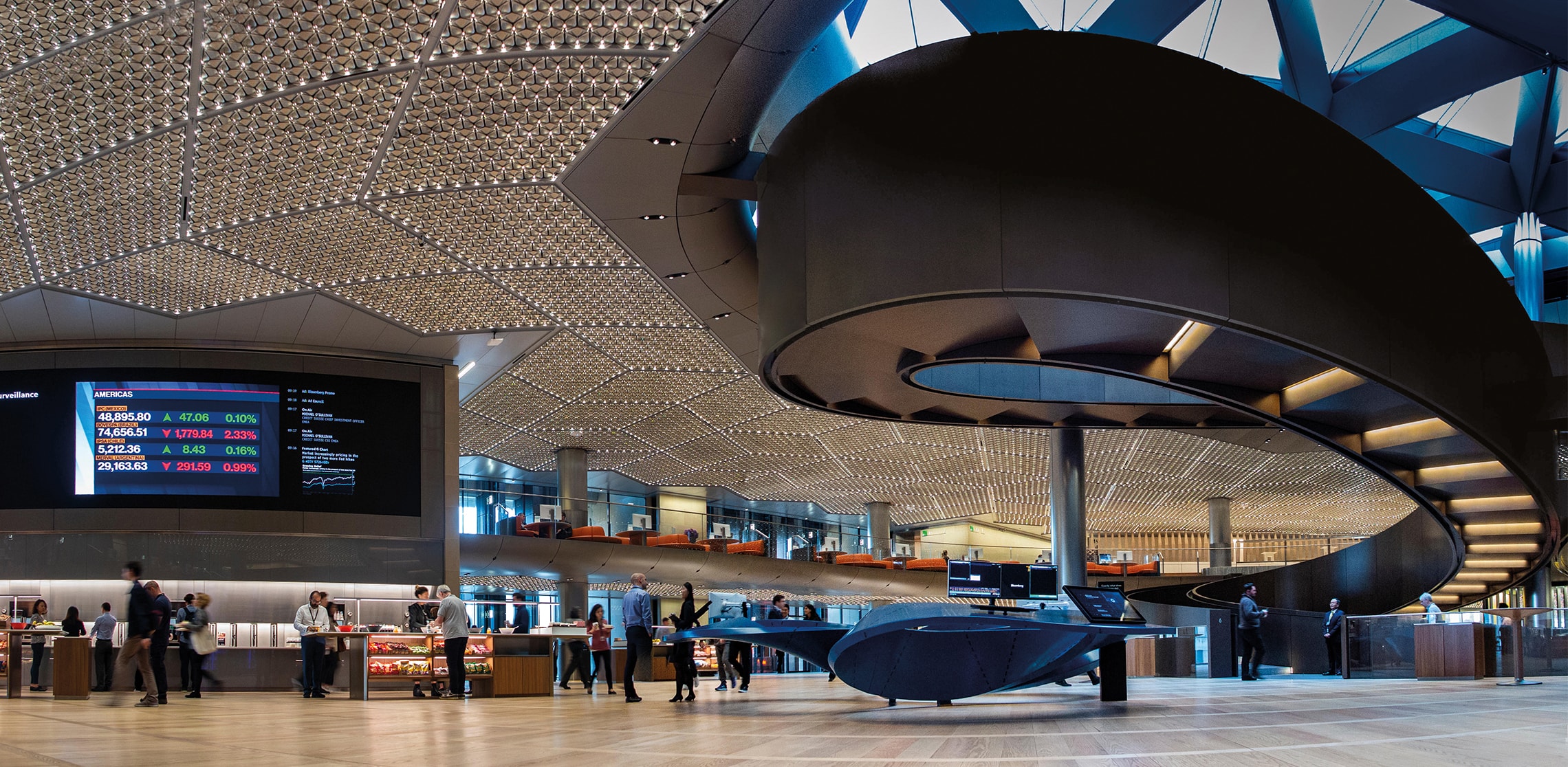
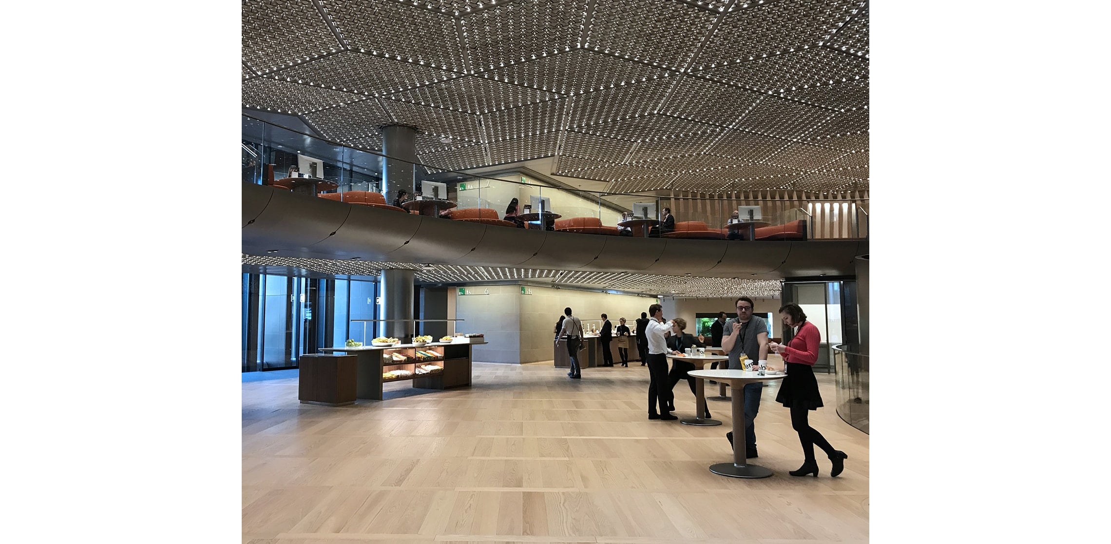
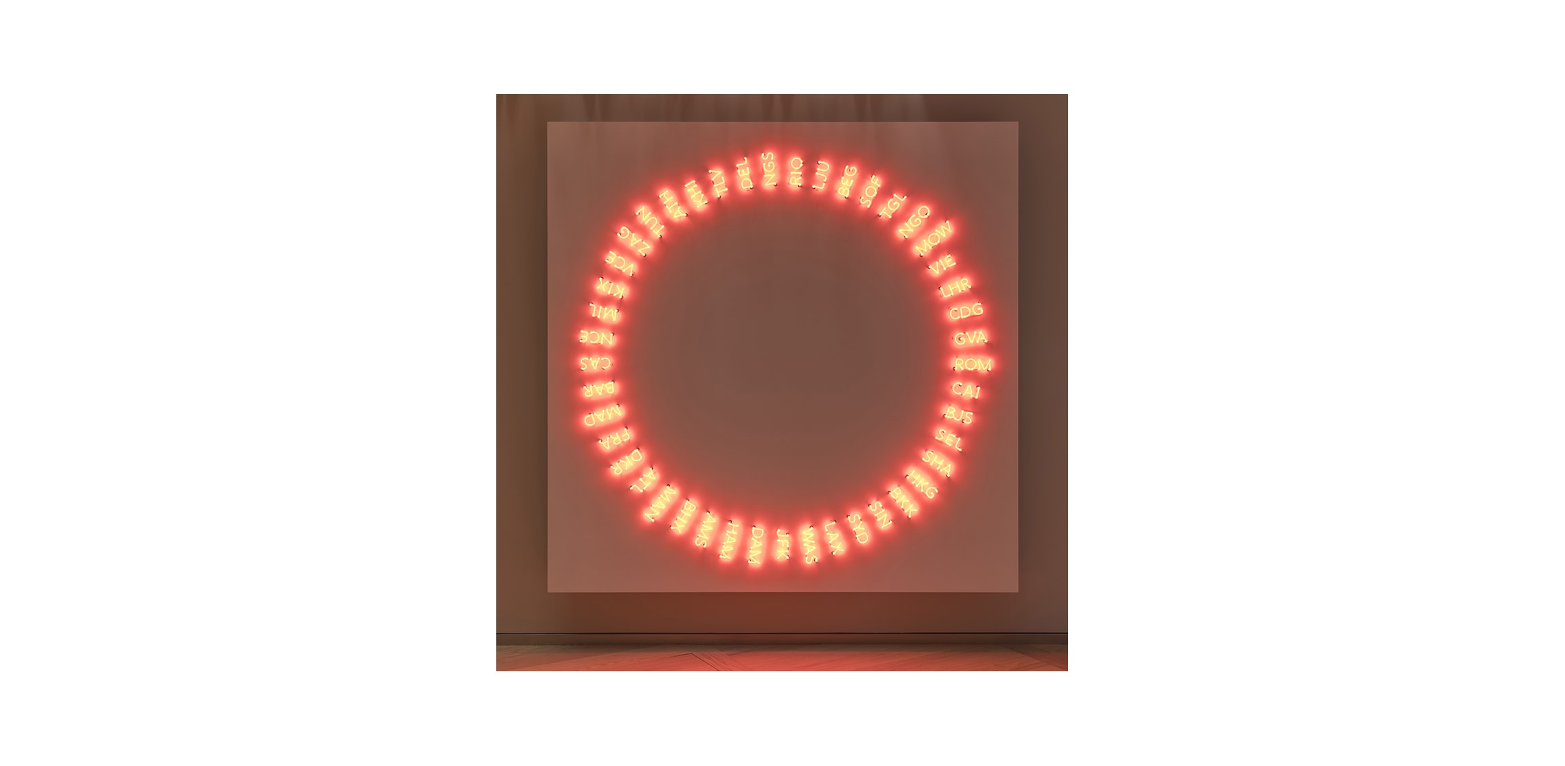
Our approach was grounded in a familiar urban logic. Inspired by New York, central to Bloomberg’s identity, we treated the workplace as a series of city blocks, where navigation happens through a combination of structure and recognition rather than instruction. The architecture itself becomes part of the system: the spiral ramp, material shifts, and artworks act as landmarks that allow people to orient themselves instinctively, reducing the time spent consciously figuring things out.
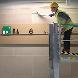
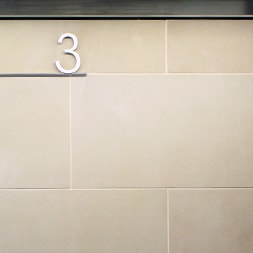
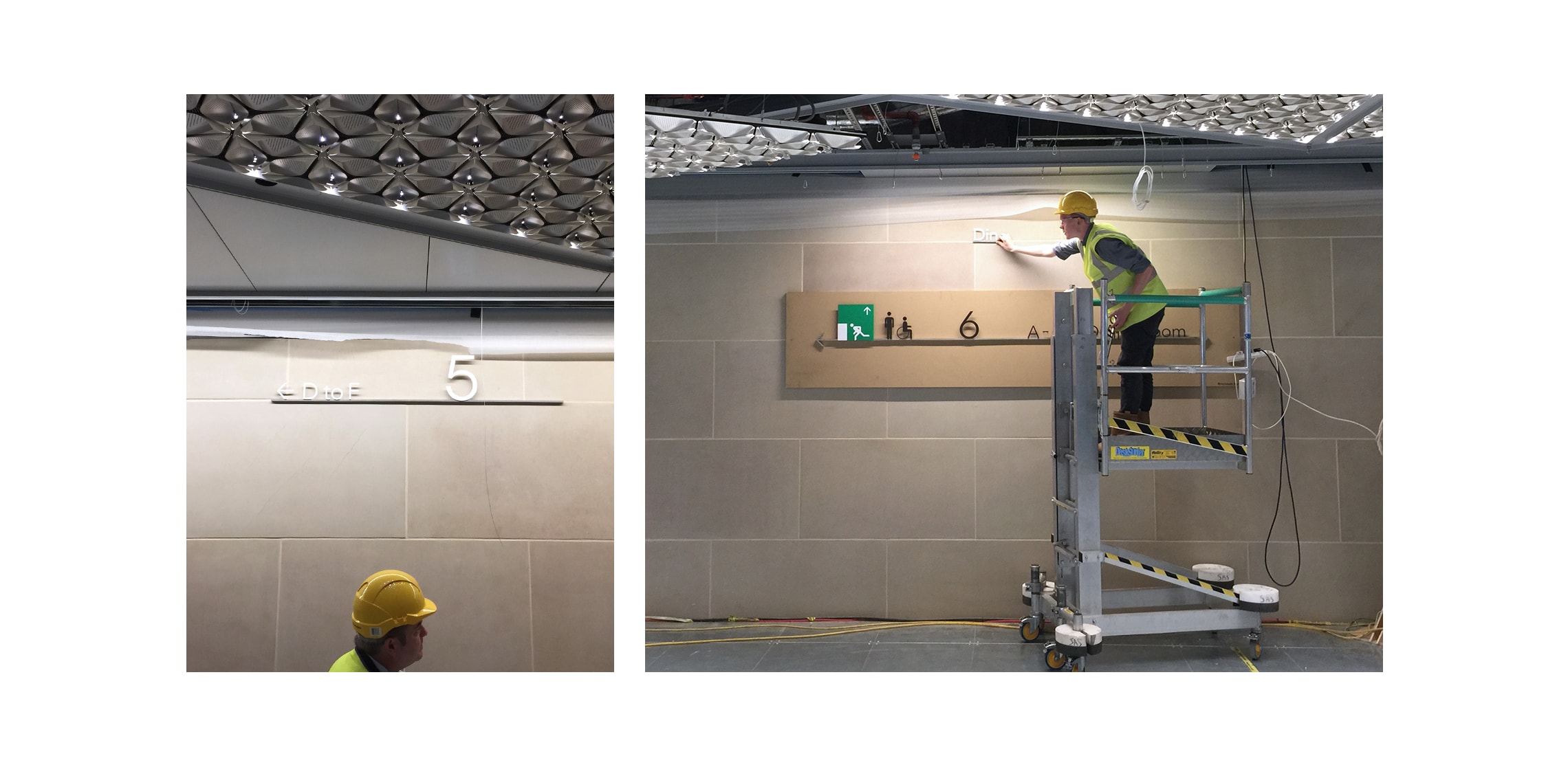
We then overlaid a simple grid. Six primary routes, or “avenues,” run from A to F, with numbered positions along them. The principle is immediate: find your avenue, follow the numbers, arrive at your desk. It is a system most people already understand, which means it can be read almost instantly, even under pressure. That familiarity is what saves time, not just in movement, but in decision-making.
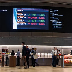
Information is delivered at the moments it matters most. As people step out of the lifts, prominent screens present the grid clearly and concisely, giving first-time visitors what they need within seconds. There is no need to stop, search, or decode. The system meets people in motion and keeps them moving.
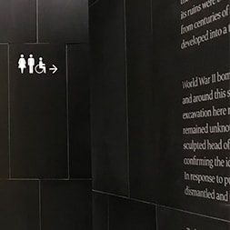
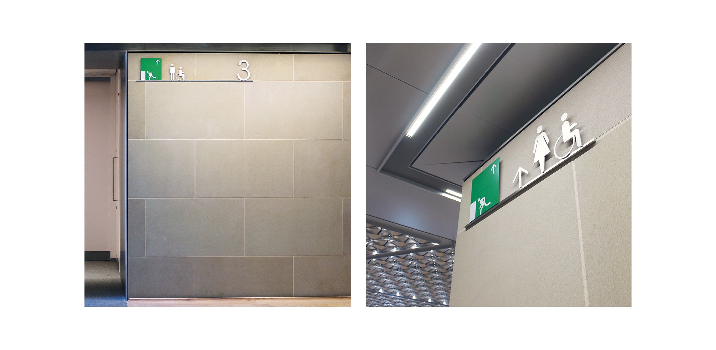
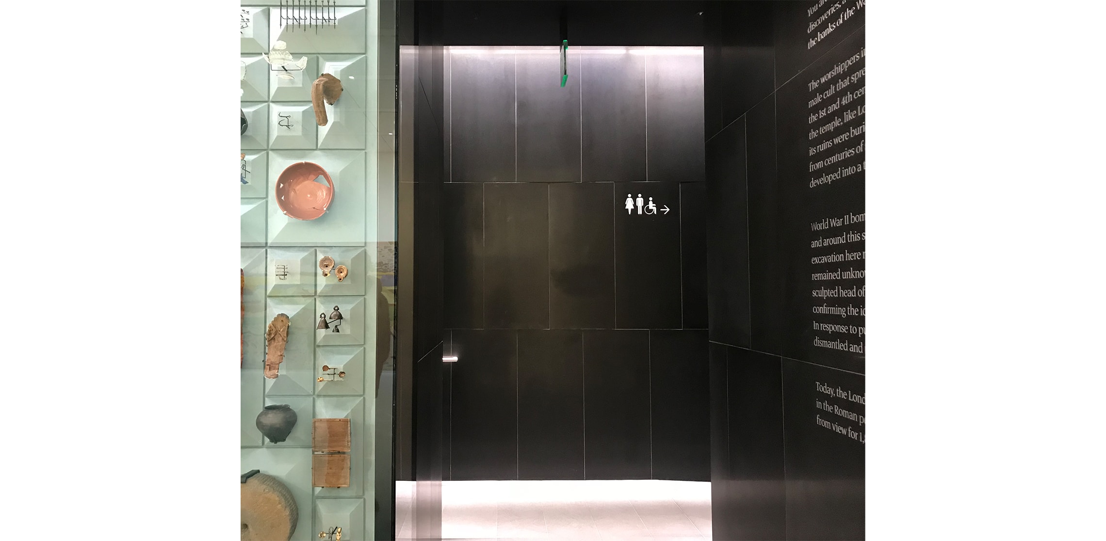
Because of this clarity, signage itself can recede. Working with Studio Fernando Gutiérrez, we developed a family of visually quiet elements that support the architecture rather than compete with it. Nothing is superfluous; everything is placed with intent. The result is a building that feels calm, but operates at speed.
Our contribution has been described as “a masterclass in reductive signage… clean and elegant.” What sits behind that simplicity is a precise understanding of the building and time spent: how long people pause, where they hesitate, and how quickly they can regain certainty. In a building designed for collaboration and flow, that understanding becomes essential, ensuring that movement is not just possible, but effortless.