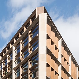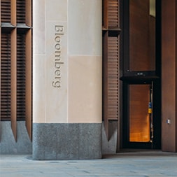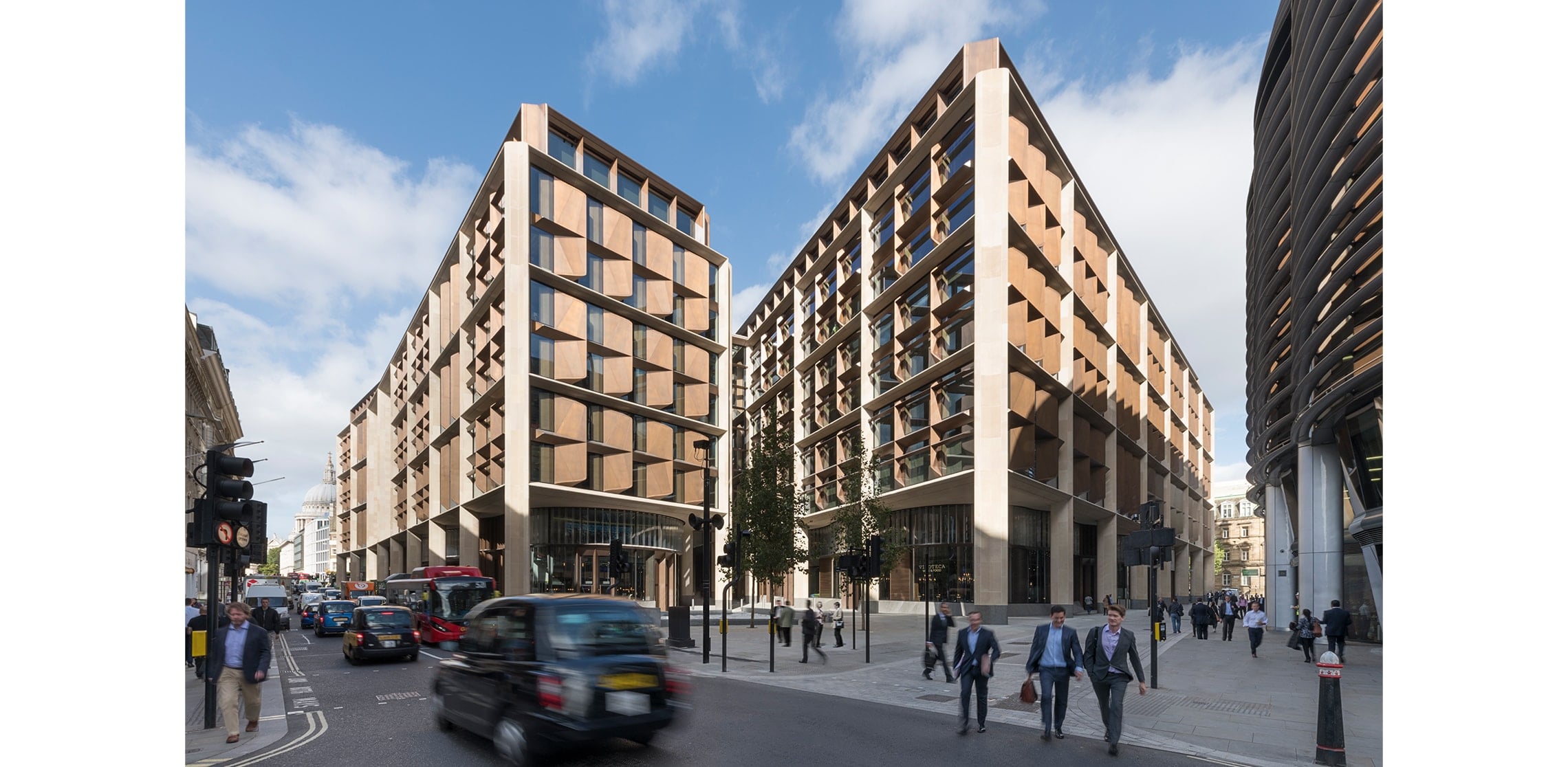
From the founding vision to the delivery detail, Bloomberg’s European HQ is a story of commitment – ‘A staggering commitment to design quality.’ That was the verdict of the Architects Journal judging panel recognising Bloomberg as Client of the Year 2018. The building went on to win the 2018 RIBA Stirling Prize for Foster + Partners.
Selected by Foster + Partners, we were part of the world class Bloomberg team.
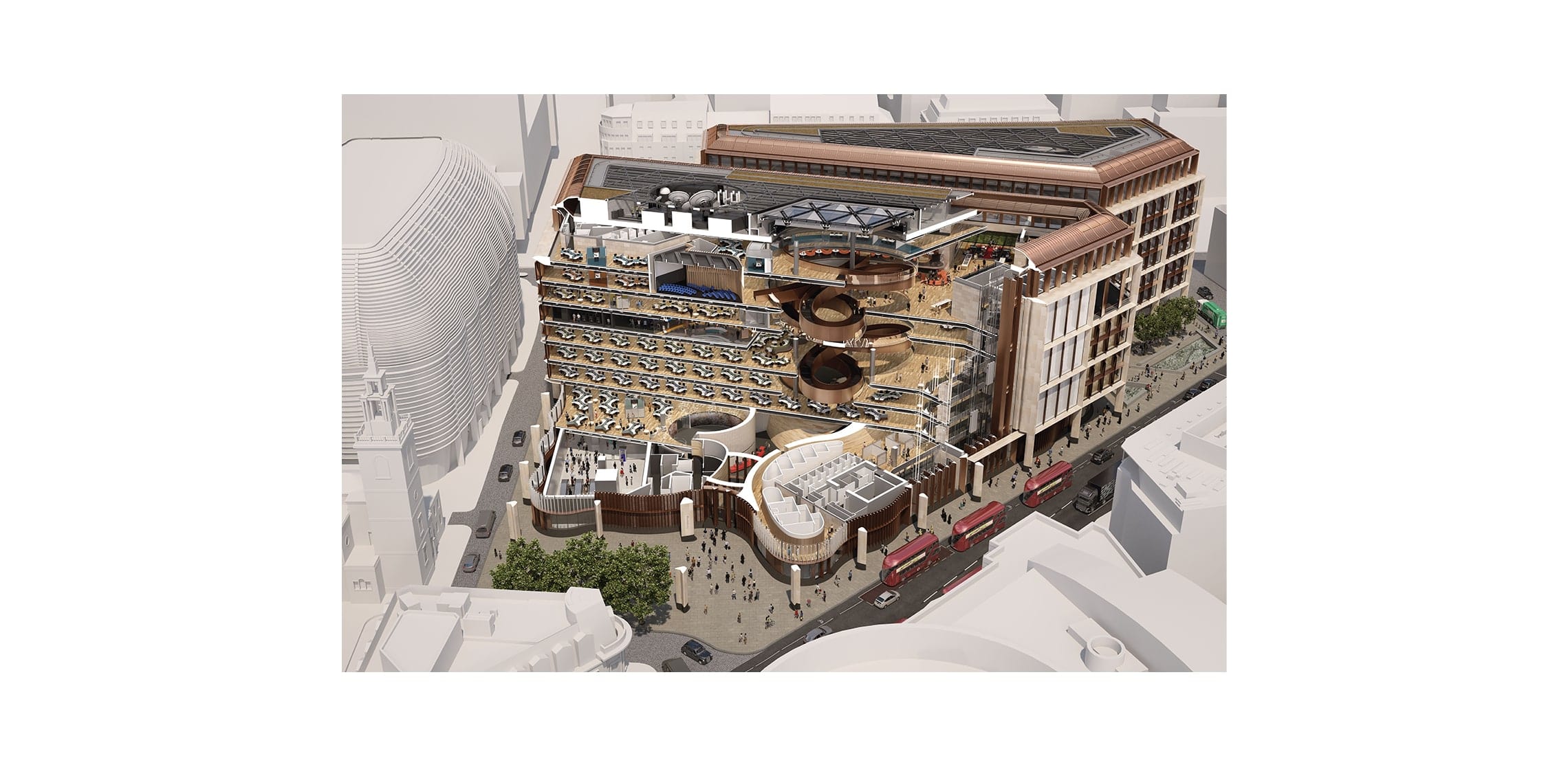
Fosters knew we would understand and respect the design ambitions for the building but that we would also be up to solving the considerable challenge of making this open, flowing building legible to the 4000 people who would use it.
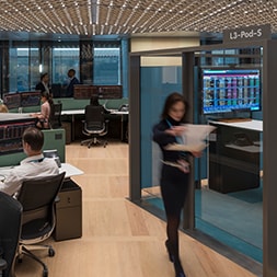
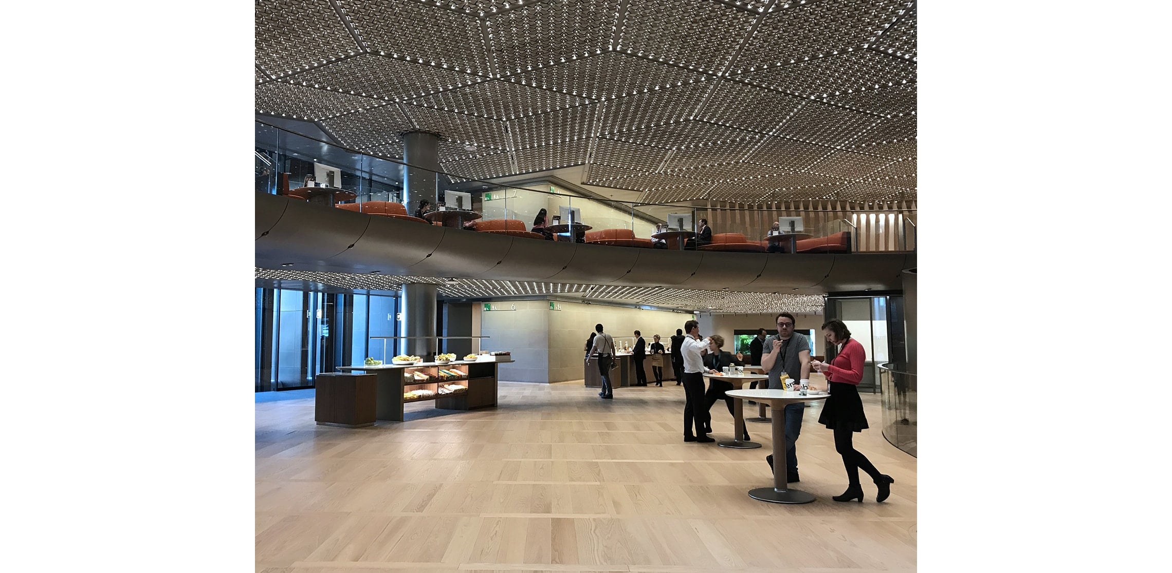
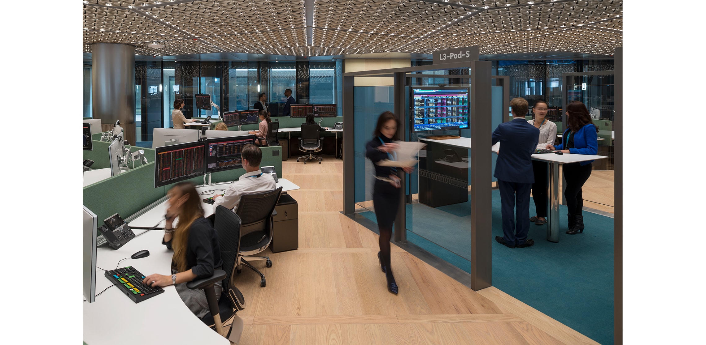
Bloomberg’s business ethos is about cooperation and collaboration. The whole building plan encourages serendipitous meetings. A detail to support collaboration is what the architect describes as ‘organic clusters of desks and spaces.’ They are clusters of up to 800 work stations. The challenge was how to help people find their desk when they are very often first time or irregular users of the building and they will rarely be met and guided to their destination desk.
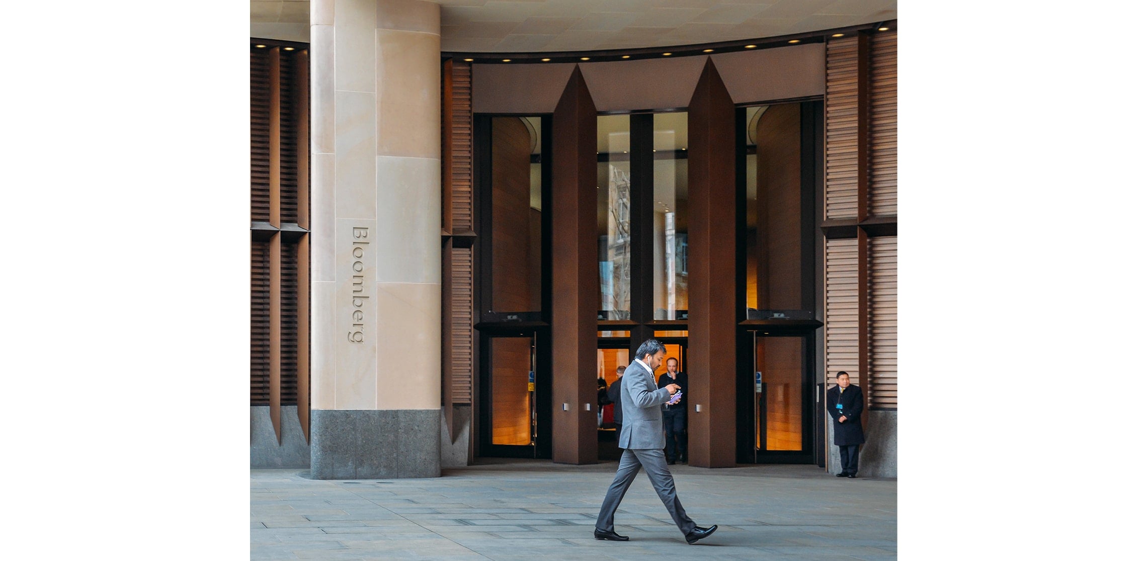
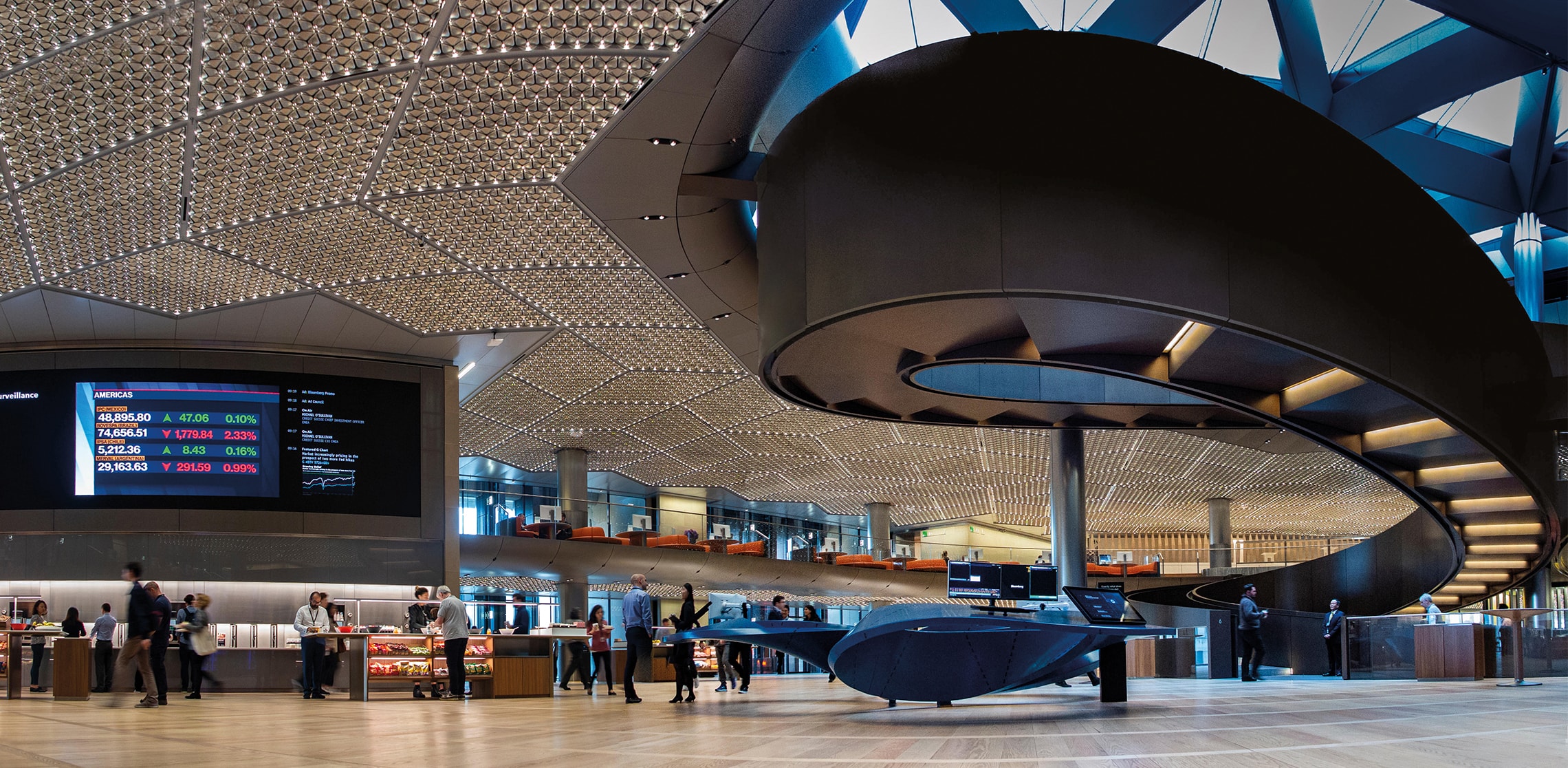
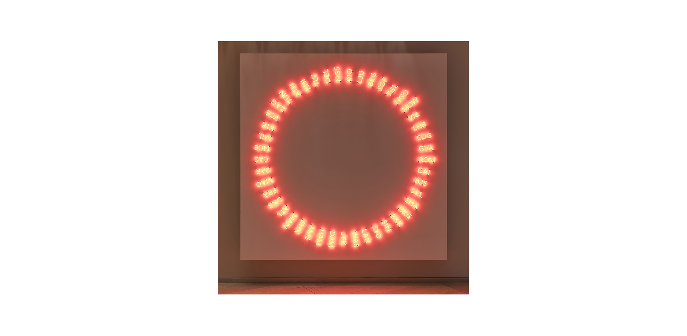
Our solution was inspired by New York – fitting for a company founded in and so much part of the Bloomberg brand. The desk areas can be seen as a sort of city block. The architectural features of the building – the central spiral ramp, materials used in particular themed spaces, artworks – function as visual markers people orient themselves by just as you’d use landmarks in New York City.
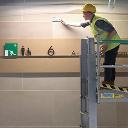
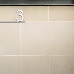
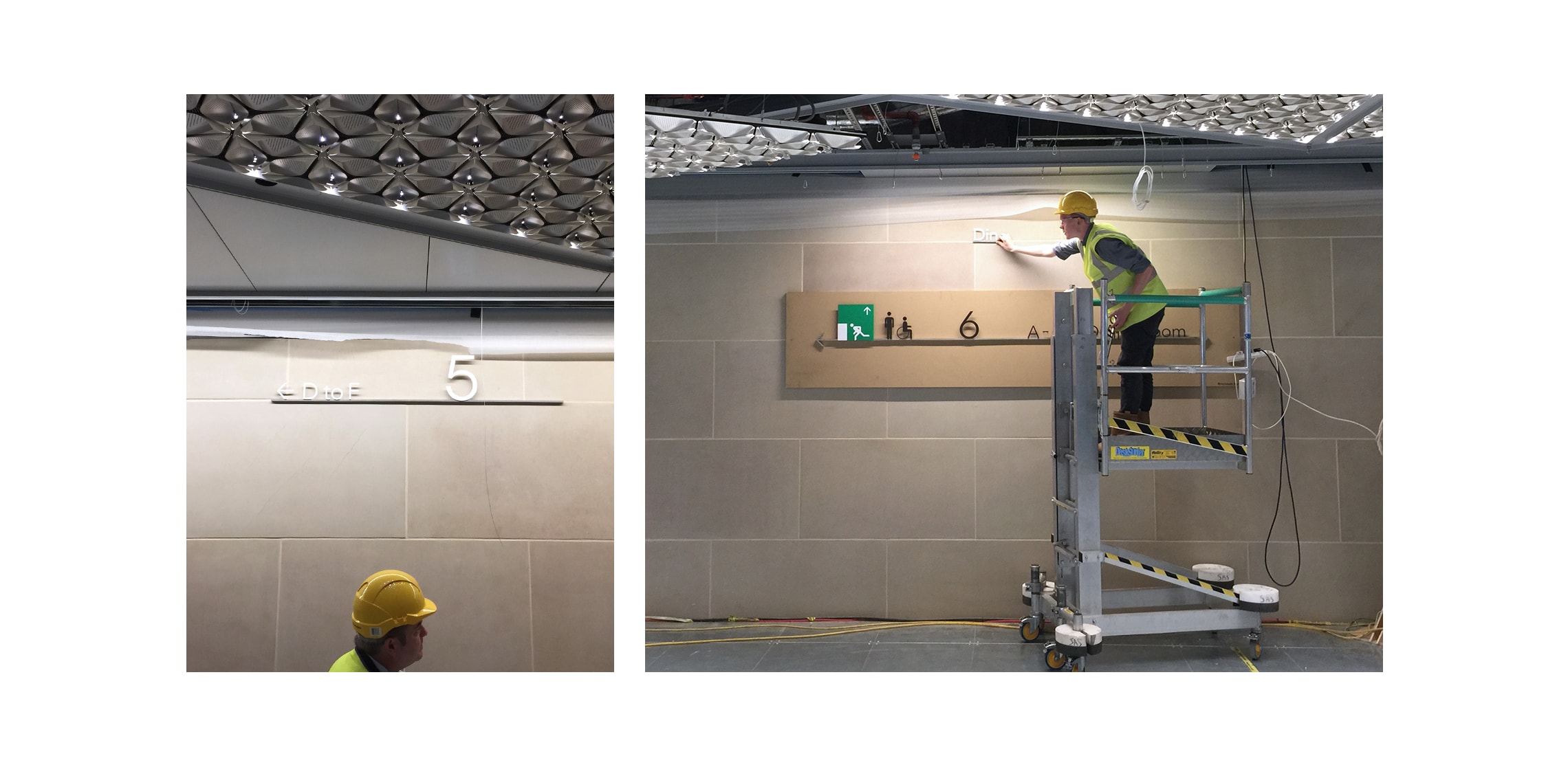
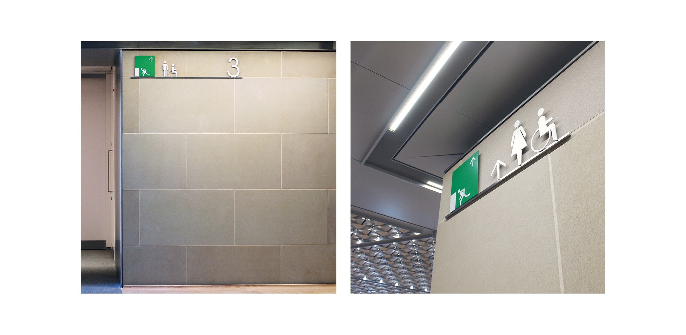
The grid navigation system delivers detail in a familiar way. We identified a navigational grid marked out by what we think of as avenues – six of them from A through to F. Just like in a city you find your avenue and then follow the sequence of numbers until you get to your spot.
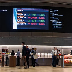
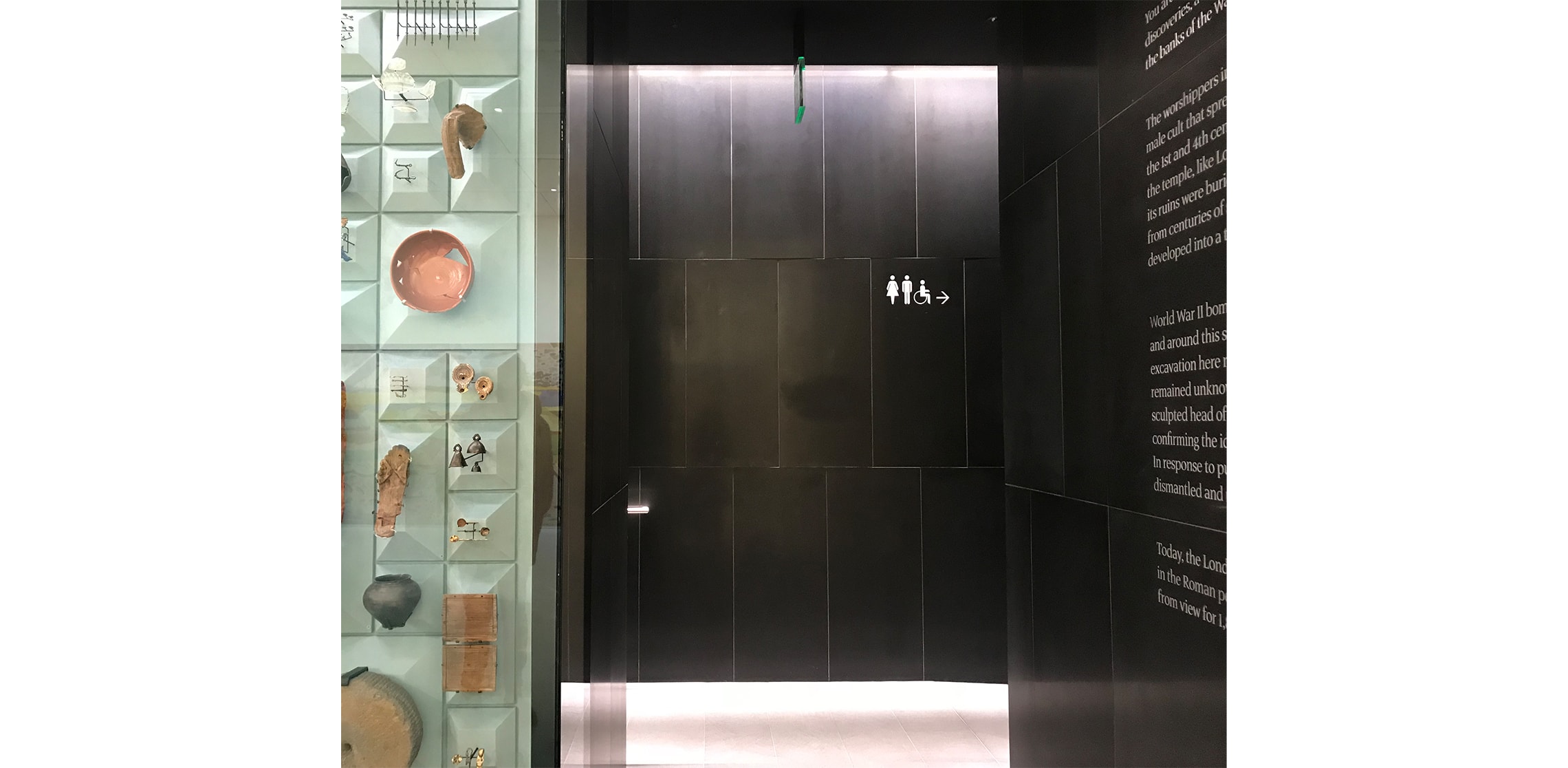
Because it’s a familiar navigation convention, signage can be kept to a minimum. The grid is depicted on prominent screens as people exit the lifts. It’s a simple to get idea that’s presented in a clear and timely way to the first time visitor.
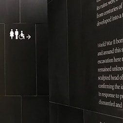
We worked with graphic designers Studio Fernando Gutierréz to deliver ‘visually quiet’ signs that are beautiful and effective and fit the design integrity of the project.
Our contribution to the building has been described as ‘A masterclass in reductive signage…clean and elegant.’ We are very proud to have been part of the team that delivered this wonderful building.